Purchases made through my links help support this website, at no additional cost to you. Details.
 |
To reflect the sky colors in the water, I made a duplicate layer of the sky, flipped it vertically in Edit–>Transform. I reduced its transparency to 36%, and slightly adjusted the color to make it greener (for the influence of the green of the water) and darker. |
I remembered my painting lessons which taught me that the sky is almost always the lightest natural tone in any picture. So, the water had to be a little darker. (ref. Carlson’s Guide to Landscape Painting – an inexpensive must-own if you’re working with landscape-type art.)
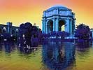
| Next, I knew that I wanted at least one figure in this ATC, so I found a slightly risque public domain photo. (They’re easy to find, online, even the U.S. gov’t site has some in their art resources, online. Or look for the British Museum’s free online images.) | 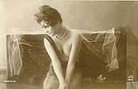 |
 |
I selected just the figure to use on my ATC, and blurred the edges slightly. (Remember, if you’re working with a layer that’s going to be transparent, you can get away with far less precision in your images.) |
Then, I…
- made a duplicate layer so would be two figures
- flipped one of them
- adjusted the transparency
- set the figures where I wanted them.
Then I merged the two figure layers so that I could play with the hue, saturation, and contrast.
Next page: ATC Tutorial 3 – Memories – Giving it meaning.