Continued from ATC Tutorial 3 – Memories – Giving it meaning
The card was very nearly finished. I liked the colors and the general design of the image, but it needed just a little… something else. I didn’t know what, yet.
This is the part of the process that can take forever, since it’s trial and error. There’s a feeling that you’re almost there, and it’s only working with a set time limit that prevents the card from becoming a two-week continuing project.
 |
I remembered an ATC that I made earlier, with a photo of a little girl and her teddy bear.
Suddenly, the new card was about a frail and elderly woman, remembering her days as a “flapper”. She was remembering her childhood near San Francisco when she and her father would go to the pond by the Palace of Fine Arts, to feed the birds. |
| I still had the layers from my earlier card, so it was easy to copy the layer with the little girl and position her on this new ATC.
I liked the effect immediately. |
 |
Before flattening the layers, I selected that band of natural color where the water meets the land, and I increased the saturation.
Then, I chose the inverse selection and lightened it, reducing contrast as well.
Finally, I flattened the layers and reduced the image size to fit on a 3″ x 5″ ATC.
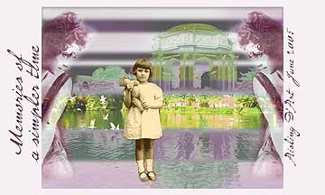
I added the border and text, using the P22-Monet font. I deliberately overlapped the text and the image a little, because I wanted it to look like the lady had written this on the card herself.
Here is the completed card:

right-click on the card to save it to your hard drive
You can print this card at 150 dpi to create you own copy of this 3″ x 5″ ATC. (It’s okay to adjust the size to fit the more popular 2.5″ x 3.5″ format.)
Amazon and the Amazon logo are trademarks of Amazon.com, Inc, or its affiliates. As an Amazon Associate, I earn from qualifying purchases.
