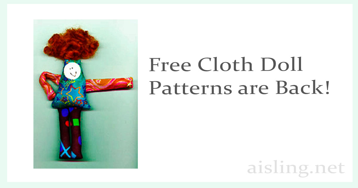
Sometimes, plans go awry. This collage… Well, it was intended as an 8″ x 10″ work, so the support I started with was 8.5″ x 11″.
But, as I kept working, it grew.
The collage elements include images leftover from a piece I worked on, yesterday.
The woman at the top of the art is Sharon Stone. Her comment about roles for women – that they’re aren’t any between ages 40 and 60 – resonated with me. Ageism continues to thrive, as do labels, especially for women. That 40-to-60 age can be especially troublesome.
(I see the recent raves about how great/young Selma Hayek looks in a swimsuit, at age 53, and wonder, “Yes, she looks great, but are we defining ‘beauty’ as ‘looks like she’s 30’? and why is her age part of the headline? Why not say ‘Selma Hayek Has Style’ and leave it at that?”)
So, the “you’re READY” phrase and “She’s back” are about rebellion against compartmentalization – by age, race, gender, and so on.
The elevator buttons reference rising up.
The image of the woman at the lower left is deliberately torn, as all of us try to navigate a challenging time. Right now (January 2021), I think so many people are confused and somewhat overwhelmed, compartmentalizing is even easier. It’s a way to put people into categories instead of finding time to understand them as individuals.
What’s resulting is a fractured society, defined by labels that can separate us.
And then there’s how the collage spilled off the lower edge of the support. In a way, that’s part of the artistic message, as well. It was unintended, but… well, many of us are “playing it by ear” right now. If the results aren’t tidy, at least they’re authentic.
Materials: torn images from magazines, Yes paste, and a poster board support.
The photo shows my worktable, with cotton swabs for applying small bits of adhesive, my Speedball brayer for smoothing each piece as its applied, the collage (on a kitchen cutting board I like for collage work), and my reading glasses for seeing details.
Click to download a printable ATC version, at 300 dpi. (You can print it larger at 150 dpi.)
Next to my bed, I keep a three-ring binder for articles that inspire me, plus notes and ideas I jot on paper, and so on.
The cover of that notebook features word art, “Create the Life You Can’t Wait to Wake Up To.”
My illustration (above) features one of my early morning sunrise sketches – an oil painting – as the background.
Even after several years of seeing it every day, I still smile as I read those words. (In a Google Image Search, you can see many more examples of that phrase, accenting art & photos, or used as word art.)
I like the term “word art” because it describes art-with-words. That includes digital and printed art, calligraphy, mailart, art journaling, coloring books, and scrapbooking… plus many other creative projects.
And I love word art because – even if you can’t draw a stick figure – you can still create lovely (even magnificent) word art.
Three parts of successful word art
Successful word art includes letters (usually as words, phrases, or longer text), so the style of the letters – the font (or fonts) – matter. So do the proportions of the letters and the layout of the text.
Of course, the message is important, too. It should be something with an emotional impact. I like words and phrases that are uplifting and inspiring, and sometimes funny as well.
And finally, the background – if you use one – can enhance the message.
It’s ideal for all three elements to work together. But, if you’re a perfectionist, avoid tweaking more than you need to. Know when to say “good enough.”
Where to begin
Every artist has their own system for creating word art.
It might start with an idea they want to express.
They might find a quote that makes their heart sing.
The spark may come from a sketch, a painting, or a photo. Or a photo of art.
This morning, I started with an idea, then found a quote I liked, selected a font, and then located a background photo.
I assembled the pieces in Photoshop, but Canva, Gimp, and other free tools can produce gorgeous results, too.
Here’s what I created in about 10 minutes.
Tomorrow, I might start with some art and then build out, adding a quote I like.
In other words, no approach is “best” and – in art – I try to avoid by-the-numbers formulas, anyway.
Next, here are some tips so you can create and enjoy word art, too.
Quote resources
Most of my word art starts with an idea. Then I look for a quote that fits it. In case I decide to use the finished art commercially, I try to locate quotes that are in the public domain. That prevents copyright disputes.
Once I have a quote, I look for a font (or two or three) that suits it.
Fonts for commercial use
Like other artwork, fonts can be copyrighted… as software. (It’s complex. You may want to read this article at Lawyers.com.)
Keep that in mind if you’re planning to use a font in something like a coloring book, blank journal, poster, or print-on-demand product.
Free fonts
My favorite free resources include FontSquirreland GoogleFonts. They specialize in open source fonts, and fonts you can use (free) in commercial products.
I also use sites like DaFont, but it’s essential to check each font’s terms of use. If it’s “personal use only,” there may be a fee to use the font commercially. DaFont (and others like it) usually provide links to contact the font designer about this.
Some huge sites – like FontSpace – offer great, free fonts for personal use. However, when I searched FontSpace today, looking for commercially licensed free fonts, none of their 71,000 fonts met that one search criterion.
Fonts to purchase
When shopping for fonts, you’ll find many affordable options. Some are better than others. Frankly, many of them confirm the adage, “you get what you pay for,” but some stand out with great products, great prices, or great customer service.. or all three.
Generally, if I find one or two attractive fonts in a package, I’ll buy the entire package. That’s usually less expensive than buying the ones I like, individually.
(Also, I’ve had great, fast response from TheHungryJPEG’s customer support as well as CreativeMarket’s.)
However, it’s smart to double-check by searching (at Google, Qwant, etc.) for the font you like, by name. If you can’t find it, search for the name of the artist or font foundry. Sometimes, their individual fonts are very affordable.
For years, I recommended FontBundles.net and their sister site, DesignBundles. Now, after a shockingly bad experience with their customer support – as others have, too – I will never shop there again.
In a class of its own
My all-time favorite source of paid fonts is Design Cuts. (Obviously, they offer a lot more than fonts.) They offer bundles – often themed – for around $30. They’re dazzling, and the values – sometimes in thousands of dollars – are not exaggerated.
You can also purchase individual products; the more you buy, the bigger the discounts.
For fonts, Design Cuts earns my highest praise. Their fonts are stylish and high-quality. You won’t find anything “plain vanilla” in their bundles or their individual products.
Their customer service has been flawless, as well.
A sneaky way to get the look you want, free
There are times when you want a great, stylish font, but you can’t afford it.
See if they recommend a free or really inexpensive font that’s “close enough” to what you wanted.
Sneaky tactic #2:Search at free font sites (like DaFont) using the name of the font you like. Then try slight misspellings. If the price-y font is popular, there may be a pretty good (and free) clone of it.
Of course, no free or inexpensive (and legal) font is going to match the style and elegance of the original, high-priced font. But, until you can afford to buy that font, the lookalike might be all you need.
Learn the fine art of combining fonts
No matter what look you aspire to, font combinations can make a huge difference. The way fonts interact often highlights the best features of each font. In a way, it elevates the lettering into the “fine art” realm.
Search for “font combining” and you’ll find lots of advice. Add the current year (right now, that’d be “2020 font combining”) for edgy and trending combinations.
I hope this article has inspired you to try some word art of your own. Whether you use it to decorate your home or office, in an Etsy product, or you share it free in memes, word art is a way to convey a powerful message.
If you have questions, comments, or suggestions, leave a message in the comments section below. (I read and manually approve all comments at all of my sites, and I’d love to hear from you.)
Links in this article are (deliberately) not affiliate links. I earn nothing for recommending those resources.
It’s a good day for a free art mini-poster. Or maybe two. Or even all three! After all, they’re FREE!
They’re PDFs. Each is designed to print on an 8.5″ x 11″ sheet of paper, with a small margin around them for matting. (The photos show what they’ll look like, framed.)
Click on any image to download it from Google Drive. And yes, they really are free. It’s okay to share these with friends, give them as gifts, etc… just don’t use them commercially, okay?
Are you looking for an easy – and somewhat sneaky – way to add more excitement to your art journaling?
The answer may be: RESIST!
In art journaling, “resist” is a way to keep paint – and some other products – from sticking to the page. Other terms for this include: mask, masking fluid, and frisket. (You’ll see many different products at Amazon.com.)
Some resist techniques are simple, like using a white crayon on a white page. Watercolors, acrylic paint, most (not all) rubber stamp inks, and so on… they usually won’t stick to any area where the crayon wax is.
This short video shows one way to use white crayon as a resist.
Here’s another short video with some good suggestions if you’re using a white crayon as a way to keep part of your page white:
Remember that once the wax crayon has been applied, that area on your artist’s journal page won’t accept water-based media, ever. Even if you try to wipe the crayon lines off… the paint (or rubber stamp ink, etc.) probably won’t stick.
White Glue Mask/Resist
In this video, you’ll see one of Traci Bautista’s products mentioned. It’s a decoupage product, Collage Pauge, that can be uses as a resist. However, as the video explains, you can use white glue for the same purpose.
Alcohol Resist
Other resists aren’t necessarily as waterproof as crayon. Alcohol is an example. Though it can be 100% resistant to water-based pigment, sometimes it isn’t. Also, it can be harder to control than white glue, white crayon, or products designed for use as resists, masks, and friskets.
Embossing Resist (with Heat)
If you have embossing supplies, this is an innovative way to use them in your art journal, as a resist.
Resist with Adhesive Letters or Decorations
This is a fun, kind of reverse-resist approach to art journaling. First, you paint a colorful layer. Then, you add the adhesive-backed letters or shapes. (I’d use inexpensive letters, and don’t push them down too firmly.) Then you paint over the whole thing with white (or a color), and then you peel off the letters/shapes you’d stuck onto the page.
I think these ideas are kind of wonderful. I already knew a few, but – watching these videos – I’m inspired to revisit them, and try the new resist techniques, too.
She’s still a great inspiration, whether you’re a beginner or a long-time scrapbooker or art journalist.
If you’re not familiar with Keri’s art & philosophy, this video may be a good place to start. It’s about 3 minutes long.
https://youtu.be/EQpoDWSHby0
If you like her message, you’ll find more,related videos at YouTube.
Also, even if you don’t speak Spanish, this 3-minute video is fascinating. Multiple artists demonstrate how they “wrecked” a Wreck This Journal (Destroza Este Diario).
Would you like to sketch in your art journal or scrapbook, but need some ideas? This short (under two minutes) video is in German – with subtitles in English – and it may give you a fresh outlook.
Mr. Scheinberger talks about sketching art materials that may be at your elbow, but changing their size or proportions. In other words, make the everyday into something different.
We use cookies to optimize our website and our service.
Functional
Always active
The technical storage or access is strictly necessary for the legitimate purpose of enabling the use of a specific service explicitly requested by the subscriber or user, or for the sole purpose of carrying out the transmission of a communication over an electronic communications network.
Preferences
The technical storage or access is necessary for the legitimate purpose of storing preferences that are not requested by the subscriber or user.
Statistics
The technical storage or access that is used exclusively for statistical purposes.The technical storage or access that is used exclusively for anonymous statistical purposes. Without a subpoena, voluntary compliance on the part of your Internet Service Provider, or additional records from a third party, information stored or retrieved for this purpose alone cannot usually be used to identify you.
Marketing
The technical storage or access is required to create user profiles to send advertising, or to track the user on a website or across several websites for similar marketing purposes.