The Journey – Mixed Media Art Journaling Collage

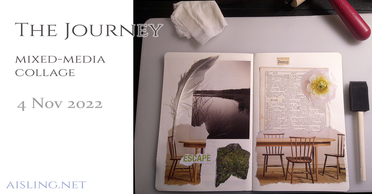
Earlier this week, I decided it’s time to resume daily art journaling. So, I created this collage:
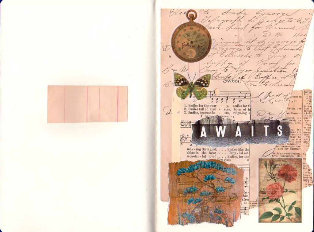
Small Journal - first collage

The next day, trying to work on another mixed media collage, I realized that the art/studio side of my home office was a mess.

Okay, maybe not a total mess, but I needed to create order and space to then create my art “in flow.”

That led to rearranging everything in my home office.

Three times. Over two days. I’m not kidding. (It had to be “just so.”)

And now, more daily art journaling collages?

Today, I decided it’s time to resume this project. Get back in the habit of daily art journaling collages.

(Yes, it really is a habit. In some ways, an effortless one, but – right now – it’s essential to carve out time and mental space for it.)

Here’s what resulted. I think it’s a good art journaling example, and expresses where I’m at, right now.

The Journey – An Art Journaling Collage
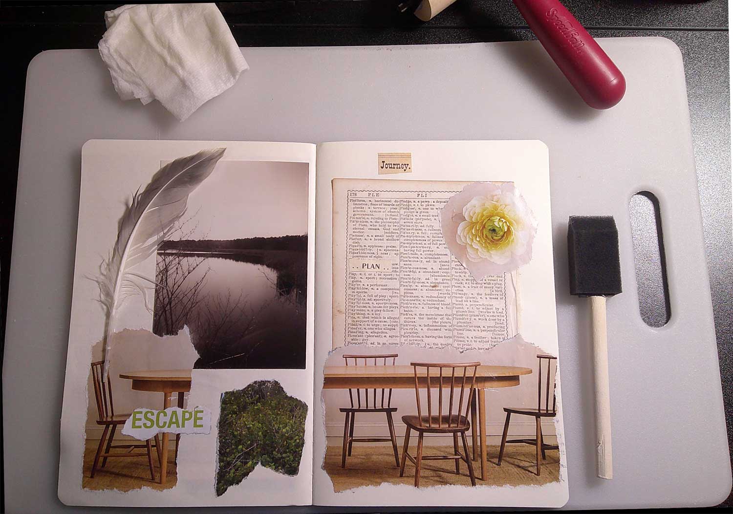
This started with the word “play.” It’s on the page from an 1853 dictionary, on the right side of this two-page spread.

Note: The dictionary was coverless and in rough shape when I found it at a flea market. Giving that book’s pages fresh life in art seemed right.

Next, I took the word “Plan” and pasted it just above the dictionary entry for “play.”

Meaning: I need to plan to play.

Not “planning” in an excruciating, controlled way, but just create an opening in my daily schedule… for play.

After that, there’s the torn image of a set of chairs at a table. I wanted the image split, like someone had pushed back from the table. Making a different choice.

So, the word “escape” made sense in this collage, as well.

The photo is my own, taken at a pond in Maine. Over it, the feather came from a walk along Fortunes Rocks Beach, near Kennebunkport, Maine.

The finishing elements were the blossom and the word “Journey,” which inspired the title of this art journaling piece.


Art journaling supplies used in this mixed media collage (Links will take you to Amazon.)

  • One of 21 notebooks in a travel journaling set.  I love the size of these, and how well they lend themselves to journaling and collage art.
  • A page from an 1853 dictionary. There’s something wonderful about old books, whether they’re originals or digital copies.
  • Bits of paper – photos and words – mostly from travel and tourism brochures & booklets. They’re among my favorite resources for collage art.
  • A feather found nearby, at Fortunes Rocks Beach (Maine). After using this, I got “pink eye” from rubbing my eye, and learned to sanitize feathers in the future.)
  • Yes! paste, used in all of my recent collages. It’s now one of my favorite art supplies.

She’s Back – Torn Paper Collage

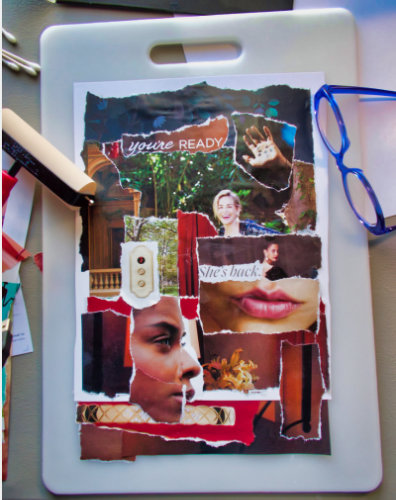
Sometimes, plans go awry. This collage… Well, it was intended as an 8″ x 10″ work, so the support I started with was 8.5″ x 11″.

But, as I kept working, it grew.

The collage elements include images leftover from a piece I worked on, yesterday.

She's Back - torn-paper collage

The woman at the top of the art is Sharon Stone. Her comment about roles for women – that they’re aren’t any between ages 40 and 60 – resonated with me. Ageism continues to thrive, as do labels, especially for women. That 40-to-60 age can be especially troublesome.

(I see the recent raves about how great/young Selma Hayek looks in a swimsuit, at age 53, and wonder, “Yes, she looks great, but are we defining ‘beauty’ as ‘looks like she’s 30’? and why is her age part of the headline? Why not say ‘Selma Hayek Has Style’ and leave it at that?”)

So, the “you’re READY” phrase and “She’s back” are about rebellion against compartmentalization – by age, race, gender, and so on.

The elevator buttons reference rising up.

The image of the woman at the lower left is deliberately torn, as all of us try to navigate a challenging time. Right now (January 2021), I think so many people are confused and somewhat overwhelmed, compartmentalizing is even easier.

It’s a way to put people into categories instead of finding time to understand them as individuals.

What’s resulting is a fractured society, defined by labels that can separate us.

And then there’s how the collage spilled off the lower edge of the support. In a way, that’s part of the artistic message, as well. It was unintended, but… well, many of us are “playing it by ear” right now. If the results aren’t tidy, at least they’re authentic.

Materials: torn images from magazines, Yes paste, and a poster board support.

The photo shows my worktable, with cotton swabs for applying small bits of adhesive, my Speedball brayer for smoothing each piece as its applied, the collage itself (on a kitchen cutting board I like for collage work), and my reading glasses for seeing details.


Some related art journaling and collage articles you may enjoy:

Torn-Paper Collages – How-to video (a 2010 video – some info outdated)

Adding Collage Layers in Your Artists Journals


You can see more of my best collages in the Gallery section of this website, and at my Eibhlin.com website.

(My real name is Eibhlin, pronounced “Eileen.” I’d adopted the “Aisling D’Art” pen name in the 1990s, when few women were online, and it seemed prudent to protect my privacy. Then, when the Aisling name became associated with the art journaling movement, I kept using it.)

Resilient – Torn Paper Collage

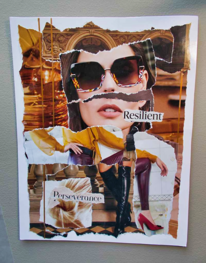
As I was creating this collage, the word “resilient” seemed to leap off the page. It’s definitely the theme for this, though I won’t pretend I understand the significance of everything in this mixed media piece. (I work intuitively. If a collage element seems to make visual sense, I use it.)

At the moment, we’re in our sixth week of interrupted sleep.* We live in an apartment, and – overhead – our new neighbors are waking us most nights. We’re still trying to resolve this with the property managers, but my optimism is starting to fade. Moving may be our only option.

So, that’s where the word “perseverance” comes in. (The word is deliberately broken. Because that’s how it can feel when you persist… but you persevere, anyway.)

For others facing challenges right now, this collage may have its own meaning.

Whatever you’re hoping will improve in this new year (2021), I hope that the words resilient and perseverance resonate with you.

You’re not alone. We’ll all get through this, together.

Resilient is approximately 8″ x 10″ on poster board. Materials: torn magazine pages, Yes paste, and lines drawn with a gold metallic marker.


*2022 update: Looking back at some of the collages from that time, I can see that I wasn’t at my best. I’m sharing these collages anyway. After all, this site – started in 1998 – has always been about authenticity and art.

Even when it’s not my best art.


You can see more of my art in the Gallery section of this website, and some of my best collages at my Eibhlin.com website.

(My real name is Eibhlin, pronounced “Eileen.” I’d adopted the “Aisling D’Art” pen name in the 1990s, when few women were online, and it seemed prudent to protect my privacy. Then, when the Aisling name became associated with the art journaling movement, I kept using it.)


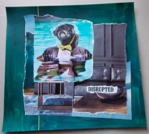
Disrupted – Torn Paper Mixed Media Collage

A dog in a bow tie, in swimming pool? That’s where this collage began.

I photographed this collage as I finished it, early this morning (low light). The deep teal colors in the photo aren’t as vivid in the real piece.

Mostly, I absolutely LOVE how my collages are moving in a “fine art” direction, and couldn’t wait to share it. The finished piece is 12″ x 12.5″.

This collage started as a jest, responding to Robert Presti’s joke’s about puppies in my art. (Bob is a childhood friend.)

Then, as I collected elements that appealed to me, the collage took on a fresh depth. I decided to make it a comment about disrupting the staid boardrooms and others’ expectations.

But, looking at it later, I realized that – at this time (late 2020) – many of us are living with disruptions.

Some are more convenient that others.

Some disruptions are pushing us to make decisions we’d tried to avoid.

And others are blink-blink confusing… like, “Wow, how did this happen?”

(2023 note: I was going through a lot of this since we were un-invited to the annual family Christmas gathering. I didn’t talk about it at the time, but – for context – it’s the backstory of my art following that crushing discovery.)

Disrupted is approximately 12″ x 12″ on poster board.

Materials

I’m thrilled with Yes paste as an adhesive. After applying it and gluing the paper down, I smooth the work with a brayer, with a protective layer of wax paper between.

Some bubbles and texture remain in the work, because I like it to show at least some process. The vertical line is actually gold, applied with a pen that has a felt-like tip, so the line is deliciously smooth.

Note: The cotton swabs (at the left edge of the photo) are on my desk because I use them to roll on really bold, shiny glitter – but there’s no glitter in this collage. (My current favorite “glitter out loud” product is Ceramcoat Glitter Explosion.)

Magazines I use most often, right now: Town & Country (American edition), Vanity Fair, Wired, and – for the puppies – ads in AARP’s magazines and other junk mail.


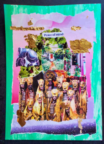
Peace of Mind – Torn-Paper Collage

What does this torn-paper collage mean…? I have no idea. My creative process is intuitive.

(And yes, this photo is blurry. I took the picture, hand-held and in low-light conditions. For now, it’s “good enough,” at least until I decide whether to do more with this piece. Then I’ll scan or re-photograph it.)

Here’s how I work on art journaling collages, and similar, stand-alone collages like this:

First, I gather pieces. I see which make visual sense, together. I don’t go looking for logic. Not intellectually, anyway.

The process is entirely visual.

Then I assemble the collage elements – loosely and without adhesive – and see if they still work.

This one is still a work in progress.

I have no idea how “peace of mind” relates to kale, some New England gardens and front doors, the colors of the Paris sky, and the cast of The Lion King.

But there it is. And, stepping back from it, I can see a symmetry in the design that echoes the costuming of the Lion King cast.

I’m not 100% pleased with the balance… yet.

It needs something… maybe.

Or it might be “creative ennui.” I seem to go through that with some pieces, and – a few days later – decide that the piece is actually fine, as-is.

I’m posting this anyway, because I want to represent the process authentically as I go along.

And, at some point, I may realize what this piece means. Until then, you may see things in it that make sense to you. Or not.

I’m pleased with the visual logic of this, and – sometimes – that’s all I’m aiming for.

Besides, it’s the holiday season and I have a lot of projects to complete before Christmas! This is my favorite time of year, but it can also be the most hectic. And personally rewarding, too, since it’s a time to gather with friends and family. Happy holidays!

For more (far better) collages, see my Gallery pages, and visit my fine art website, Eibhlin.com. (My actual, legal name is Eibhlin, pronounced “Eileen.”)

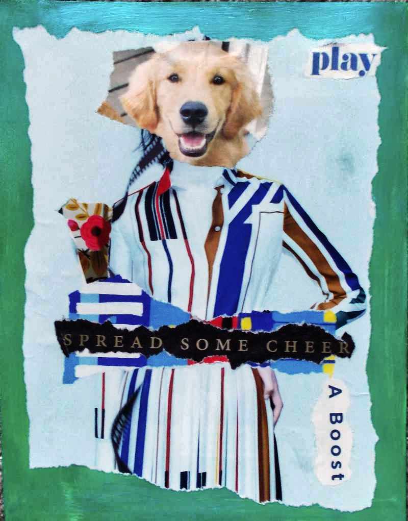
Play… with Elegance – Torn-Paper Collage

This collage started with a puppy’s cute face.

Then, because my humor is quirky, I realized the puppy’s face would fit perfectly on an Hermes ad from a British fashion magazine.

With a few added details, this torn-paper collage – the only one I created this past weekend – seemed complete.

Sometimes, the simplest collages are the most effective.

It’s the holiday season and – as usual – I’m looking forward to Christmas and all it represents. So, I guess I’m in a flippant, happy mood.

Play, and spread some cheer!

P.S. The support for this collage was painted green, and then applied a slightly sheer layer of iridescent teal blue. I’ll replace this photo with a better one, later, but – for now (on a Monday morning) – it conveys the general idea behind this art.

(And yes, my husband quoted “Ghostbusters,” saying something like, “Okay, so she’s a dog.” Because his humor is quirky, too.)

Things I learned, creating this collage:

Simple can be fun. It’s far to easy for me to keep adding collage elements when the work might be better with a greater sense of space.

Using glue stick as the adhesive prevents more buckling and bubbling than gel medium, but the adhesion isn’t as consistent, especially as glue stick dries so quickly. And, once placed, the glue holds almost immediately, so fewer adjustments are possible.

But, for small collage elements, where I can place the piece lightly (and make minor adjustments) and then press it down, glue stick can be better than gel medium.

(My usual art journaling glue is Yes!Paste.)

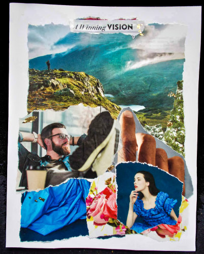
Winning Vision – Collage

This morning’s collage is a deliberate enigma. Also, I’ve decided that – after yesterday’s efforts – it may be best to leave the meaning of the collage to the observer. After all, that was my initial plan for this series.

So, is he thinking of her (and perhaps the rustle of her blue dress), or about the landscape, or something else?

Is she wondering about him, and is he the one that sent her flowers?

Does the finger point to what they’re both dreaming about?

Do their dreams – their visions – intersect? Or, is this very early in the relationship?

Or, do they even know each other… yet?

It’s definitely an “..in the eye of the beholder” kind of piece.


Things I learned, creating this collage:

Most American magazines seem to be printed on cheap, thin, very porous paper. National Geographic is an exception. Town & Country (American magazine) is on better paper than, say, Better Homes & Gardens, Wired, and Vanity Fair.

The British editions of Harper’s Bazaar and Elle are on paper close to the quality of Nat’l Geographic. For collage, it’s worth spending extra for them.

When working with cheap paper, it’s best to apply the collage adhesive to the support rather than directly on the collage element.

This makes element placement far more challenging, but it reduces buckling and bubbling… only slightly. (“Slightly” may be as good as it gets. So, I’m reminding myself that this shows the process in the finished art, and that’s okay.)

Some collages have a vision (no pun intended, with this work) from the start, while others – like yesterday’s piece – are a process.

It’s probably similar to the writing process: Some authors are “plotters” (plan the story, sometimes in great detail, ahead of time) but others are “pantsers” (writing with a vague idea, and making it up – flying “by the seat of one’s pants” – as they go along).

And sometimes, even the most dedicated, focused “plotters” suddenly find their stories going in a weird (but wonderful?) direction, and they go with it.

This collage started with a fairly clear vision, and then went slightly astray, but only slightly.

I like it, but I’m not dazzled by it.

I think I miss Thanksgiving. This is the first year that, due to Covid precautions, our family hasn’t had the big annual dinner at an in-laws’ home. It felt weird – kind of hollow – for us to have our personal Thanksgiving dinner at home, though it was delicious (if I do say so myself).

This year of ennui seems to be seeping into my art, but maybe the art will help me rise above it. And so, the collages will continue.

For more of my collages, see additional articles in the Art Gallery category at this site.

Torn-Paper Collage – Authenticity in a Time of Challenge

Today’s collage is – like yesterday’s – not quite finished. But, for now, it’s going to sit. I want to look at it for a while, and see what else it says to me. See if anything is missing or needs… something.

That’s a challenge for me, because this isn’t my usual design style.

November 2022 note: I look at this and realize how much it was the product of months of nightly, interrupted sleep during 2020. My art was disjointed during that time.

At the end of that year, we were not included in the big annual Christmas gathering of family and friends. I still don’t know why. It was baffling and excruciating. (Nearly two years later, it still is.)

So, in 2021, I decided that things had to change… and that’s reflected in my related, later art you’ll see at this website.

I’m leaving these older pieces online for authenticity. I don’t like this collage, but also know it reflects my struggle in 2020, feeling cut-off from friends and family, as so many of us were, due to Covid concerns, politics, and probably myriad other/related reasons.

I want to turn back the clock. I want to quit feeling so heartbroken, but I also know that’s how I should feel, in the context of what happened. It’s an appropriate response, and the richness – the authenticity – of life is what fuels my art.

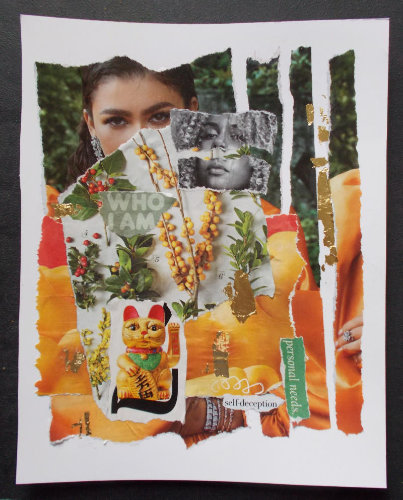
The foundation

This piece started with the first layer, showing a smiling model in a tangerine/orange satin gown and an almost ostentatious amount of glittery jewelry.

But – for me – the model’s eyes didn’t match her smile.

Years ago, looking at portraits, I learned to ignore (or even cover) the lower half of the person’s face. The eyes showed the person’s real emotions.

So, as I built this collage, the first thing I did was to cover the lower half of the model’s face. The new layer featured seasonal plants and berries. The colors resonated with the background image, but the texture – and the almost-careless untidiness of Nature – was a sharp contrast.

Suddenly, this collage was about authenticity. The look in the model’s eyes… what is it? Sadness? Distance from everything around her?

That’s when I tore the background image into strips. I chose to apply them randomly, out of order, and with emptiness between them.

Again, that’s a reference to an emerging sense of artifice as I studied the photo.

Next, contrasts and similarities

The next step was to study other magazine photos. I wanted to see if the expression in other models’ eyes were lacking, or at least didn’t match the rest of the face.

When I found the black-and-white image, it seemed perfect. That model’s eyes and mouth, and the tilt of her head, all delivered the same message. I emphasized that by disconnecting them – tearing that image in half. It’s a harsh contrast – in color (b&w), in consistency, and style – against the original layer in this collage.

I began gluing the collage elements in earnest when I found an ad for macaroni and cheese. The colors in that advertisement perfectly matched the orange satin gown. It’s almost difficult to tell what’s macaroni and what’s the gown. And, in contrast with the lifestyle represented by the amount of jewelry in the original image, I also wanted to note the number of people for whom macaroni and cheese – from a box – is considered a luxury meal.

It would be trite to talk about the shallow lives of those driven by status and symbols of wealth, but – as I kept working on this collage – the reference was almost unavoidable.

Final clues

The words “who I am” are almost lost in the busyness of the design. “Personal needs” is slightly tilted, as much of the rest of the images is. And then there’s the crisp statement, “self-deception” in black and white, with a childish scribble leading to it.

The final elements – the heavily made-up “lucky cat” (Maneki-neko) and ragged gold leaf – fit both the color & theme of this piece.

In some ways, this collage lacks drama, deliberately. It’s less visually appealing than what I usually aspire to, with my art.

But, at a time when – wearing masks – we rely so heavily on the emotion expressed with one’s eyes, and we’re witnessing a stunning, rapidly expanding gap between the “haves” and “have-nots,” I’m pleased with the statement of this piece.

Does that seem odd? Well, it’s about authenticity.

In a world where things can feel tumultuous and destabilizing, maybe authenticity is the touchstone… the sense of self that keeps us grounded.

Empowered, even in a challenging context.

Able to achieve what we’ve always suspected we can do… and can be.

And, once again drifting into irony, I’m remembering the song lyrics in “Grease.” Perhaps – more than ever, as we choose our personal paths to the new “normal” – it’s time to believe that we can be who we are.