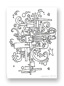
 This ATC is typical of the scribbles that decorated my class notes starting around age 12.
Bored out of my mind in junior and senior high school, I only half-listened to teachers. (Yes, I regretted that later.)
Instead, I drew a variety of designs, usually a series of connected images like the one at left.
For me, the squares and rectangles represent the architecture of the city. The swirls represent the city’s energy, and the stars are the dreams and real-life stars, while the circles are clouds and bubbles of creativity.
Free download
You can download your own copy of this ATC by clicking on the image at left, or by right-clicking here and saving it to your hard drive. Print it at 150 dpi so it’s 2.5″ x 3.5″.
This is one of six ATCs that I created in October 2010, experimenting with a new pen. (It’s a Size 0 point Koh-i-Noor Rapido Drawing Pen.)
Evolution of this style
When I was a teenager, I sometimes drew these designs in ink and just left them as-is.
Others were drawn in pencil during school. Later, at home, I drew over the pencil with India ink and my crow quill pen.
When the ink was fully dry, I’d add color. My mother had paints left from her years as an air brush artist (Dr. Ph. Martin’s radiant, concentrated watercolors) and I used those because the colors were so vivid. Generally, my color choices included magenta, turquoise, lime green, and yellow. I used purple as well, but carefully; it’s a color that can dominate artwork very easily.
One of these drawings — painted with acrylic paints — decorated a residential elevator on Marlborough Street in Boston (MA) in 1970. I remember showing it to musician Jaime Brockett when he visited me, and he could barely believe I’d created it.
Even then, I don’t think my appearance or demeanor matched who I really am.
Another of these designs became a wall mural in an office just outside of Salt Lake City (UT) in 1973. It’s no longer visible, of course, but I like to think that it still exists under layers of paint and tasteful wallpaper.
(Hmm… have I mentioned that I was a rather mobile hippie in that era?)
The art themes
These kinds of scribbles have a lot in common with work by Peter Max, but I don’t think he was popular when I began drawing these.
In fact, I think the art in my class notes (and this ATC) drew upon the same cultural icons that inspired Max and others. (The posters for the Grateful Dead and for concerts in general — particularly around San Francisco — also featured similar imagery.)
When I adopted elements from any popular art, it was probably from a TV show that (I think) aired in the afternoons when I returned home from high school. It had a title like “The Amazing World of Dr. Silver”, but that’s not quite right. I’m pretty sure it was on PBS and produced in Boston, Massachusetts. (Does anyone else remember this show?)
Mostly, there was a certain style to the art of the late 1960s and early 1970s. It was happy but also complex, in its own way.
This ATC reflects that.
Amazon and the Amazon logo are trademarks of Amazon.com, Inc, or its affiliates. As an Amazon Associate, I earn from qualifying purchases.

Thank you for sharing your style evolution – just fascinating! great ATC.