Continued from ATC Tutorial 2 – Memories – Adding More Layers
At this point, the card was pretty… but it had no real theme or meaning to it. And, while “pretty” art can stand on its own merits, I rarely choose to make art without another layer of meaning. So, I started examining the card for clues.
I increased the contrast and lightened the background layer. I knew that something needed to go in front of it, and by reducing the “obviousness” of the background, it helped me to focus.
I was still drawing a blank.
So, I went to my copy of Photoshop Secrets of the Pros: 20 Top Artists and Designers Face Off for ideas. (If it’s selling for under $10 at Amazon and you enjoy this kind of art, get a copy. Otherwise, see if your public library owns it. If they don’t, tell them to buy a copy.)
I was inspired by the work of John Henry Donovan, of 5pieces.com.
 |
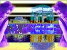
I tried inverting color (Image–>Adjust) in strips with five-pixel feathering. However, once the stripes were dark, I needed to duplicate the layer with the Paris-Draped figure, to make it more opaque. |
I wasn’t too sure that I liked the effect. In fact, it was pretty much ick. And, having set a three-hour deadline–trying to mimic my one-hour ATCs but allow for this documentation–I needed to finish the card quickly.
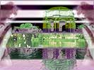
| I deleted the extra layer of Paris-Draped so that the figures were transparent again. And, I desaturated the layer. But, as I was using the Hue/Saturation screen for this, I accidentally altered the background hues… and liked the effect. |  |
I started selecting rectangular areas of the background, and changing the hue of each of them and then switched them back again.
Finally, I worked with the area nearest the middle and altered it back to its original, natural colors.
Then, I chose Select–>Inverse and tweaked the remaining background image and adjusted it until I was happy with it.
Finally, the Paris-Draped layer had to be adjusted as well, both contrast and hue.
Now, I was getting a theme. The Paris-Draped figure was clearly from the past, and the single band of natural/real coloring in the image was like a faded memory… only part of it was accurate and the rest was a little surreal.
Conclusion: ATC Tutorial 4 – Memories – Finishing the ATC
Amazon and the Amazon logo are trademarks of Amazon.com, Inc, or its affiliates. As an Amazon Associate, I earn from qualifying purchases.
