Art Journals – Beauty is in the eye of…

not coloring in my art journal... yetToday, I was browsing some sites where people have posted their art journals (or artist’s journals… same thing… it’s a term always in transition).

I quickly found a wonderful series of pages, and the artist  (Zom) muses if they’re part of an ugly art journal.

I want to say, “No! Those pages are lovely!” but I hold back.

It’s sort of like when I was pregnant.  Each time, I’d refer to myself as “the fat lady.”  At the time, it amused me.  Obviously, I was pregnant, not fat, but the size of my stomach… well, my humor runs to sarcasm.  Telling me I wasn’t “fat” made me question the vision of the observer.

Hello.  60 inch stomach…?  Fat! *chuckle*

But, of course, I understood the point.  They just didn’t understand mine… which was also okay.  Often, people don’t get my humor.

So anyway…

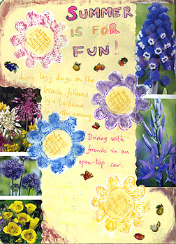
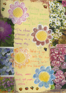
I look at these pages in all their loveliness.  I absolutely love the juicy colors and the choice of images.

However, if Zom wants to call them ugly… well, it’s her journal.  My opinions are different, but that’s my experience, not necessarily hers.

Moving past that semantic moment…

I love it where she says, “I don’t know how much of a connection I am feeling with this art journal. Is the form no longer relevant?”

That resonated with me.  For a long time, I didn’t connect with my artists journals.  I looked at them, tried to add to them, and generally felt a sense of ennui before completing even one page.

I became a different person over the past several years.  The reasons I’d kept an art journal, years ago… they weren’t there any more.  It was a different context altogether.  For starters, I’d been driven to keep my journal… it was a manic, almost “outsider” thing, for years.  It was how I kept my sanity during challenging years.

Since then, my world gradually shifted.  It wasn’t quite like watching paint dry, but it was very slow-moving.  I didn’t want to articulate it because the changes — even the minute ones — were radical, but — at the same time — they were constantly in transition.

What I’d say one moment might be totally different, even an hour later.  I suppose they were very subtle ah-HA! moments.

So, I’d put things down on paper and, later that day or sometimes a few days later, I’d shred them.  They weren’t me… not a “me” that lingered for more than a few minutes, anyway.  And, with such fleeting changes, I didn’t want to keep art around that represented that.  It took me back in time, uncomfortably.  It wasn’t a real ME-me, if you get my meaning.

I do like to document the process, no matter what the process is.  However, there are times when the changes are like trying on a huge stack of clothes in a fitting room: By the time I find what fits me and looks good, I’ve pretty much forgotten the oh-dear-heaven-that’s-not-me stuff, now at the bottom of the pile.

I don’t want to save some of those half-baked journal pages any more than I’d take photos of myself in unattractive clothing in the fitting room.

They’re not me.

They don’t have significance in my life, even as process.

Keeping those pages would be making the moment more than it was.

Perhaps I should journal about those pages.

Anyway, this blog entry (linked below) is wonderfully, deliciously thought-filled.  Click to read the pages.  They’re very good and some may resonate with you as they did with me.

pinch me to see if you’re dreaming: An Ugly Art Journal

pinchmetoseeifyouaredreaming.blogspot.com10/13/11

I don’t write as often about my art journal as I used to. I think my AJ and I have been going through a difficult phase. I knew things needed to change, not because anything was ‘wrong’ but because, for me, the innate nature of

Art and the Economics of Giving

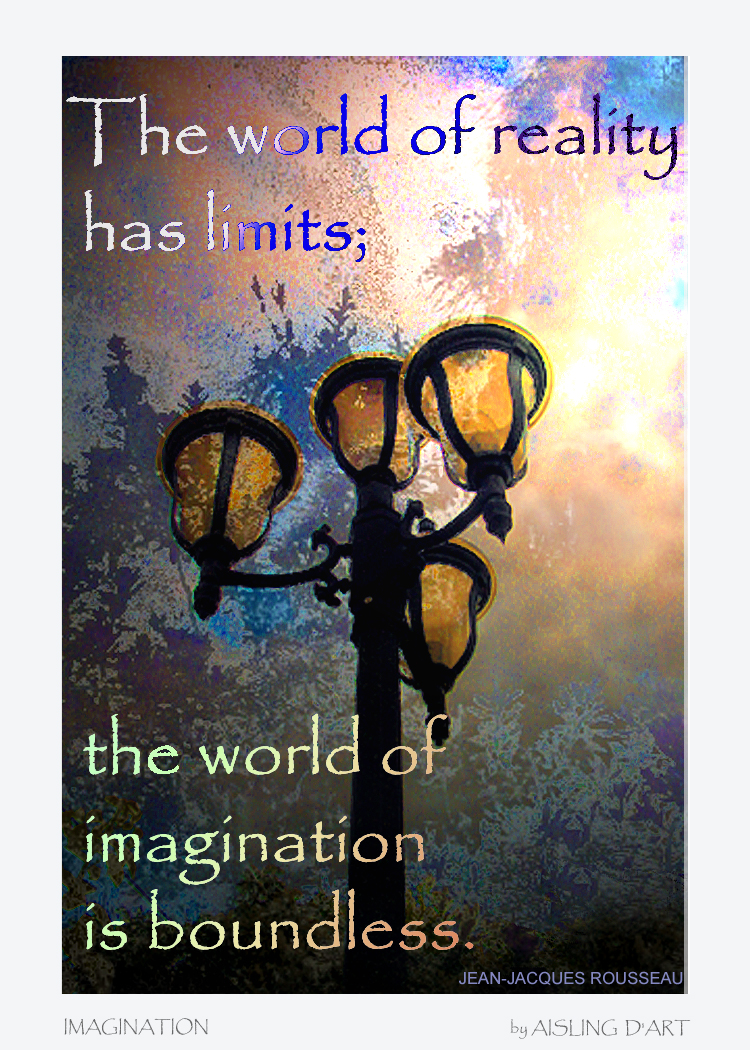
Online picture of a free poster and ATC - Imagination by Aisling D'ArtAre you struggling to sell your original art… or even your prints?

The fact is, as of late 2025, fewer than 25% of Americans have $2000 in the bank.

50% of Americans have less than $500 in savings.

And 23% of Americans age 25 – 34 have nothing in their bank accounts.

Yes: Nothing. (Ref. Nasdaq.)


If you’re in business, you need to know your potential audience and customers.

If your usual fans & collectors are among 75% of Americans, they can’t buy your $1500 painting, wall hanging or assemblage, no matter how gorgeous it is, or how badly they want to own it.

Sure, your art may be worth that much or more.

Value isn’t the issue here.

The more pertinent questions might be:

  • Do your business practices make your future customers feel better or worse about themselves?
  • Do they like how they feel around you and (especially) around your art?
  • Do you have rapport with them?

If they don’t feel that sense of mutual understanding on a personal level – even as artist-to-customer – they won’t be as open to connecting with what your art communicates.

Sure, you can focus on the minority who can afford your art.

However, that probably shouldn’t be your exclusive focus.

Reaching the 75%

If you’re meeting some of that 75% at art shows, galleries, or even as you’re running errands – and hope to attract them as clients, customers and collectors in the future, when they’re back on their feet – now is the time to establish rapport. They’ll remember it later.

Think about what you can do, so they feel a connection with you right now. What can you give or sell to them that they can own, and – at the same time – help them feel better about themselves?

Even if the person can’t purchase any of your art – even as prints – right now, he or she should walk away thinking, “That art is so great.  I’m going to own some of that, some day.”

Contrast that with the sad, “That art is beautiful, and yet another thing I can’t afford. Maybe I never will.”

See the difference?

So, make it possible for the person to connect with your art and feel good about it, right now.

The importance of gifts

Whether it’s a happy conversation, an occasional artcard, or a link to a webpage where they can download something… make sure you connect with your friends and fans, and they remember it as a happy meeting.

This isn’t a reciprocity thing.  It’s not, “I’ll give you this now, and you agree to give me something in return, later.”

The gift economy is a little different. 

It’s about bonding as individuals, and as a community, to establish a personal connection and goodwill for the sake of the group and each other, period.

What do you get out of this?

You get to be part of a happier, more connected community…
                                                                                         in a happier, more connected world.

You get the satisfaction of having done something good. 

Too often, that’s vastly underrated.

Remain sensitive to what’s really going on, despite appearances.

This is your opportunity to do something nice and helpful… and be remembered for it.

Everyone wins!

Pave the road to your successful future.

It’s fine to focus on people with cash who also like your art.  That’s common sense.

However, I hope you’ll invest a little happy karma by making it possible for everyone to own some of your art, right now.

This may require a little creativity, but you can do it.

(Note: If you liked my graphic at the top of this article, it’s a free download.  You can click on the image or here to download it as a 5″ x 7″ poster.  If you collect ATCs, click here for that free download.)

Aisling D'Art

To understand more about
our economy and the importance of gifts
read Linchpin by Seth Godin

While I’m Talking About Public Domain…

Never underestimate the value of the U.S. government when it comes to surreal and absurd images, many of which are in the public domain.

I mean it.  And, if you’re easily offended, or if the subject of VD bothers you, avert your eyes.

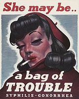
1940s poster from the U.S. government (Artist, "Christian")Seriously, this poster (at right) appears to be in the public domain.  (See notes at the U.S. National Library of Medicine.) You can download a 4MB copy of it at the gov’t website.

I can see so many very wrong uses for that image.  I’d like to put it on a tee shirt, except that I want to replace the VD words with… something else.  I’m not sure what, yet.

I look at her and think, “Really? I mean really? Is that what men found alluring in the 1940s?”

However, that’s not the only image of its kind. A search at the gov’t website using the phrase “venereal disease” turns up all kinds of strange posters of apparently dangerous women.

She may look clean...Check out the sweet girl in the poster on the left.  (Click on the image for the full, print-quality image at the NLM.)
Wasn’t she a famous movie star?  She looks really familiar… like someone I’ve seen in old movies.  Well, now we know about her history!

I’m amused by the phrase “‘good time’ girls.”  It makes me wonder, were there “bad time” girls?

That poster is in the public domain.

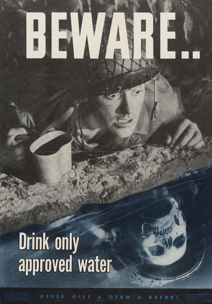
1944 - beware waterThe next poster for your consideration (or amusement) is about clean water.  Gosh, it looks like our boys were dealing with all kinds of dangers in the 1940s… wasn’t war enough?

Because that was produced specifically for government use, I’m pretty sure it’s in the public domain.

Click the image to see a really large copy of it.  There may be even bigger versions in the NLM files.

(Of course, if you’re going to use it for a product, it’s smart to research the provenance at the NLM website.)

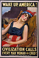
And, so it’s not all one-step-away-from-zombies, at left is an early poster that has a lot of possibilities if you’d like to alter it for a political statement.

This one is from 1917, so it’s almost certainly in the public domain.  (Most – but not all – American works from before 1923 are now in the public domain.)

If you have questions about copyright law and what’s in the public domain, one of my favorite resources is Cornell’s chart about copyright terms and limits.


Before Spring – A Photo Essay about New Hampshire

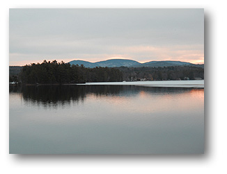
Dawn at Lake WinnesquamYesterday morning, I went out to take some photos of the sunrise.  They’re intended as reference photos for future artwork, but some of these may become art prints.
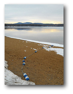
Once I get started on an adventure like this, it can turn into a mini road trip… and that’s exactly what happened.

About three hours later, I was on a hilltop gazing across Lake Winnipesaukee, savoring the view.

This was an amazingly gorgeous start to my day, and it was incredibly inspiring. Every day should start like this!

It also reminded me of the beauty of Nature, even during the start of a “mud season” kind of Spring.

I’d only planned to take few photos at the edge of Lake Winnesquam, shown in the photo above.  It was the first lake I paused at, during my morning adventure.  However, I was soon caught up in the beauty of the sunrise and the fresh breezes predicting more snow.

There’s always a sense of anticipation when the winds shift like that.  For me, it has that same subtle thrill as standing near the top of a magnificent cliff, and the same eagerness of waiting for the next bolt of lightning in a spectacular storm.

So, I continued my morning’s adventures.

Lake Winnesquam beachA little further up the road, I discovered a private-ish beach.  It was behind a funky looking seasonal store (closed when I was there, probably for the winter) called Mountain View Manna.  It looks like they sell homemade bread and maybe some crafts.

Since most of the nearby summer cottages were closed up, I felt only a little guilty for trudging up the private (?) dirt road behind the store.

That’s the beach, in the photo on the right.  I may turn this picture into an art print; I think summer visitors might enjoy it.

(If I were a more realistic painter, I’d probably paint this.  For me, it’s a very wistful image showing the lakeside when snow is still on the ground.)

From there, I drove around the lake and soon found Mohawk Island.  (That’s the island in the photo at lower left.  It’s a small, very wooded island.)

I had no idea it was there.  It’s only accessible by water, and it looks very private… and charming.  A couple of buildings suggest that people live there, but I’m not sure if it’s seasonal or year ’round.  There’s something wonderful about the idea of island living.

Mohawk Island, Lakes Region, NH(This summer, I hope to get out to Monhegan Island in Maine, and the Isles of Shoals, off the coast of Portsmouth, NH.  Both are legendary as  art-inspiring destinations.)
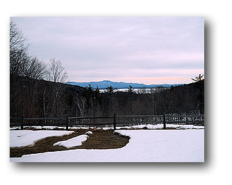
Then, I decided to head northeast, back toward Lake Winnepesaukee.

On the way, I stopped at Gunstock Ski Area, where my children had learned to ski.  The area is far more developed now, and I almost decided to take the Panorama lift to the top of the mountain, just to see the view.

Instead, I joked with a few skiers who were there for what may be some of the last great skiing of the season.  (As I’m writing this, another foot of snow is predicted… and falling in peaceful drifts outside my window.)

Lake Winnepesaukee at dawnMy next stop — before heading home — was on a hilltop overlooking Lake Winnepesaukee.

In the photo on the right, the lake is barely visible between the tops of the trees and the White Mountains in the distance.

The wind was shifting and there was a crisp “bite” to the air, alerting me to the approaching snowstorm.

I wrapped my scarf more closely around my face, and stood there for several more minutes, taking in the landscape.

The colors and the view were breathtaking.  I love how the colors of the sky are reflected in the lilac-tinged snow.  It’s a reminder that subtle colors can sometimes have the most impact.

For me, these photos are partly landscape references. Some of the images will certainly be featured in my paintings.

By the time Spring is here, leaves on the trees will obscure some important details that I’ll want to include in my work.  So, I’m printing several of my best photos from yesterday, and putting them into my art journal… the one I keep as a reference for upcoming sketches and paintings.

However, Nature is also one of the best teachers, revealing how different colors can create different moods.  She’s also showing how contrast and edges can add emotion and interest, depending on whether they’re crisp or soft.

It was a good day, and a reminder that every season is beautiful!

Art Journals v. Artist’s Journals

I wrote the first draft of this article in 2006, when the arts community was still deciding if we were “art journaling” or creating “artists’ journals.”  Then, I expanded the article in 2011, weighing in on the continuing debate. (Today, the phrase “art journaling” seems preferred, so I’ve updated the article… but only a little.)

rainbow stripe divider

Two phrases are often used interchangeably:  ‘art journals’ and ‘artists journals.’

For me, an artist’s journal is an illustrated diary or journal representing the artist.  It’s about the person’s life, or some aspect of it, such as a travel journal, a diet & fitness journal, or something like my ‘decluttering journal’.

It usually includes art and the journal is also a work of art, in itself.

Many people call that “art journaling,” and I suppose it is. I mean, are we getting tangled in semantics, when the art is what really matters?

So what else is an art journal?

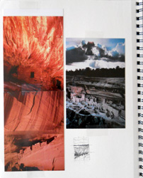
Art journal page showing inspirationBy contrast, an art journal is where I keep notes about art I’m working on or might want to create later.  It includes visual inspiration – photos, articles, etc. – as well as my own thumbnail sketches, etc.
It’s sort of my pre-art brainstorming, in a journal format.

At left is a page from a 2011 art journal. The photos and sketch represent ideas that I used to inspire an oil painting.

I use an art journal as my on-paper memory of inspiration and original ideas.  It’s sort of like a visual thumb drive of art ideas, for later use.

If I don’t jot down my ideas in a journal, they’ll vanish from my thoughts in a matter of days, if not hours.  I tend to have a steady stream of creative ideas, and one soon replaces another in my consciousness.

For me, it’s part of the creative process.

Here’s how my ideas develop, through my art journaling

People often ask me where I get my original art ideas. Well, I’m not sure that they’re entirely “original,” but they are fresh and new, if only to me.

Here’s a typical sequence: I started by surfing the Internet to see what other artists are currently working on.

Yesterday, I viewed a website called The Starving Artist’s Way, which included a project using second-hand woolen sweaters that had been washed and dried to shrink them in a “felted” style.

I didn’t think much more about that – not on a conscious level, anyway – but later in the day, after a nap, I woke up thinking about what else I could do with that kind of wool.

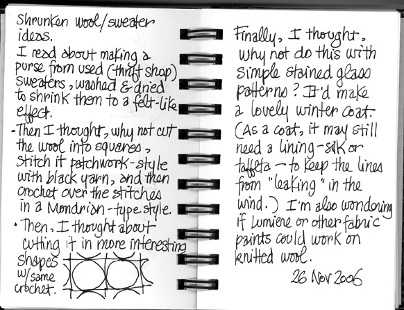
While the thoughts were still fresh in my mind -and evolving – I jotted them down in my art journal. These are my two pages of notes:

felted journals page


In a nutshell, I was thinking about the kinds of wearable art that I could make with felted-style wool.

(Geek note: It’s not actually “felted” wool when you wash & dry woven/knitted/etc. wool to shrink it. It’s called “fulled” wool. Felting is when you use the raw fibers and a tool to tangle and/or compact them.)

This merged with the Mondrian art that I was reminded of when I was playing an online game, Kingdom of Loathing, yesterday.

And, once I started jotting down these ideas, I remembered when I used to make stained glass windows. Those patterns would adapt nicely to this kind of wool treatment, too.

I’m not sure that I’ll ever actually do anything with this idea. I get a bazillion of these ideas, steadily.

So, I’m scanning the pages from my idea journal, and putting them into my next art zine. I’m doing that for two reasons.

First, it documents that it was my idea. It drives me crazy when I decide to run with an idea and it turns out that another artist has been working on a similar concept… and people think that one of us is “copying” the other, when we’re not.

Second – and more importantly – I am sharing this idea so that someone else might be inspired by it and adapt the concepts (or copy it line-for-line, for all I know/care) to his or her own art.

Sharing art journaling, and the “copying” issue

    My grandfather was a successful inventor and used his ideas to create his own (large) company.
    When his original ideas were copied, he used to chuckle and say, “Plenty more where that came from.”
    In other words, he didn’t complain about those who copied him.
    I’ve always liked that, and he was the richest man I knew, when I was growing up. He literally made millions (when that was a lot of money) from his creative ideas; he was a good role model.

So, I’m okay with the idea of sharing my art journal pages so that people see what one can look like.

However, these may be my own definitions.  How you use the terms ‘art journals’ and ‘artists journals’ may be different… and that’s fine with me.

The creativity that matters more than the words!

How to Organize Images for Collages

Are you art journaling with mixed media and ephemera?

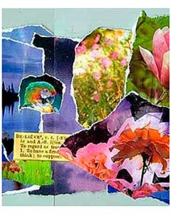
Torn-paper collage including a bird and flowersDo you struggle to collect and organize collage photos, papers and ephemera?
Here’s the system that works well for me. It might help you, too.

Art journaling – and mixed-media collages – can require lots of images. And, to remain “in flow” as you’re creating a new journal entry (or embellishing an older one), organization can be vital.

Here are some tips to keep the clutter under control.

Step One: Sort collage elements into groups

Start by deciding how you think about your collages.

  • Are you primarily color-focused?
  • Or, do you choose images by themes, such as Nature, Anime, Steampunk, Skies, and so on?

For me, all of my art – including my collages and art journaling pages – is often about color.

So, I organize my loose images into the major color groups (red, blue, green, etc.) and then expand (lime green, turquoise, etc.) as my collection of saved images becomes too large for anything simpler.

Usually, I store them in individual manila folders, based on the main color in the image.

Then, when I want something blue, I open my “blue” folder and I’ll see my primarily blue magazine images, but also blue tissue paper, maybe some bits of blue ribbons or fabrics that I intend to use in collage, and so on.

However, I’ve also started folders that say things like “skies” and “green plants.”

Think about how (and what) you look for elements and ephemera to add to your collages as you work on them.

Also, look at your existing collages. Your categories might be “faces” or even more specifically, “women’s smiling faces,” etc. Or, “nature,” “dark-looking castles,” “cute cottages,” “kissing,” “fast cars,” “vintage images,” or whatever.

Create categories that work for you and your creative process.

Step Two: Keep those folders tidy.

Having a bunch of folders, no matter how well they’re filled with juicy, colorful images, is just the first step.

Then, they need to be accessible.

For me, that means a standard file box with hanging files.

All the blue-related folders (turquoise, sky blue, navy) go into one hanging file. All the photos of forests from travel magazines and National Geographic go in another hanging file, along with a folder that’s gardens and another that’s houseplants. And maybe honeybees and butterflies.

Optional Addition: Bins.

As I work on a collage and tear off pieces, I’m often left with shreds and shards of paper that are too good to throw out.

When that happens, I put them into small bins. In my case, I’m recycling plastic sandwich meat containers from Target. (My family’s favorite ham comes in those containers.)

I have one for blues and greens. One for glittery ephemera. One for ribbons, feathers, and so on.

You get the idea, I’m sure.

When I’m just NOT finding the collage element I need, I open those bins and usually find the perfect element.

Either that, or – looking at those bits – I have an “ah-HA!” moment and know where to look for the element I need. Usually, that’s a magazine or travel brochure from my stack of unread future collage resources.

Why to Stay Organized

If you’re like me, you create your best art when you’re “in flow.” Anything that interrupts can affect the journal page or collage that I’m working on, and not in a good way.

So, the more I can create systems that work intuitively for me, and keep everything organized, the happier I am as an artist.

Find (or create) systems that work for you and keep you organized.

I know that can be a challenge for artists, but it’s also essential for us to create our very best work.


Composition Book Artists Journals


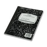
Mead composition bookA composition book art journal is any journal that’s kept in a composition book. Those are generally school-type, saddle-sewn (along the crease) notebooks with cardboard covers… similar to exam/test booklets, but a little more permanent.
Composition books are inexpensive, so many people like them especially for informal journaling. It feels less intimidating to use a journal that doesn’t cost much, and is familiar from our years in school.

They’re so affordable, you can buy several. Put one in your car, one in the baby bag, one by your bed, and so on. Then, you’re ready to create a journal page when you have some free time. The journals are so inexpensive, you can rip completed pages out and bind them into your more formal artist’s journal.

(“Binding” the loose page can be as easy as taping it into your other journal. Or, you can glue it, sew it, staple it, etc.)

Composition books have lots of lined pages in them… as many as 100. They come in a variety of sizes, but the traditional ones are about 8″ x 10″ or so. The traditional ones often have a b&w cover that looks sort of marbelized.

You can also find composition books with red covers, plain manila covers, green covers, and so on. You may want to choose one with a color that reminds you of your childhood. (But, the color may not matter if you’re going to cover it with art anyway.)

Also, it’s easy to embellish the cardboard covers. I’d still use something (such as fusible interfacing) on the back so that threads don’t pull through, but you can sew through the cardboard with a crewel needle. Then, you can embroider on it, add beads & buttons, etc., in addition to other embellishments.

(For more about sewing on your journal pages and covers, see Sewing on Journal Pages.)

ACEOs – Production-Line Shortcuts

ACEOs - tips for making your own

This article was originally published in 2011, and has been updated for 2026.

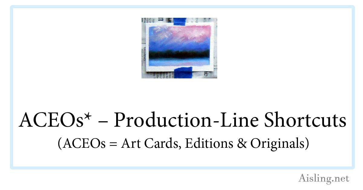
I’m trying some oil paintings as ACEOs.  (That stands for Art Card limited Editions and Originals, a kind of artists’ trading cards.)

Because traditional art cards (including ACEOs) are the same size as other trading cards (like baseball cards, etc.), the 2.5″ x 3.5″ ACEOs can be tricky to work with if you’re painting with oils or acrylics.

My first attempt revealed a few flaws that I’ll fix with the next batch.  However, here’s what I did to create this batch of artcards:

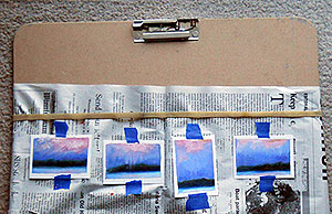
First, I covered a masonite sketch board (shown below, at right) with newspaper, held in place by a very big elastic. (The elastic comes with the sketch board when you buy it at any arts or crafts store, or you can simply use one from other packaging… but you may not need it at all.)

Then, I positioned a series of blank ATCs (artist trading cards) approximately where I figured they should be, to mask them. (Michael’s and other stores sell these canvas-textured blanks in the same aisle as their fine art drawing & painting supplies.)

Next, I used blue (easy to peel off) painter’s masking tape to tack blank ACEOs in place. (Note: Use good painter’s masking tape, so the paint doesn’t bleed underneath the edges… but it also peels-off cleanly, not taking any of the card stock/paper with it.)

After that, I laid down strips of that same tape, masking the edges of the cards, usually about 1/4 inch.  (That’s not shown in the photo.)

And then, of course, I painted them… at least with an underpainting (my signature cadmium red) and then the first layer of oil paint.

(When I wrote this article, I was using Brera Maimeri water-soluble oil paints. As of 2026, I don’t think those are available, however, I’d have no hesitation using Winsor & Newton’s highest quality water-soluble oil paints.)

Impatient to see how they’ll look, I peeled off the long strips of masking tape.  The result is in the photo on the right.

One card tore slightly as I was peeling off the tape.  (The tear was a small surface tear and it can be repaired with glue.)

I’m not sure if that issue can be wholly avoided with this process, but I’ll keep experimenting. Even the best painter’s tape can cause the occasional problem… but it’s also a trial-and-error process, learning how firmly to apply the tape for the best results.

I tweaked some of the cards while this first layer of paint is wet.  I wanted to cover the cadmium red that had seeped under the tape more than the oil paint did.  Alas, some of the tweaking ventured into the ACEOs’ white margins.

While these cards dry, I’m currently starting a new batch of ACEOs…

This time, I used a ruler to position the cards and the tape, so it’s more regular.  So far, so good.

The oil paint will take at least a week or two to dry enough for the next layer of paint, so these cards won’t be completed very quickly.   I’m aiming to have the first batch of ACEOs ready to ship in about a month.

However, I see several merits to using ACEOs for oil paint (or acrylics):

1. These allow me to experiment with designs on a small scale, to evaluate them for larger paintings.  These cards are sort of like thumbnail sketches, but more finished.

2. I can sell these ACEOs for far less than my paintings, making them easy for new art collectors to purchase.  (I’m very enthusiastic about the Cheap Art Manifesto as much as it’s practical… while still being a professional artist.)

3. Shipping the ACEOs will involve wax paper (to protect the surface of the card) and some cardboard rectangles as support in the mail.  Then, each card can go in an envelope… cheap and easy!

As soon as I’ve worked out more of the bugs, I may create a sheet that you can easily use to layout the blank cards yourself, if you’d like to try a painterly approach to ACEOs.

Why Art?

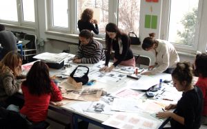
Art class, photo by erdogan ergun, TurkeyWhy art? Really, why would anyone take the time to create art, unless  he or she is a full-time artist?
The answers are clear to anyone who’s independently created art of any kind.

Even if it’s a scribble or a graphic note in the margin of your class notes, if you’ve ever expressed yourself visually, you’ve created art.

Note that I said independently created art.  That’s important.

If it was a class assignment, or something you had to do, the art process may have been vacant.

For many artists, the art process is where the value is. If the process is drudgery, it’s only mimicking art.

Artist Harley Brown said it well. “Within a second of starting a picture, I’m on top of a mountain which has finally become my reality. So, when I tell people to do a drawing a day, it is not only to learn to observe or perfect skills, it is putting ourselves closer to what we really are and for what we live.”

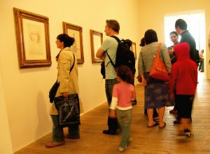
Art Gallery, photo by brendan gogartyWhat makes art important in our lives is how art makes us feel.
Whether you’re creating the art or admiring it in a gallery or on your drawing pad, art should evoke an emotional reaction. If it doesn’t, the art isn’t necessarily bad, it’s just not resonating with who you are, inside.

For most artists, particularly when you’re starting out, the focus must be on the process. Your results will improve with practice. The joy is in the creative moments and the discoveries you’ll make — good and bad — as you work on art.

Your art, whether it’s drawing or painting or singing or fine-tuning a recipe, is a process that makes you feel more authentic… more alive.

In The Book of Awakening, Howard Thurman is quoted, “Don’t ask what the world needs. Ask what makes you come alive, and go do it. Because what the world needs is people who have come alive.”

Separate the technical aspects of art from the joy of creating. Sometimes, the learning process can be as exciting (or boring) as singing scales or reciting multiplication tables. However, the process of putting the pencil to the paper, or paint on the canvas, is where the magic is.

Little girl playing, by Armin HanischAim for something original. That won’t come from copying others, or measuring your work against theirs. The finished product may be a disappointment, but the more important question is: How did you feel when the work came alive? Did you forget about time and tidiness? Did you feel in flow, following a joyful current?

Musician Jeff Beck said, “As long as there’s something original going on, that’s all that really matters.”

He’s right.

Art can be about the finished work. However, it’s more important to focus on the energy that is grounded in and emanates from the creative process.

If you feel that spark of vitality, even for a few seconds as you’re creating art, you’ve seen a glimmer of what drives us to be artists… and what keeps us fully alive in every moment.

We create art for how it feels, not necessarily for the merits of the finished work.

Photo credits
Art class – erdogan ergun, Turkey
Art gallery – brendan gogarty, Australia
Girl in field – Armin Hanisch, Germany