ACEOs – Production-line shortcuts

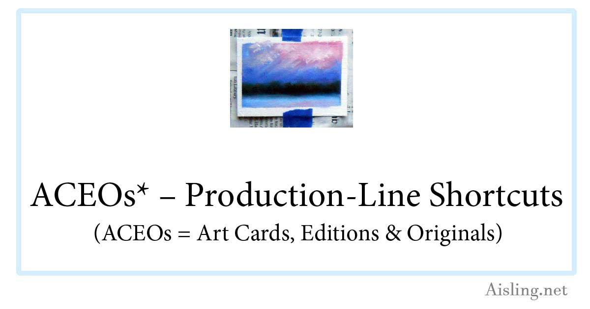
ACEO - in progressI’m trying some oil paintings as ACEOs.  (That stands for Art Card limited Editions and Originals, a kind of artists’ trading cards.)

Because traditional art cards (including ACEOs) are the same size as other trading cards (like baseball cards, etc.), the 2.5″ x 3.5″ ACEOs can be tricky to work with if you’re painting with oils or acrylics.

My first attempt revealed a few flaws that I’ll fix with the next batch.  However, here’s what I did:

First, I covered a masonite sketch board (shown below, at right) with newspaper, held in place by a Very Big Elastic. (The elastic comes with the sketch board when you buy it at any arts or crafts store, or you can simply use one from other packaging… but you may not need it at all.)

Then, I positioned a series of blank ATCs (artist trading cards) approximately where I figured they should be, to mask them. (Michael’s and other stores sell these canvas-textured blanks in the same aisle as their fine art drawing & painting supplies.)

Next, I used blue (easy to peel off) painter’s masking tape to tack blank ACEOs in place.

After that, I laid down strips of that same tape, masking the edges of the cards, usually about 1/4 inch.  (That’s not shown in the photo.)

And then, of course, I painted them… at least with an underpainting (my signature cadmium red) and then the first layer of oil paint.

Impatient to see how they’ll look, I peeled off the long strips of masking tape.  The result is in the photo on the right.

One card tore slightly as I was peeling off the tape.  (The tear was a small surface tear and it can be repaired with glue.) I’m not sure if that issue can be wholly avoided with this process, but I’ll keep experimenting.

I tweaked some of the cards while this first layer of paint is wet.  I wanted to cover the cadmium red that had seeped under the tape more than the oil paint did.  Alas, some of the tweaking ventured into the ACEOs’ white margins.

While these cards dry, I’m starting a new batch of ACEOs.  This time, I used a ruler to position the cards and the tape, so it’s more regular.  So far, so good.

The oil paint will take at least a week or two to dry enough for the next layer of paint, so these cards won’t be completed very quickly.   I’m aiming to have the first batch of ACEOs ready to ship in about a month.

However, I see several merits to using ACEOs for oil paint (or acrylics):

1. These allow me to experiment with designs on a small scale, to evaluate them for larger paintings.  These cards are sort of like thumbnail sketches, but more finished.

2. I can sell these ACEOs for far less than my paintings, making them easy for new art collectors to purchase.  (I’m very enthusiastic about the Cheap Art Manifesto as much as it’s practical… while still being a professional artist.)

3. Shipping the ACEOs will involve wax paper (to protect the surface of the card) and some cardboard rectangles as support in the mail.  Then, each card can go in an envelope… cheap and easy!

As soon as I’ve worked out more of the bugs, I’ll create a sheet that you can easily use to layout the blank cards yourself, if you’d like to try a painterly approach to ACEOs.

ATC – Spalding Inn, NH

Spalding Inn, Whitefield, NH - ATC by Aisling D'ArtThe subject of this pen & ink ATC is the Spalding Inn. I’m not entirely sure why that hotel fascinates me, but it does.

My husband and I have stayed there several times.

And it helps that my uncle and his wife used to vacation there. There’s a sense of heritage, I guess.

But… I don’t know.  It’s more than that.

The Spalding seemed a logical subject for an ATC.  It’s the final ATC in this series of six, and obviously the most detailed.  (The previous ATC, displaying a rose, led up to it.)

Though this country hotel has a charming history and – supposedly – a few great ghost stories, it’s not actually associated with UFOs.

The reason I put a flying saucer in this ATC is because the Spalding Inn is along the flight path described by America’s first known alien abductees, Betty & Barney Hill… and I wanted something interesting in the sky.  (The design of the card is based on my fine art painting of the Spalding Inn.)

The Spalding Inn is located in Whitefield, New Hampshire.  It’s near Mount Washington, and it’s generally in a perfect location for exploring the White Mountains.

As of 2019, and perhaps earlier, the hotel closed when its previous owners sold it. I think a local company bought it, but I’m not sure.

That also makes it a great location for any artist to set up an easel and paint, en plein air. From any spot on the hotel’s property, there are amazing views in any direction… all year ’round.

You can download a free, printable copy (at 150 dpi) of this Spalding Inn ATC by clicking on the image above, or by clicking here.

ATC – A Simple Rose

ATC - roseFor me, this ATC (artist’s trading card) was about design.  I wanted to see if I could use a simple subject and create enough visual interest so people don’t simply glance at it and say, “Ho-hum, it’s just a rose.”

I’m not 100% certain that I achieved that, but I think the various shading techniques work well enough.

This ATC actually repeats an exercise that I did in my junior year of high school.  I’m not kidding.  I’d learned a lot from it, and it’s stuck in my memory as something very positive.

Like my other ATCs in this series, this card was drawn with a Size 0 (zero) point rapidograph-style pen.  It’s a Koh-i-noor Rapido Drawing Pen, and I love it.  Unlike older rapidographs that I’ve used since college (when dorm friend/artist Darcy Grimm showed me her rapidograph), this one doesn’t seem to clog easily.  That’s a huge plus, and it’s one reason why I’m doing far more artwork with it.

Anyway, it’s all dots & lines in this ATC, and I’m pleased with it.  You can download a printable copy (at 150 dpi) by clicking on the card image, above, or by clicking here.

ATC – City/Stars in pen & ink

ATC - pen and ink - city stars This ATC is typical of the scribbles that decorated my class notes starting around age 12.

Bored out of my mind in junior and senior high school, I only half-listened to teachers. (Yes, I regretted that later.)

Instead, I drew a variety of designs, usually a series of connected images like the one at left.

For me, the squares and rectangles represent the architecture of the city.  The swirls represent the city’s energy, and the stars are the dreams and real-life stars, while the circles are clouds and bubbles of creativity.

Free download

You can download your own copy of this ATC by clicking on the image at left, or by right-clicking here and saving it to your hard drive. Print it at 150 dpi so it’s 2.5″ x 3.5″.

This is one of six ATCs that I created in October 2010, experimenting with a new pen.  (It’s a Size 0 point Koh-i-Noor Rapido Drawing Pen.)

Evolution of this style

When I was a teenager, I sometimes drew these designs in ink and just left them as-is.

Others were drawn in pencil during school.  Later, at home,  I drew over the pencil with India ink and my crow quill pen.

When the ink was fully dry, I’d add color.  My mother had paints left from her years as an air brush artist (Dr. Ph. Martin’s radiant, concentrated watercolors) and I used those because the colors were so vivid.  Generally, my color choices included magenta, turquoise, lime green, and yellow.  I used purple as well, but carefully; it’s a color that can dominate artwork very easily.

One of these drawings — painted with acrylic paints — decorated a residential elevator on Marlborough Street in Boston (MA) in 1970.  I remember showing it to musician Jaime Brockett when he visited me, and he could barely believe I’d created it.

Even then, I don’t think my appearance or demeanor matched who I really am.

Another  of these designs became a wall mural in an office just outside of Salt Lake City (UT) in 1973.  It’s no longer visible, of course, but I like to think that it still exists under layers of paint and tasteful wallpaper.

(Hmm… have I mentioned that I was a rather mobile hippie in that era?)

The art themes

These kinds of scribbles have a lot in common with work by Peter Max, but I don’t think he was popular when I began drawing these.

In fact, I think the art in my class notes (and this ATC) drew upon the same cultural icons that inspired Max and others. (The posters for the Grateful Dead and for concerts in general —  particularly around San Francisco — also featured similar imagery.)

When I adopted elements from any popular art, it was probably from a TV show that (I think) aired in the afternoons when I returned home from high school. It had a title like “The Amazing World of Dr. Silver”, but that’s not quite right. I’m pretty sure it was on PBS and produced in Boston, Massachusetts.  (Does anyone else remember this show?)

Mostly, there was a certain style to the art of the late 1960s and early 1970s.  It was happy but also complex, in its own way.

This ATC reflects that.

ATC – Desk chair

ATC of desk chair, printable copy linkedThe next ATC (artist’s trading card) in my pen-and-ink art experiments features my husband’s desk chair.

I drew it with a Size 0 (zero) point technical drawing pen.  I’ve been using this kind of pen for art since I was introduced to them by a college friend, Darcy Grimm.

The ink is called Ultradraw, and it’s Koh-i-Noor’s India ink for artists, illustrators and draftsmen.

Once that ink is dry, it’s usually waterproof and I can paint over the ink with watercolor paint or use watercolor pencils with water.

It’s ideal for sketchcrawls and other sketches that might become more formal artwork.

This ATC shows a comfy chair upholstered in a grey tweed, and our cat loves to sit in the chair when my husband isn’t in it.  (Otherwise, the cat likes to sit in HT’s lap.)

To protect the chair from our cat’s long hair, we have a (now somewhat ragged) piece of flannel that’s laundered regularly.  The fabric was on the chair when I drew this ATC.

To print this ATC, right-click on the picture and save the higher resolution copy on your computer.  Then, print the artwork at 150 dpi; it’ll be a 2.5″ x 3.5″ ATC after you trim it to size.

ATC – Pen and ink, fan

Printable ATC - click here to downloadMy second ATC in this series  of six shows our living room fan.  It’s one of those huge grey fans that, on the high setting, blasts you like you’re in a wind tunnel.

Drawing it was sort of a challenge.  I mean, there’s a lot of detail and shading in the actual fan.  Deciding what to include and what to leave out… that was the challenge.

Scaling it down to ATC size was even more interesting.

There are things I might do differently if I were to draw it all over again, but — of course — this was just an ATC… a one-time sketch.  I’m generally pleased with it.

This ATC was drawing with a Size 0 (zero) Koh-i-Noor rapido technical drawing pen on regular paper in my sketchbook.

I started by drawing (in pencil) the 2.5″ x 3.5″ dimensions of a standard ATC.  Then, I began drawing with my pen.  There was no rough sketch to start with, just the outline of the card so I’d get the size right.

About five minutes later (maybe less), it was an ATC.

Pretty simple, huh?

These are super easy.  A good pen makes all the difference.  Sure, you could use any drawing pen, including a felt-tip (like a Sharpie) or a rollerball pen.

However, I think there’s a different quality to more traditional pens, and I think it shows up in the finished artwork.

ATCs are like miniature works of art.  That makes the materials and workmanship more important, in a way.

(Don’t let that scare you off; if the ATC doesn’t look good, you can always put new/different art over it, or throw it out altogether.)

So, for this ATC and the others in this six-card series, I used a rapidograph with Koh-i-Noor’s Ultradraw black India ink. (The ink comes with the pen.)

Right-click on the image to download a printable copy (at 150 dpi)  of this ATC.

ATCs in Pen and Ink

ATCs - Umbrella ATC - October 2010ATCs have always been dear to my heart.  From the 1990s when many ATCs were created on 3″ x 5″ cards, to the 2.5″ x 3.5″ size that became more standard, to the smaller variations that have emerged: ATCs are fun, fast art.

Recently, I purchased a new rapidograph, also called a “rapido sketch pen.”  It’s an easier way to create the kind of drawings I did as a teenager, when I used a crow quill pen and an ink well.

My new pen has a Size 0 (zero) point, and it’s a vast improvement over rapidographs from even 10 years ago.

Anyway, to get used to my new pen, I decided to sketch a few ATCs.  My first is shown at right.  (Right-click on the image to download your own copy.) It’s a contour drawing of my silvery umbrella… the one I take with me when I go outside to paint landscapes in nature.

Like all of my recent ATCs, the original of this card is 2.5″ x 3.5″ and — by right-clicking on the image, above, and saving it to your hard drive — you can print a full-sized copy (at 150 dpi).

This is the first of six ATCs I’ll be posting over the next few days, showing my progress with my new drawing pen.

The signature (ais/em 2010) on these ATCs is sort of a segue between my online name of Aisling and Eibhlin (“Eileen”), the (real) name I paint under.

ATC Tutorial 4 – Memories – Finishing the ATC

Continued from ATC Tutorial 3 – Memories – Giving it meaning

The card was very nearly finished. I liked the colors and the general design of the image, but it needed just a little… something else. I didn’t know what, yet.

This is the part of the process that can take forever, since it’s trial and error. There’s a feeling that you’re almost there, and it’s only working with a set time limit that prevents the card from becoming a two-week continuing project.

everlasting ATC I remembered an ATC that I made earlier, with a photo of a little girl and her teddy bear.

Suddenly, the new card was about a frail and elderly woman, remembering her days as a “flapper”.  She was remembering her childhood near San Francisco when she and her father would go to the pond by the Palace of Fine Arts, to feed the birds.

I still had the layers from my earlier card, so it was easy to copy the layer with the little girl and position her on this new ATC.

I liked the effect immediately.

final image for ATC

Before flattening the layers, I selected that band of natural color where the water meets the land, and I increased the saturation.

Then, I chose the inverse selection and lightened it, reducing contrast as well.

Finally, I flattened the layers and reduced the image size to fit on a 3″ x 5″ ATC.

I added the border and text, using the P22-Monet font. I deliberately overlapped the text and the image a little, because I wanted it to look like the lady had written this on the card herself.

Here is the completed card:


right-click on the card to save it to your hard drive

You can print this card at 150 dpi to create you own copy of this 3″ x 5″ ATC. (It’s okay to adjust the size to fit the more popular 2.5″ x 3.5″ format.)

ATC Tutorial 3 – Memories – Giving it meaning

Continued from ATC Tutorial 2 – Memories – Adding More Layers

At this point, the card was pretty… but it had no real theme or meaning to it. And, while “pretty” art can stand on its own merits, I rarely choose to make art without another layer of meaning. So, I started examining the card for clues.

I increased the contrast and lightened the background layer. I knew that something needed to go in front of it, and by reducing the “obviousness” of the background, it helped me to focus.

I was still drawing a blank.

So, I went to my copy of Photoshop Secrets of the Pros: 20 Top Artists and Designers Face Off for ideas. (If it’s selling for under $10 at Amazon and you enjoy this kind of art, get a copy. Otherwise, see if your public library owns it. If they don’t, tell them to buy a copy.)

I was inspired by the work of John Henry Donovan, of 5pieces.com.

another step in the ATC process - inverting color I tried inverting color (Image–>Adjust) in strips with five-pixel feathering. However, once the stripes were dark, I needed to duplicate the layer with the Paris-Draped figure, to make it more opaque.

I wasn’t too sure that I liked the effect. In fact, it was pretty much ick. And, having set a three-hour deadline–trying to mimic my one-hour ATCs but allow for this documentation–I needed to finish the card quickly.

I deleted the extra layer of Paris-Draped so that the figures were transparent again. And, I desaturated the layer. But, as I was using the Hue/Saturation screen for this, I accidentally altered the background hues… and liked the effect. ATC starting to look good

I started selecting rectangular areas of the background, and changing the hue of each of them and then switched them back again.

Finally, I worked with the area nearest the middle and altered it back to its original, natural colors.

Then, I chose Select–>Inverse and tweaked the remaining background image and adjusted it until I was happy with it.

Finally, the Paris-Draped layer had to be adjusted as well, both contrast and hue.

Now, I was getting a theme. The Paris-Draped figure was clearly from the past, and the single band of natural/real coloring in the image was like a faded memory… only part of it was accurate and the rest was a little surreal.

Conclusion: ATC Tutorial 4 – Memories – Finishing the ATC

Memories – A Digital ATC

This card was designed to document the creative process when I’m working on digital ATCs.

I’ve written four pages–with thumbnail images of each step–to explain how I work on these cards.  It shows you how to go from initial idea to finished card.

This card, with documentation and HTML work, took about three and a half hours. I think that I spent an hour on the card itself. That’s what I’m trying to maintain as a challenge.

To read how the card was made, and why I made the choices that I did, see How to Make a Digital ATC.