Art Journals v. Artist’s Journals

I wrote the first draft of this article in 2006, when the arts community was still deciding if we were “art journaling” or creating “artists’ journals.”  Then, I expanded the article in 2011, weighing in on the continuing debate. (Today, the phrase “art journaling” seems preferred, so I’ve updated the article… but only a little.)

rainbow stripe divider

Two phrases are often used interchangeably:  ‘art journals’ and ‘artists journals.’

For me, an artist’s journal is an illustrated diary or journal representing the artist.  It’s about the person’s life, or some aspect of it, such as a travel journal, a diet & fitness journal, or something like my ‘decluttering journal’.

It usually includes art and the journal is also a work of art, in itself.

Many people call that “art journaling,” and I suppose it is. I mean, are we getting tangled in semantics, when the art is what really matters?

So what else is an art journal?
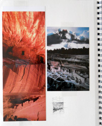
Art journal page showing inspirationBy contrast, an art journal is where I keep notes about art I’m working on or might want to create later.  It includes visual inspiration – photos, articles, etc. – as well as my own thumbnail sketches, etc.

It’s sort of my pre-art brainstorming, in a journal format.

At left is a page from a 2011 art journal. The photos and sketch represent ideas that I used to inspire an oil painting.

I use an art journal as my on-paper memory of inspiration and original ideas.  It’s sort of like a visual thumb drive of art ideas, for later use.

If I don’t jot down my ideas in a journal, they’ll vanish from my thoughts in a matter of days, if not hours.  I tend to have a steady stream of creative ideas, and one soon replaces another in my consciousness.

For me, it’s part of the creative process.

Here’s how my ideas develop, through my art journaling

People often ask me where I get my original art ideas. Well, I’m not sure that they’re entirely “original,” but they are fresh and new, if only to me.

Here’s a typical sequence: I started by surfing the Internet to see what other artists are currently working on.

Yesterday, I viewed a website called The Starving Artist’s Way, which included a project using second-hand woolen sweaters that had been washed and dried to shrink them in a “felted” style.

I didn’t think much more about that – not on a conscious level, anyway – but later in the day, after a nap, I woke up thinking about what else I could do with that kind of wool.

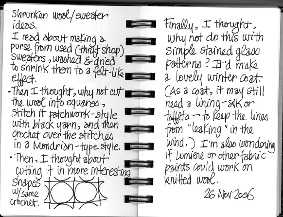
While the thoughts were still fresh in my mind -and evolving – I jotted them down in my art journal. These are my two pages of notes:
felted journals page


In a nutshell, I was thinking about the kinds of wearable art that I could make with felted-style wool.

(Geek note: It’s not actually “felted” wool when you wash & dry woven/knitted/etc. wool to shrink it. It’s called “fulled” wool. Felting is when you use the raw fibers and a tool to tangle and/or compact them.)

This merged with the Mondrian art that I was reminded of when I was playing an online game, Kingdom of Loathing, yesterday.

And, once I started jotting down these ideas, I remembered when I used to make stained glass windows. Those patterns would adapt nicely to this kind of wool treatment, too.

I’m not sure that I’ll ever actually do anything with this idea. I get a bazillion of these ideas, steadily.

So, I’m scanning the pages from my idea journal, and putting them into my next art zine. I’m doing that for two reasons.

First, it documents that it was my idea. It drives me crazy when I decide to run with an idea and it turns out that another artist has been working on a similar concept… and people think that one of us is “copying” the other, when we’re not.

Second – and more importantly – I am sharing this idea so that someone else might be inspired by it and adapt the concepts (or copy it line-for-line, for all I know/care) to his or her own art.

Sharing art journaling, and the “copying” issue

    My grandfather was a successful inventor and used his ideas to create his own (large) company.
    When his original ideas were copied, he used to chuckle and say, “Plenty more where that came from.”
    In other words, he didn’t complain about those who copied him.
    I’ve always liked that, and he was the richest man I knew, when I was growing up. He literally made millions (when that was a lot of money) from his creative ideas; he was a good role model.

So, I’m okay with the idea of sharing my art journal pages so that people see what one can look like.

However, these may be my own definitions.  How you use the terms ‘art journals’ and ‘artists journals’ may be different… and that’s fine with me.

The creativity that matters more than the words!

ACEOs – Production-line shortcuts

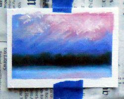
ACEO - in progressI’m trying some oil paintings as ACEOs.  (That stands for Art Card limited Editions and Originals, a kind of artists’ trading cards.)
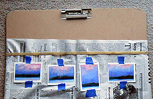
Because traditional art cards (including ACEOs) are the same size as other trading cards (like baseball cards, etc.), the 2.5″ x 3.5″ ACEOs can be tricky to work with if you’re painting with oils or acrylics.

My first attempt revealed a few flaws that I’ll fix with the next batch.  However, here’s what I did:

First, I covered a masonite sketch board (shown below, at right) with newspaper, held in place by a Very Big Elastic. (The elastic comes with the sketch board when you buy it at any arts or crafts store, or you can simply use one from other packaging… but you may not need it at all.)

Then, I positioned a series of blank ATCs (artist trading cards) approximately where I figured they should be, to mask them. (Michael’s and other stores sell these canvas-textured blanks in the same aisle as their fine art drawing & painting supplies.)

Next, I used blue (easy to peel off) painter’s masking tape to tack blank ACEOs in place.

After that, I laid down strips of that same tape, masking the edges of the cards, usually about 1/4 inch.  (That’s not shown in the photo.)

And then, of course, I painted them… at least with an underpainting (my signature cadmium red) and then the first layer of oil paint.
Impatient to see how they’ll look, I peeled off the long strips of masking tape.  The result is in the photo on the right.

One card tore slightly as I was peeling off the tape.  (The tear was a small surface tear and it can be repaired with glue.) I’m not sure if that issue can be wholly avoided with this process, but I’ll keep experimenting.

I tweaked some of the cards while this first layer of paint is wet.  I wanted to cover the cadmium red that had seeped under the tape more than the oil paint did.  Alas, some of the tweaking ventured into the ACEOs’ white margins.

While these cards dry, I’m starting a new batch of ACEOs.  This time, I used a ruler to position the cards and the tape, so it’s more regular.  So far, so good.

The oil paint will take at least a week or two to dry enough for the next layer of paint, so these cards won’t be completed very quickly.   I’m aiming to have the first batch of ACEOs ready to ship in about a month.

However, I see several merits to using ACEOs for oil paint (or acrylics):

1. These allow me to experiment with designs on a small scale, to evaluate them for larger paintings.  These cards are sort of like thumbnail sketches, but more finished.

2. I can sell these ACEOs for far less than my paintings, making them easy for new art collectors to purchase.  (I’m very enthusiastic about the Cheap Art Manifesto as much as it’s practical… while still being a professional artist.)

3. Shipping the ACEOs will involve wax paper (to protect the surface of the card) and some cardboard rectangles as support in the mail.  Then, each card can go in an envelope… cheap and easy!

As soon as I’ve worked out more of the bugs, I’ll create a sheet that you can easily use to layout the blank cards yourself, if you’d like to try a painterly approach to ACEOs.

Why Art?

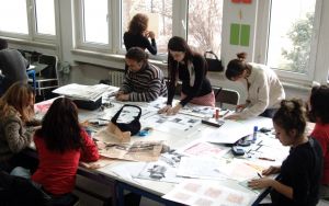
Art class, photo by erdogan ergun, TurkeyWhy art? Really, why would anyone take the time to create art, unless  he or she is a full-time artist?
The answers are clear to anyone who’s independently created art of any kind.

Even if it’s a scribble or a graphic note in the margin of your class notes, if you’ve ever expressed yourself visually, you’ve created art.

Note that I said independently created art.  That’s important.

If it was a class assignment, or something you had to do, the art process may have been vacant.

For many artists, the art process is where the value is. If the process is drudgery, it’s only mimicking art.

Artist Harley Brown said it well. “Within a second of starting a picture, I’m on top of a mountain which has finally become my reality. So, when I tell people to do a drawing a day, it is not only to learn to observe or perfect skills, it is putting ourselves closer to what we really are and for what we live.”

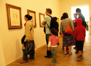
Art Gallery, photo by brendan gogartyWhat makes art important in our lives is how art makes us feel.

Whether you’re creating the art or admiring it in a gallery or on your drawing pad, art should evoke an emotional reaction. If it doesn’t, the art isn’t necessarily bad, it’s just not resonating with who you are, inside.

For most artists, particularly when you’re starting out, the focus must be on the process. Your results will improve with practice. The joy is in the creative moments and the discoveries you’ll make — good and bad — as you work on art.

Your art, whether it’s drawing or painting or singing or fine-tuning a recipe, is a process that makes you feel more authentic… more alive.

In The Book of Awakening, Howard Thurman is quoted, “Don’t ask what the world needs. Ask what makes you come alive, and go do it. Because what the world needs is people who have come alive.”

Separate the technical aspects of art from the joy of creating. Sometimes, the learning process can be as exciting (or boring) as singing scales or reciting multiplication tables. However, the process of putting the pencil to the paper, or paint on the canvas, is where the magic is.

Little girl playing, by Armin HanischAim for something original. That won’t come from copying others, or measuring your work against theirs. The finished product may be a disappointment, but the more important question is: How did you feel when the work came alive? Did you forget about time and tidiness? Did you feel in flow, following a joyful current?
Musician Jeff Beck said, “As long as there’s something original going on, that’s all that really matters.”

He’s right.

Art can be about the finished work. However, it’s more important to focus on the energy that is grounded in and emanates from the creative process.

If you feel that spark of vitality, even for a few seconds as you’re creating art, you’ve seen a glimmer of what drives us to be artists… and what keeps us fully alive in every moment.

We create art for how it feels, not necessarily for the merits of the finished work.

Photo credits
Art class – erdogan ergun, Turkey
Art gallery – brendan gogarty, Australia
Girl in field – Armin Hanisch, Germany

In Business? Who Are You Reading?

business of art - who are you reading?Are you a professional artist, or launching an art career?
Whether you’re a gallery veteran or simply considering selling your art, it’s vital to remain current about the art field as well as business trends in general.

So… who are you reading, to stay current?

One of the most important recent books is Seth Godin’s Linchpin.  It’s changing about 70% of how I spend my online time, and almost everything about my offline art/business activities.  (Godin is talking about art, but not necessarily visual or fine arts.  The book applies to anyone with a job… self-employed or not.)

In addition, I subscribe to updates (or read the RSS feeds) from several people.  Once again, Seth Godin is high on that list.  (See his recent, excellent blog post, The First Rule of Doing Work that Matters.) Dan Zarrella is another one.  (If you’ve never heard of him, this is a typical post:  Introduce Yourself: Why Should We Listen to You?)

To stay current on art trends, read magazines related to art collecting. Generally, watch for regional trends that are likely to spread.

I put the most focus on the European markets, as they often influence what’s going on the States.  However, I also like the American Art Collector Magazine website, especially their Virtual Art Walk.

Look for colors, designs, and price ranges that are popular.  Look for the influence of mixed media and sculpture, paper arts and fiber.

You can benefit from these insights, whether you’re a full-time artist or someone who’s hoping to earn extra money with spare-time creative projects.

ATC – Spalding Inn, NH

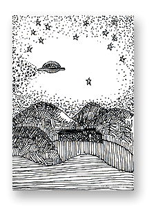
Spalding Inn, Whitefield, NH - ATC by Aisling D'ArtThe subject of this pen & ink ATC is the Spalding Inn. I’m not entirely sure why that hotel fascinates me, but it does.

My husband and I have stayed there several times.

And it helps that my uncle and his wife used to vacation there. There’s a sense of heritage, I guess.

But… I don’t know.  It’s more than that.

The Spalding seemed a logical subject for an ATC.  It’s the final ATC in this series of six, and obviously the most detailed.  (The previous ATC, displaying a rose, led up to it.)

Though this country hotel has a charming history and – supposedly – a few great ghost stories, it’s not actually associated with UFOs.

The reason I put a flying saucer in this ATC is because the Spalding Inn is along the flight path described by America’s first known alien abductees, Betty & Barney Hill… and I wanted something interesting in the sky.  (The design of the card is based on my fine art painting of the Spalding Inn.)

The Spalding Inn is located in Whitefield, New Hampshire.  It’s near Mount Washington, and it’s generally in a perfect location for exploring the White Mountains.

As of 2019, and perhaps earlier, the hotel closed when its previous owners sold it. I think a local company bought it, but I’m not sure.

That also makes it a great location for any artist to set up an easel and paint, en plein air. From any spot on the hotel’s property, there are amazing views in any direction… all year ’round.

You can download a free, printable copy (at 150 dpi) of this Spalding Inn ATC by clicking on the image above, or by clicking here.

ATC – A Simple Rose

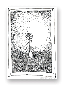
ATC - roseFor me, this ATC (artist’s trading card) was about design.  I wanted to see if I could use a simple subject and create enough visual interest so people don’t simply glance at it and say, “Ho-hum, it’s just a rose.”

I’m not 100% certain that I achieved that, but I think the various shading techniques work well enough.

This ATC actually repeats an exercise that I did in my junior year of high school.  I’m not kidding.  I’d learned a lot from it, and it’s stuck in my memory as something very positive.

Like my other ATCs in this series, this card was drawn with a Size 0 (zero) point rapidograph-style pen.  It’s a Koh-i-noor Rapido Drawing Pen, and I love it.  Unlike older rapidographs that I’ve used since college (when dorm friend/artist Darcy Grimm showed me her rapidograph), this one doesn’t seem to clog easily.  That’s a huge plus, and it’s one reason why I’m doing far more artwork with it.

Anyway, it’s all dots & lines in this ATC, and I’m pleased with it.  You can download a printable copy (at 150 dpi) by clicking on the card image, above, or by clicking here.

ATC – City/Stars in pen & ink

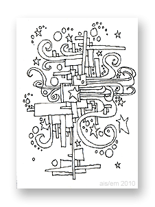
ATC - pen and ink - city stars This ATC is typical of the scribbles that decorated my class notes starting around age 12.

Bored out of my mind in junior and senior high school, I only half-listened to teachers. (Yes, I regretted that later.)

Instead, I drew a variety of designs, usually a series of connected images like the one at left.

For me, the squares and rectangles represent the architecture of the city.  The swirls represent the city’s energy, and the stars are the dreams and real-life stars, while the circles are clouds and bubbles of creativity.

Free download

You can download your own copy of this ATC by clicking on the image at left, or by right-clicking here and saving it to your hard drive. Print it at 150 dpi so it’s 2.5″ x 3.5″.

This is one of six ATCs that I created in October 2010, experimenting with a new pen.  (It’s a Size 0 point Koh-i-Noor Rapido Drawing Pen.)

Evolution of this style

When I was a teenager, I sometimes drew these designs in ink and just left them as-is.

Others were drawn in pencil during school.  Later, at home,  I drew over the pencil with India ink and my crow quill pen.

When the ink was fully dry, I’d add color.  My mother had paints left from her years as an air brush artist (Dr. Ph. Martin’s radiant, concentrated watercolors) and I used those because the colors were so vivid.  Generally, my color choices included magenta, turquoise, lime green, and yellow.  I used purple as well, but carefully; it’s a color that can dominate artwork very easily.

One of these drawings — painted with acrylic paints — decorated a residential elevator on Marlborough Street in Boston (MA) in 1970.  I remember showing it to musician Jaime Brockett when he visited me, and he could barely believe I’d created it.

Even then, I don’t think my appearance or demeanor matched who I really am.

Another  of these designs became a wall mural in an office just outside of Salt Lake City (UT) in 1973.  It’s no longer visible, of course, but I like to think that it still exists under layers of paint and tasteful wallpaper.

(Hmm… have I mentioned that I was a rather mobile hippie in that era?)

The art themes

These kinds of scribbles have a lot in common with work by Peter Max, but I don’t think he was popular when I began drawing these.

In fact, I think the art in my class notes (and this ATC) drew upon the same cultural icons that inspired Max and others. (The posters for the Grateful Dead and for concerts in general —  particularly around San Francisco — also featured similar imagery.)

When I adopted elements from any popular art, it was probably from a TV show that (I think) aired in the afternoons when I returned home from high school. It had a title like “The Amazing World of Dr. Silver”, but that’s not quite right. I’m pretty sure it was on PBS and produced in Boston, Massachusetts.  (Does anyone else remember this show?)

Mostly, there was a certain style to the art of the late 1960s and early 1970s.  It was happy but also complex, in its own way.

This ATC reflects that.

ATC – Desk chair

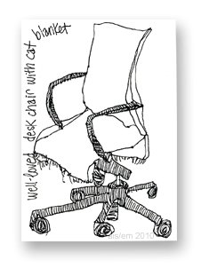
ATC of desk chair, printable copy linkedThe next ATC (artist’s trading card) in my pen-and-ink art experiments features my husband’s desk chair.

I drew it with a Size 0 (zero) point technical drawing pen.  I’ve been using this kind of pen for art since I was introduced to them by a college friend, Darcy Grimm.

The ink is called Ultradraw, and it’s Koh-i-Noor’s India ink for artists, illustrators and draftsmen.

Once that ink is dry, it’s usually waterproof and I can paint over the ink with watercolor paint or use watercolor pencils with water.

It’s ideal for sketchcrawls and other sketches that might become more formal artwork.

This ATC shows a comfy chair upholstered in a grey tweed, and our cat loves to sit in the chair when my husband isn’t in it.  (Otherwise, the cat likes to sit in HT’s lap.)

To protect the chair from our cat’s long hair, we have a (now somewhat ragged) piece of flannel that’s laundered regularly.  The fabric was on the chair when I drew this ATC.

To print this ATC, right-click on the picture and save the higher resolution copy on your computer.  Then, print the artwork at 150 dpi; it’ll be a 2.5″ x 3.5″ ATC after you trim it to size.

ATC – Pen and ink, fan

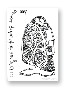
Printable ATC - click here to downloadMy second ATC in this series  of six shows our living room fan.  It’s one of those huge grey fans that, on the high setting, blasts you like you’re in a wind tunnel.

Drawing it was sort of a challenge.  I mean, there’s a lot of detail and shading in the actual fan.  Deciding what to include and what to leave out… that was the challenge.

Scaling it down to ATC size was even more interesting.

There are things I might do differently if I were to draw it all over again, but — of course — this was just an ATC… a one-time sketch.  I’m generally pleased with it.

This ATC was drawing with a Size 0 (zero) Koh-i-Noor rapido technical drawing pen on regular paper in my sketchbook.

I started by drawing (in pencil) the 2.5″ x 3.5″ dimensions of a standard ATC.  Then, I began drawing with my pen.  There was no rough sketch to start with, just the outline of the card so I’d get the size right.

About five minutes later (maybe less), it was an ATC.

Pretty simple, huh?

These are super easy.  A good pen makes all the difference.  Sure, you could use any drawing pen, including a felt-tip (like a Sharpie) or a rollerball pen.

However, I think there’s a different quality to more traditional pens, and I think it shows up in the finished artwork.

ATCs are like miniature works of art.  That makes the materials and workmanship more important, in a way.

(Don’t let that scare you off; if the ATC doesn’t look good, you can always put new/different art over it, or throw it out altogether.)

So, for this ATC and the others in this six-card series, I used a rapidograph with Koh-i-Noor’s Ultradraw black India ink. (The ink comes with the pen.)

Right-click on the image to download a printable copy (at 150 dpi)  of this ATC.

ATCs in Pen and Ink

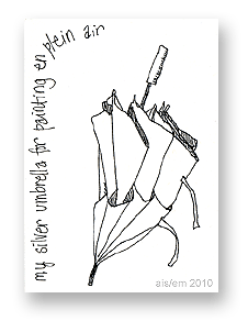
ATCs - Umbrella ATC - October 2010ATCs have always been dear to my heart.  From the 1990s when many ATCs were created on 3″ x 5″ cards, to the 2.5″ x 3.5″ size that became more standard, to the smaller variations that have emerged: ATCs are fun, fast art.

Recently, I purchased a new rapidograph, also called a “rapido sketch pen.”  It’s an easier way to create the kind of drawings I did as a teenager, when I used a crow quill pen and an ink well.

My new pen has a Size 0 (zero) point, and it’s a vast improvement over rapidographs from even 10 years ago.

Anyway, to get used to my new pen, I decided to sketch a few ATCs.  My first is shown at right.  (Right-click on the image to download your own copy.) It’s a contour drawing of my silvery umbrella… the one I take with me when I go outside to paint landscapes in nature.

Like all of my recent ATCs, the original of this card is 2.5″ x 3.5″ and — by right-clicking on the image, above, and saving it to your hard drive — you can print a full-sized copy (at 150 dpi).

This is the first of six ATCs I’ll be posting over the next few days, showing my progress with my new drawing pen.

The signature (ais/em 2010) on these ATCs is sort of a segue between my online name of Aisling and Eibhlin (“Eileen”), the (real) name I paint under.