1000 Journals Project
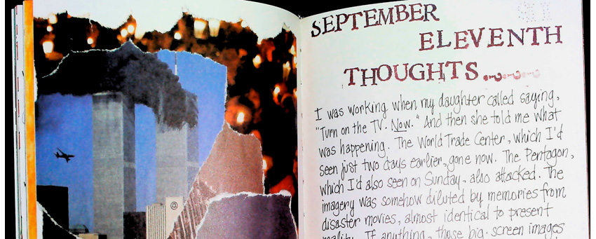
Recently, having misplaced my own copy of the 1000 Journals Project book, I ordered another. Seeing it again, after all these years, was astonishing. Even now, it feels like that being part of that art journal/project was a “right time, right place” moment. Even more bizarre, I received it at 9/11, and – a few […]
1000 Journals Project Read More »