Play… with Elegance – Torn-Paper Collage

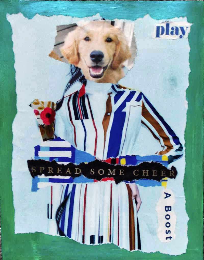
This collage started with a puppy’s cute face.

Then, because my humor is quirky, I realized the puppy’s face would fit perfectly on an Hermes ad from a British fashion magazine.

With a few added details, this torn-paper collage – the only one I created this past weekend – seemed complete.

Sometimes, the simplest collages are the most effective.

It’s the holiday season and – as usual – I’m looking forward to Christmas and all it represents. So, I guess I’m in a flippant, happy mood.

Play, and spread some cheer!

P.S. The support for this collage was painted green, and then applied a slightly sheer layer of iridescent teal blue. I’ll replace this photo with a better one, later, but – for now (on a Monday morning) – it conveys the general idea behind this art.

(And yes, my husband quoted “Ghostbusters,” saying something like, “Okay, so she’s a dog.” Because his humor is quirky, too.)

Things I learned, creating this collage:

Simple can be fun. It’s far to easy for me to keep adding collage elements when the work might be better with a greater sense of space.

Using glue stick as the adhesive prevents more buckling and bubbling than gel medium, but the adhesion isn’t as consistent, especially as glue stick dries so quickly. And, once placed, the glue holds almost immediately, so fewer adjustments are possible.

But, for small collage elements, where I can place the piece lightly (and make minor adjustments) and then press it down, glue stick can be better than gel medium.

(My usual art journaling glue is Yes!Paste.)

Winning Vision – Collage

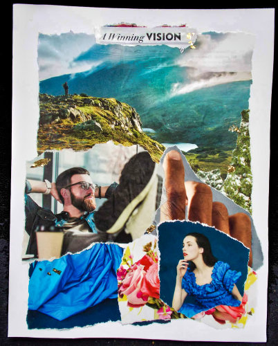
This morning’s collage is a deliberate enigma. Also, I’ve decided that – after yesterday’s efforts – it may be best to leave the meaning of the collage to the observer. After all, that was my initial plan for this series.

So, is he thinking of her (and perhaps the rustle of her blue dress), or about the landscape, or something else?

Is she wondering about him, and is he the one that sent her flowers?

Does the finger point to what they’re both dreaming about?

Do their dreams – their visions – intersect? Or, is this very early in the relationship?

Or, do they even know each other… yet?

It’s definitely an “..in the eye of the beholder” kind of piece.


Things I learned, creating this collage:

Most American magazines seem to be printed on cheap, thin, very porous paper. National Geographic is an exception. Town & Country (American magazine) is on better paper than, say, Better Homes & Gardens, Wired, and Vanity Fair.

The British editions of Harper’s Bazaar and Elle are on paper close to the quality of Nat’l Geographic. For collage, it’s worth spending extra for them.

When working with cheap paper, it’s best to apply the collage adhesive to the support rather than directly on the collage element.

This makes element placement far more challenging, but it reduces buckling and bubbling… only slightly. (“Slightly” may be as good as it gets. So, I’m reminding myself that this shows the process in the finished art, and that’s okay.)

Some collages have a vision (no pun intended, with this work) from the start, while others – like yesterday’s piece – are a process.

It’s probably similar to the writing process: Some authors are “plotters” (plan the story, sometimes in great detail, ahead of time) but others are “pantsers” (writing with a vague idea, and making it up – flying “by the seat of one’s pants” – as they go along).

And sometimes, even the most dedicated, focused “plotters” suddenly find their stories going in a weird (but wonderful?) direction, and they go with it.

This collage started with a fairly clear vision, and then went slightly astray, but only slightly.

I like it, but I’m not dazzled by it.

I think I miss Thanksgiving. This is the first year that, due to Covid precautions, our family hasn’t had the big annual dinner at an in-laws’ home. It felt weird – kind of hollow – for us to have our personal Thanksgiving dinner at home, though it was delicious (if I do say so myself).

This year of ennui seems to be seeping into my art, but maybe the art will help me rise above it. And so, the collages will continue.

For more of my collages, see additional articles in the Art Gallery category at this site.

Torn-Paper Collage – Authenticity in a Time of Challenge

Today’s collage is – like yesterday’s – not quite finished. But, for now, it’s going to sit. I want to look at it for a while, and see what else it says to me. See if anything is missing or needs… something.

That’s a challenge for me, because this isn’t my usual design style.

November 2022 note: I look at this and realize how much it was the product of months of nightly, interrupted sleep during 2020. My art was disjointed during that time.

At the end of that year, we were not included in the big annual Christmas gathering of family and friends. I still don’t know why. It was baffling and excruciating. (Nearly two years later, it still is.)

So, in 2021, I decided that things had to change… and that’s reflected in my related, later art you’ll see at this website.

I’m leaving these older pieces online for authenticity. I don’t like this collage, but also know it reflects my struggle in 2020, feeling cut-off from friends and family, as so many of us were, due to Covid concerns, politics, and probably myriad other/related reasons.

I want to turn back the clock. I want to quit feeling so heartbroken, but I also know that’s how I should feel, in the context of what happened. It’s an appropriate response, and the richness – the authenticity – of life is what fuels my art.

The foundation

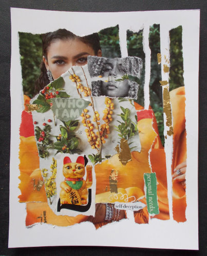
This piece started with the first layer, showing a smiling model in a tangerine/orange satin gown and an almost ostentatious amount of glittery jewelry.

But – for me – the model’s eyes didn’t match her smile.

Years ago, looking at portraits, I learned to ignore (or even cover) the lower half of the person’s face. The eyes showed the person’s real emotions.

So, as I built this collage, the first thing I did was to cover the lower half of the model’s face. The new layer featured seasonal plants and berries. The colors resonated with the background image, but the texture – and the almost-careless untidiness of Nature – was a sharp contrast.

Suddenly, this collage was about authenticity. The look in the model’s eyes… what is it? Sadness? Distance from everything around her?

That’s when I tore the background image into strips. I chose to apply them randomly, out of order, and with emptiness between them.

Again, that’s a reference to an emerging sense of artifice as I studied the photo.

Next, contrasts and similarities

The next step was to study other magazine photos. I wanted to see if the expression in other models’ eyes were lacking, or at least didn’t match the rest of the face.

When I found the black-and-white image, it seemed perfect. That model’s eyes and mouth, and the tilt of her head, all delivered the same message. I emphasized that by disconnecting them – tearing that image in half. It’s a harsh contrast – in color (b&w), in consistency, and style – against the original layer in this collage.

I began gluing the collage elements in earnest when I found an ad for macaroni and cheese. The colors in that advertisement perfectly matched the orange satin gown. It’s almost difficult to tell what’s macaroni and what’s the gown. And, in contrast with the lifestyle represented by the amount of jewelry in the original image, I also wanted to note the number of people for whom macaroni and cheese – from a box – is considered a luxury meal.

It would be trite to talk about the shallow lives of those driven by status and symbols of wealth, but – as I kept working on this collage – the reference was almost unavoidable.

Final clues

The words “who I am” are almost lost in the busyness of the design. “Personal needs” is slightly tilted, as much of the rest of the images is. And then there’s the crisp statement, “self-deception” in black and white, with a childish scribble leading to it.

The final elements – the heavily made-up “lucky cat” (Maneki-neko) and ragged gold leaf – fit both the color & theme of this piece.

In some ways, this collage lacks drama, deliberately. It’s less visually appealing than what I usually aspire to, with my art.

But, at a time when – wearing masks – we rely so heavily on the emotion expressed with one’s eyes, and we’re witnessing a stunning, rapidly expanding gap between the “haves” and “have-nots,” I’m pleased with the statement of this piece.

Does that seem odd? Well, it’s about authenticity.

In a world where things can feel tumultuous and destabilizing, maybe authenticity is the touchstone… the sense of self that keeps us grounded.

Empowered, even in a challenging context.

Able to achieve what we’ve always suspected we can do… and can be.

And, once again drifting into irony, I’m remembering the song lyrics in “Grease.” Perhaps – more than ever, as we choose our personal paths to the new “normal” – it’s time to believe that we can be who we are.

Teal Magic Art Doll – From a 2000 Art Swap

In 2000, I met other dollmakers online, and participated in art doll swaps.

What is an art swap?

A “art swap” is when artists make several pieces of art – usually identical or nearly alike, though each design is unique, and individually crafted with love.

Then, each artist sends the required number of items (the pieces of art) to the swap’s host.

The host then sends one of each to other participants. (The host keeps one for themselves, as a “thank you” for the work involved in hosting.)

Each participant receives one item of art less than they sent to the swap. (That’s how the host gets to keep one of each.)

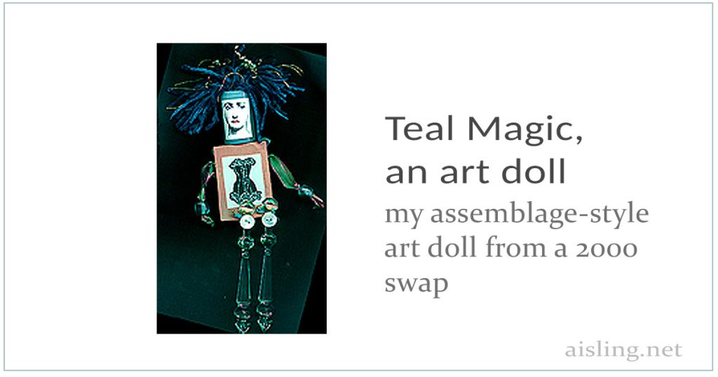
“Teal Magic” was the name of the first series of art/assemblage dolls I made for an art doll swap. That’s her, in the small photo below.

an artdoll from 2000 - art that's a doll... or a doll that is art!

What is an art doll?

An “art doll” (or “artdoll”) is a handmade figure – like a doll – that’s created as art.

It’s like sculpture, but designed as a doll. Not necessarily one you’d play with, but certainly one to display.

Each one is made by hand, though they may be part of a series of art dolls that look alike.

That’s one of my art dolls, at right. She’s called “Teal Magic” because her predominant color is a teal blue, and I like to pretend she’s magical, like a fairy. (And yes, she has wings!)

How I Made Her

  • Her body is a simple wooden block, painted with copper-colored paint.
  • I photocopied a corset and hand colored it, and then glued that image onto the block, to represent her torso.
  • I added small, wired wings at her back. They’re colored turquoise, and rubber-stamped with a wing design on rice paper.
  • Her head is a translucent white 35mm film canister. Her face is paper, printed and hand-colored.
  • Her hair springs out of the film canister.   The hair is yarn, embroidery floss, and some wires with beads attached.
  • The arms are sparkly ribbon with glass beads for hands.
  • The legs are made from vintage, plastic “crystals” (probably from a lamp or chandelier) and antique buttons covered where they were attached to the body.

I made six of these art dolls, kept one (that I still have in 2024), and sent the rest to the swap.

Trivia: At the time, Geoff, one of my SoHo chatroom friends (from GeoCities, an early blogging platform) joked that I’d named the dolls after him.  His surname (in real life) is Teale.

I’m still very proud of those art dolls.  At the time, no one else was making anything like them.

Here’s my original post about this art doll

This is exactly what I posted at my GeoCities (Soho/6708) website, way back when (meaning: at or before 2000)…

The theme of this exchange was simply “Art Fetish Doll,” and the only guideline was for the doll to be less than six inches tall (to make shipping easier).

We could send up to six dolls, and receive different ones in return, one less than we sent. (I sent five, so I’ll receive four back.)

I started with an empty plastic film canister, and a bagful of old plastic Christmas ornaments that look like cut glass from a chandelier.

My first step was to find a Victorian face image, to tweak and then reduce to collage onto the film canister. I used a Dover clipart book for this.

Next, I decided to make her body from the wooden blocks I’d recently purchased at eBay, for my unmounted rubber stamps.

Big mistake. The hardwood of the blocks was nearly impenetrable, and I had to insert four small screw eyes, two for her arms and two for her legs. It took forever! *grin and shrug*

My next step was to drive to Harvard Square (Cambridge, Massachusetts) to find the perfect beads for her hands. I already had the pink-and-green sheer & iridescent silk ribbon for her arms.

I bought heavy blue glass beads, which look like beach glass from old Coke bottles.

Then I shopped at a seedy local flea market for o-l-d magazines, to find the perfect corset image, to tweak, print, accent by hand, and then glue to each copper-painted wood block. This represented her torso.

Her hair — which is NOT accurately represented in the photo — is actually a deep, juicy teal color. Think of the most remarkable teal you’ve ever seen on a duck. That’s the color of the chenille yarn I used for her hair.

I separated the strands of some copper-colored (metallic) embroidery floss, and wove some of them through the teal yarn/hair, too.

Finally, in her hair, I have copper wires, intricately twisted and looped, with pearls strung on them. There are three of these wires in the hair of each doll.

The hair has been packed into the film canister and held in place with hot glue, so the hair seems to spill out, dreadlock-style.

Her legs are the plastic “crystal” chandelier-style pieces, with holes drilled in them. I used the hole in each leg to attach an antique mother-of-pearl button to the front of the leg, and tie light teal-colored embroidery floss through the button and the crystal. Each leg was then loosely attached at a screw eye on the front of the block.

When she sits on the edge of a desk or table, her legs swing down in front of her.

On her back, I placed wings. I stamped a dragonfly-style wing design with turquoise ink, on rice paper. I cut out two of these pieces for each doll: a front and back of the wings. Inside, like a sandwich, I inserted a very thin brass wire, and glued the layers together.

I attached the wings to the back of the copper-painted block, using a small carpet tack. Finally, I painted the carpet tack white (to match the white, rice paper edges of the wings) and bent the wings a bit, so they look realistic.

Five of these dolls were sent to this exchange, early in July.

Dreams / True Story Collage

What kinds of stories can art tell? And can you be part of that process?

I believe most artists want their work to be interactive… emotionally, anyway.

My collages used to be about me. The art was mine. The stories were mine, too.

Now, with this new collage – the first in about a decade – I see myself assembling pieces of a story.

It’s not necessarily my story.

In fact, each viewer is the owner.

The story they see in my collages is theirs alone… unless they share it with others, of course.

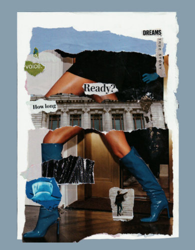
The scan of this collage, above, is preliminary. The bottom edge of the torn paper (below her left boot) is actually just as ragged as the rest, but the scanner didn’t include it. (I’ll fix this, later.)  Also, the gold trailing behind her is bright & shiny, but – in the scan – it’s dull. (I’ll make sure it shows when the collage is fully finished. At this point, it’s not actually mounted on a contrasting background.)

So… what is her story?

Here are elements and questions to consider, looking at this collage:

Is she walking – perhaps running – towards something, or away from it, or both? The right side of the collage support (white) is torn and untidy, while the right side was cut with a ruler. Does that mean anything in the context of her story?

“Dreams” and “true story” are separated. Are they still connected? Does her true story support her dreams, or has the truth fallen off and it’s now at odds with her dreams?

Likewise, “a voice”… is it fractured? Or is her inner voice leading the way, a little here and a little there, and how long will her journey be? (As I see it, both “a voice” and “How long” are sort of floating in front of her.)

Perhaps the building (a symbol of tradition, or authority?) supports her. Maybe it’s interrupting her progress, and she’ll soon leave it behind.

There’s a shark at her leading ankle. Has it already passed her, and does she care?

And the figure in the 60s-style fringed jacket, possibly pointing at the male figure in the shadowy background. Is that a warning? If so, is it to her or to the mostly hidden man?

But, of course, the big question is: Is she ready?


This collage also appears at Eibhlin.com – my other art website. (“Aisling D’Art” was a pen name I adopted in the early days of the Internet, when women were in the minority, online, and some of us went to great lengths to protect our privacy and identities.)

Art Journaling Ideas – Complex and Detailed (Video)

Looking for some fresh ideas to add depth to your art journaling projects?

This video – by another artist, not me – will inspire you. It includes lots… and lots… and LOTS of art journaling ideas!

Color. Texture. Paper, tapes, ribbons, and more. Wheeee!

Yes, this kind of mixed-media art can seem overwhelming to a beginner.

Even for an experienced artist, this many art journaling ideas can feel like too much.

My advice…?

Don’t try to do everything.

Watch and see what appeals to you the most.

Maybe just one or two things.

And then do that.

Just that. But – of course – with your own creative “voice” and style.

After all, visual journaling is about your creative expression.

Video URL: https://youtu.be/5PlbplSnuoQ

Want more art journaling ideas?

Ask me! I’ll make videos to answer your questions.

Leave a comment. Let me know what kind of materials, journals, topics, etc. interest you.

2020 – The Year We Decided: The Future is Art!

During 2020, many of us have had time to pause, reflect on what we’re doing (and not doing), and make different choices.

Like me, you may find your deepest self-expression in art, whether or not you’re ready to describe yourself as an “artist.”

Suddenly, creativity is emerging from our hearts and our souls. That artistic voice is announcing to ourselves – and perhaps the world – who we are.

Unique.

Valuable.

With something to say.

We’re saying that in our art journaling, scrapbooking, drawing and painting, decorating, and more.

We’re using pencils, paint, paper, canvas and cloth, digital resources, and “found art” items.

We’re coloring, reorganizing, and redecorating.

We’re simplifying. Focusing on what brings us joy.

We’re creating journals, wearables, objects d’art, and… well, lots of things we don’t have words for. Not yet, anyway.

This is about US… who we are, inside. The things we want (or need) to say.

And this is tremendously healthy.

Our future is ART!

Celebrate it!

Art Journaling? Resist! A Sneaky Way to Add Excitement

Are you looking for easy, clever ways to add more excitement to your art journaling?

The answer may be: RESIST!

In art journaling, “resist” is a way to keep paint – and some other products – from sticking to the page. Other terms for this include: mask, masking fluid, and frisket. (You’ll see many different products at Amazon.com.)

Some resist techniques are simple, like using a white crayon on a white page. Watercolors, acrylic paint, most (not all) rubber stamp inks, and so on… they usually won’t stick to any area where the crayon wax is.

One short video showed one way to use white crayon as a resist. (The video was made private, so I can’t link to it. Just know that there maybe more videos about using crayons as paint resist elements.)

Here’s another short video with some good suggestions if you’re using a white crayon as a way to keep part of your page white:

Remember that once the wax crayon has been applied, that area on your artist’s journal page won’t accept water-based media, ever. Even if you try to wipe the crayon lines off… the paint (or rubber stamp ink, etc.) probably won’t stick.

White Glue Mask/Resist

In this video, you’ll see one of Traci Bautista’s products mentioned. It’s a decoupage product, Collage Pauge, that can be uses as a resist. However, as the video explains, you can use white glue for the same purpose.

Alcohol Resist

Other resists aren’t necessarily as waterproof as crayon. Alcohol is an example. Though it can be 100% resistant to water-based pigment, sometimes it isn’t. Also, it can be harder to control than white glue, white crayon, or products designed for use as resists, masks, and friskets.

Embossing Resist (with Heat)

If you have embossing supplies, this is an innovative way to use them in your art journal, as a resist.

Resist with Adhesive Letters or Decorations

This is a fun, kind of reverse-resist approach to art journaling. First, you paint a colorful layer. Then, you add the adhesive-backed letters or shapes. (I’d use inexpensive letters, and don’t push them down too firmly.) Then you paint over the whole thing with white (or a color), and then you peel off the letters/shapes you’d stuck onto the page.

I think these ideas are kind of wonderful. I already knew a few, but – watching these videos – I’m inspired to revisit them, and try the new resist techniques, too.

Art Journaling Inspiration – Vintage Diaries (Video)

Sometimes, we can find inspiration in old, vintage, and antique books.

That’s especially true about old diaries. They may not be art journaling examples, but you’ll see fascinating ways people have documented their daily lives, sometimes just with words, and sometimes with illustrations.

This 25-minute video shows a variety of old-fashioned diaries. Delicious inspiration!

https://youtu.be/iBwmCMbDyjU

Guerilla Art Kit and Other Journaling Ideas – Keri Smith

Keri Smith broke the mold when she first published her “Wreck This Journal” journals.

She’s still a great inspiration, whether you’re a beginner or a long-time fan of art journaling and scrapbooking.

If you’re not familiar with Keri’s art & philosophy, this video may be a good place to start. It’s about 3 minutes long.

https://youtu.be/EQpoDWSHby0

If you like her message, you’ll find more,related videos at YouTube.

Also, even if you don’t speak Spanish, this 3-minute video is fascinating. Multiple artists demonstrate how they “wrecked” a Wreck This Journal (Destroza Este Diario). They’re some intriguing art journaling examples.

https://youtu.be/uQko6xa3whE