Continued from ATC Tutorial 2 – Memories – Adding More Layers
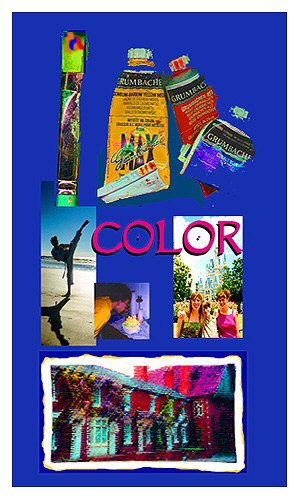
At this point, the card was pretty… but it had no real theme or meaning to it. And, while “pretty” art can stand on its own merits, I rarely choose to make art without another layer of meaning. So, I started examining the card for clues.
I increased the contrast and lightened the background layer. I knew that something needed to go in front of it, and by reducing the “obviousness” of the background, it helped me to focus.
I was still drawing a blank.
So, I went to my copy of Photoshop Secrets of the Pros: 20 Top Artists and Designers Face Off for ideas. (If it’s selling for under $10 at Amazon and you enjoy this kind of art, get a copy. Otherwise, see if your public library owns it. If they don’t, tell them to buy a copy.)
I was inspired by the work of John Henry Donovan, of 5pieces.com.
 |
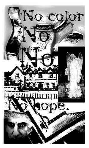
I tried inverting color (Image–>Adjust) in strips with five-pixel feathering. However, once the stripes were dark, I needed to duplicate the layer with the Paris-Draped figure, to make it more opaque. |
I wasn’t too sure that I liked the effect. In fact, it was pretty much ick. And, having set a three-hour deadline–trying to mimic my one-hour ATCs but allow for this documentation–I needed to finish the card quickly.
| I deleted the extra layer of Paris-Draped so that the figures were transparent again. And, I desaturated the layer. But, as I was using the Hue/Saturation screen for this, I accidentally altered the background hues… and liked the effect. |  |
I started selecting rectangular areas of the background, and changing the hue of each of them and then switched them back again.
Finally, I worked with the area nearest the middle and altered it back to its original, natural colors.
Then, I chose Select–>Inverse and tweaked the remaining background image and adjusted it until I was happy with it.
Finally, the Paris-Draped layer had to be adjusted as well, both contrast and hue.
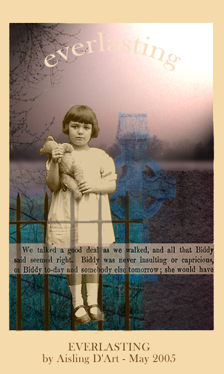
Now, I was getting a theme. The Paris-Draped figure was clearly from the past, and the single band of natural/real coloring in the image was like a faded memory… only part of it was accurate and the rest was a little surreal.
Conclusion: ATC Tutorial 4 – Memories – Finishing the ATC

 Q: I want to make some artistamps by hand, not necessarily on the computer. How do I make my art the right size for stamps? Should I be creating the art in stamp size, to start with?

 If you’re sending your artistamps for others to use, you probably want to make them as much like “real” postage as possible.
 Glue recipes vary from great to disastrous. But, they can be a fine alternative to “lickable” adhesive-backed paper and commercially prepared glues, described in my article, Glues and adhesives for artistamps.
 Note: The lemon extract repels bugs which like to munch on starches (such as gelatin and corn syrup), but you could probably use other flavoring extracts from the baking supplies aisle of the grocery store. Artistamp collectors in tropical countries may choose to store stamps in plastic.
 Artistamps can be described as fake postage. Some people call them faux postage, Cinderellas, postoids, or even real postage.
 Artistamps can be printed or individually handmade. They may have perforated edges like traditional postage, or not. They may have a pretend ‘price’ designation on them, or not.