Disneyland Tribute for My Mom (Fantasyland game)

Disneyland is celebrating its 55th anniversary.  I’m commemorating it with an artistamp design featuring art by my mother, Muriel Joan Bernier (1919 – 2010).

The artwork at left, which was also on the Fantasyland board game, was based on my mother’s art.

She freelanced for Disney in the 1950s. I remember her drawing lots & lots of versions of the castle, for Walt Disney and Parker Brothers (the game manufacturer) to approve.  Some versions were tall & skinny. Others were very broad and sturdy, like castles in England and Wales.

My mother’s drawing style was distinctive. I’d recognize it anywhere. She’d start with very simple shapes — ovals, cylinders, squares, and circles — and then adjust the lines.

She did a lot with shading, to get the effects she wanted. She liked contrast in her work. (That wasn’t always possible when she freelanced for Rust Craft, creating greeting cards & wrapping paper designs.)

The next photo shows the final version of the game artwork. (Yes, Bugs Bunny was among the characters entering the castle. I’m not sure if Mum did that deliberately, or if it was a whim of hers, just for fun.)

Disney Fantasyland board game 1956 Muriel
Fantasyland board game (1956), artwork by Muriel Bernier

My mother passed away earlier this year, and — I’m not sure why — she didn’t want me to post her artwork online.  (My mother’s always been eccentric.  Once she decides something, she rarely changes her mind.  Questioning her was pointless.)

This, however, gets around that.  The images were already online… just not credited to her.

So, I created the artistamp at the top of this article, as a tribute.  Ordinarily, I add my artistamp postal name — Ballynafae — and a postage amount (usually 3p) to make my artistamps look more stamp-like.  In this case, it didn’t seem right, so I added the basic text and here it is, as-is.

You can download it as a stamp-sized image (PDF), either with a stamp-like edge (as a graphic), or as shown above.

How to Make a Simple, Single-Sheet Zine

Single sheet zines - step oneThere are as many ways to create, modify & embellish a single-sheet zine as there are artists.

How to Create a Single-Sheet Zine

Here’s a very simple way to create one:

1. Take any white sheet of paper.  Pull one out of your desktop printer, or rip one out of a notebook.  (Think of the lines as pinstripes!)

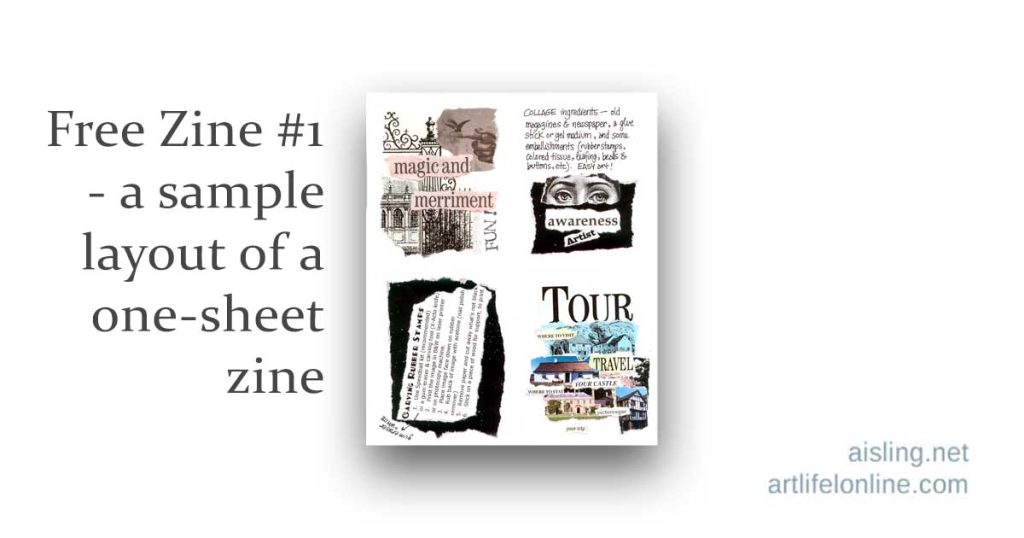
2. Fold the paper in half.  Most people fold it so it becomes a four-page zine, with each page being 8.5″ tall and 5.5″ wide, but anything’s possible. (Here’s a sample you can download and print: Free Zine #1.)

Single sheet zines - how to make them
3. Write and draw (and create other art) on each page, until it’s full.  (Alternative: Create your zine, digitally, and then print it.)

Single sheet zines - the layout and design4. Flatten the sheet so you can photocopy (or scan) it.

5. Print copies, two-sided (back to back), and fold them.  (Optional: Embellish by hand.)

Next, Share Your Zines!

Mail copies of your zines, sell them (at your site or Etsy, for example) or give them to others, sharing your ideas and artwork!

Single sheet zines - print and share
(If you live in a city, especially one with a student neighborhood, go hand some zines out and watch people blink in amazement.  They’re used to advertising flyers, etc., not actual gifts of art & inspiration.)

If you want to make and share zines, this is a great start, and one of the simplest ways to make your own zines.

Want to see a more complex zine? Print (free) the 24-Hour Zine Thing zine.

Single-Sheet Zine Layout – More Info

Single-sheet zines can be easy or complex.  In my earlier article, Single-sheet Zine Design – Basics, I showed one of the simpler ways to create a zine.

What most people do…

From what I’ve seen, the majority of people who swap or sell zines take a bunch of letter-sized printed pages (8 1/2″ x 11″) and fold them in half. Each sheet of paper is four pages of the zine.

Here’s how a single-sheet zine might look:

Single sheet zines - the layout and design

See? It’s just one sheet of paper. This can be really easy!

You can print a free zine – a variation of the single-page zine concept – at Free Zine #1.  (Warning: I wrote that around 2002, and included several New Age topics that were popular/trendy at the time.)

Of course, that’s just the beginning…

Zine sizes can vary.

An average zine is five to 15 sheets of paper, meaning 20 to 60 pages. Those are the ones you’ll see at art- and zine-related shops, where you can purchase zines.

However, most zines are at the small end of that figure.  Many of them are just a sheet or two of paper, printed (and sometimes cut) and folded/stapled to make a zine.

Once you’ve made a few classic, single-sheet zines, you may want to try something more complex.

The Classic, 16-Page Zine from a Single, Legal-Sized Sheet of Paper

If you’re a purist or on a strict budget, you may love this: It’s a 16-page zine created with one sheet of legal-sized paper, period.

I don’t count the cover as a “page” when I number my zine pages, so my own version of this is 12 pages plus an outside cover & inside covers. Here’s how it fits on the paper:

Zine layout from a single sheet of legal paper

Cut on the solid lines and fold on the dotted lines.

Staple in the center. One staple is usually enough.

One stamp on the envelope is enough to mail one of these zines.  (You can tuck them in with bill payments, notes to friends, birthday and holiday greeting cards, and so on.)

You can also scan your zine, uncut, and put it online so others can print their own copy, cut & assemble it. Easy!

Zines Know No Limits!

There are many other ways to make zines. Look at books about making handmade books, for the best inspiration.

The concept is the same, but zines are usually smaller & more informal, that’s all.

If you want to create a zine that’s a work of art, that’s fine.

If you want to get wild & crazy with design, have fun with it!

Remember that a zine can be one piece of paper, b&w, printed on both sides, and folded in half. That’s a four-page zine.  I have several in my collection, and I think some of the simpler ones are better than a few larger ones I’ve seen.

So, put your art & soul into your zine, and don’t worry about the size or technical stuff.  I love almost every zine I see; size and expertise often have nothing to do with how enthusiastic I am about a zine.

What to Do with Zines

If you’ve wanted to create a zine for fun, just do it!

  • Give them to friends.
  • Sell them (at your website or Etsy, for example).
  • You can approach local artsy stores, gaming stores, etc., to consign (or outright sell) your zines.
  • Hand them out on the street, at school, at work, to friends, neighbors, and relatives.
  • Join a zine swap or launch your own, on- or offline.  They can be tremendous, and you’ll receive fabulous zines that you might never see if you hadn’t swapped.

More zine information

If you have questions or answers, post a comment below.

Zine update – Sketchcrawl theme

[This was for a March 2010 artzine. Obviously, submissions are no longer accepted.] After considering various topics for my first/continuing zine issue, I’ve decided to make it about sketchcrawls.  (If you’re not sure what a “sketchcrawl” is, visit Sketchcrawl.com or see my examples at this website.)

So, I’m looking for articles and sketch samples — in b&w, or color images that also look good in b&w — for this zine.  Every contributor selected for this issue will receive a free copy of the zine, in the mail.

Your article can…

  • Describe a sketchcrawl you’ve been on, with sample sketches.
  • Share art tips for a successful sketchcrawl (or travel journal), such as how to deal with wet media.
  • Offer ideas to make a full-day sketchcrawl fun, such as ways to avoid blisters or tiredness, what snacks to bring, and how to cope with crowds.

Articles should be a single 8.5″ x 11″ page, unless there’s a really good reason to make it longer.  (Two pages are the max… ask me, first.)  If it’s easier to make your page 8″ x 10″, that’s okay, too.

The articles should be sent to me in PDF format.

The best way to do this is to write the article in DOC format, in Microsoft Word or in Open Office, or something like that.

Please use 1″ margins on all four sides of each page.  Use a standard font that came with your computer.  (If you’re not sure what’s “standard,” use this list:  Common fonts…)  The font size should be between 10 and 14 pt, though the headline can be up to 18 pt.

Scans of your artwork should be at 300 dpi, but no less than 150 dpi, and they should be part of the PDF, not separate.

Be sure to include your name and your website URL (or Flickr account URL) on the page, so people can find you and your art, online.

Then, save it (or “print” it) as a PDF.

The first sketchcrawl of 2010 is February 27th… now you have another good reason to get out and sketch on that day!

My current plan is to publish this zine in March 2010.  February has sort of flown past me, as my mom –  also an artist – was hospitalized. Of course, that’s upset me, and has affected my schedule.

The Return of the Zine

schoolglueThis is from my archives, when I sent “creative somethings” (including zines) to my subscribers.

Recently, I’ve been thinking of restarting this project, perhaps through Patreon. If that sounds interesting to you, let me know.


The zines are returning in 2010.

They’ll be in three versions:

1. Paper copies (“old school” b&w) for previous subscribers.

2. B&w digital copies – free or very inexpensive downloads

3. Digital copies in color – downloads available for a fee to cover bandwidth

The first/new issue

If you’d like to be included in the first zine — the theme is sketchcrawls, so anything related to that is fine — see that page for details.

This first issue will be 8.5″ x 11″ pages… letter size.

Stay tuned for news about the issues that will follow.

What’s ahead

In the future, I may be interested in half-sheet articles (8.5″ x 5.5″) with color illustrations that will also look okay in b&w.   I need graphics at 150 dpi or better.  (If you have no idea what that means, just send me a photo.  Most digital cameras take pictures large enough to print well.)

For later issues, I’ll be especially interested in:

– Journal pages
– Gluebook pages
– Sketchcrawl examples
– Dolls/figures: cloth and assemblage
– Shrines & mini-shrines
– ATCs and ACEOs  (artist’s trading cards – including art cards editions & originals)
– Fabric art (quilts, wearables, etc.)

I’m planning to focus on paper & fiber arts, and perhaps some fine art (watercolors & oil painting) and dimensional work… but mostly paper & fiber arts.

I’m interested in art-related topics, too, particularly about being organized as an artist.

In addition, since this is primarily intended as an “old school” style of zine, I’m interested in anything with a vintage or antique theme related to arts & crafts.  Funky fun or serious re-enactors’ stuff… I’m very interested.

Keep it “office safe”

All art and text should be “office safe” (that is, if your boss catches you looking at the zine online, during a break, he/she won’t sputter and raise an eyebrow).

Avoid religious & political controversy, too.  (Yes, I’m passionate about both, but I want this zine to encourage creativity, not turn people off because they shift into left-brain mode over some statement-as-art.)

Please don’t think your work “isn’t good enough.”  Generally, I prefer art (visual, written, photos, music) that is raw and unpolished.  When it gets too polished, it’s a yawn for me.  So, send it anyway.

You’ll receive a free paper (b&w) copy of the zine with your work in it, and the digital downloads, free, as well.

Past subscribers

If you’re a past subscriber to my zines or “creative somethings”, please update your address at this form. [Link]

Important: That request is ONLY for people who were paid subscribers in the past.  This is NOT a freebie.

In late February 2010, I’ll be sending out postcards to previous subscribers, to confirm your postal (snail mail) address.

Free Zine #1

Years ago, I put together a single-sheet zine as a sample for my students in my Artfest ‘Make the World Your Art Gallery’ workshop.

Mostly, I was demonstrating different techniques for zines, especially using torn-paper elements in them.

It’s not an absolutely fabulous zine, and it’s not even much about art.

I simply used topics trending at the time I taught the workshop, and tried to make each page kinda-sorta referenced that topic.

So, this zine is just a series of random pages. You could probably put them together in any order, and this zine would make equal sense.

Or, to be honest, not much sense at all. But that’s part of the FUN of zines… They don’t need to be The Meaning of Life. Or have much “sensible” meaning, at all!

front of single-sheet zine back of single-sheet zine

How to assemble this zine

Print the PDF, two-sided, on 8.5″ x 11″ (US letter sized) paper. If your printer asks, tell it to print two-sized and flip horizontally along the longer side.

Then cut the printed sheet in half (horizontally, across the middle)

Place one half-sheet on top of the other. Then fold – and maybe glue or staple – the zine in the middle.

(You can see sketches of how this works at my Single-sheet Zine Designs page.)

As I’d created it, the front cover was the one with “Tour” in big letters. The page that talks about travel should probably be on the back of it. (That is, the “Tour” page is at the front, and then the “Travel” page is on the other side of it.)

But, as I said, it doesn’t really matter how you assemble this. It wasn’t intended to make sense.

You may need to adjust the size or shift the paper so that the pages line up correctly, when printed back to back. But, when it’s assembled, it’s an 8-page zine (four, two-sized pages) from one sheet of 8 1/2″ x 11″ paper.

Here’s the link. You can right-click to save it to your hard drive, or you can simply click and open it as a PDF, and print it immediately.

Click here for the PDF of the zine

If you’d like to make your own zines, browse my other zine articles.

Zine Layouts

Here’s what you need to know about zine layouts…

Zine sizes

From what I’ve seen, the majority of people who create homegrown zines use letter-sized printed pages (8 1/2″ x 11″) and fold them in half. Each sheet of paper is four pages of the zine.

An “average” zine is five to 15 sheets of paper, meaning 20 to 60 pages. (But really, there are no “average” zines. Each is unique, as it should be! )

starIn swaps, most zines are at the small end of that figure… five or so sheets of paper, and often less.

In fact, plenty of them are just a sheet or two of paper.  They’re printed or photocopied (and sometimes cut).  Then they’re folded, and usually stapled to make a zine. That makes them four pages… depending upon how they’re cut and folded, of course.

The single-sheet zine layout

The classic zine design is funky.

  • If you’re a purist, you’ll love this.
  • If you’re on a budget, you’ll also love this: It’s a 16-page zine created with just one sheet of legal-sized paper. (Yes, just one. Really!)

Note: I don’t count the cover as a “page” when I number my zine pages, so my own version of this is 12 pages, plus an outside cover & inside covers. Here’s how it fits on the legal-sized (8.5″ x 14″) sheet of paper:

Zine layout from a single sheet of legal paper

Cut on the solid lines and fold on the dotted lines.

Staple in the center. One staple is usually enough.

How to swap, mail, and share zines

If you’re mailing one of those single-sheet zines, one stamp on the envelope is usually enough to mail one of them.

Where to send your zines – You can tuck them in with your bill payments, with your notes to friends, with your other swaps, and so on!

Swaps by mail – Tell your friends what you’re doing. Ask if they’d like to play, too. Or organize a swap on social media, on your website, in a forum, etc. Learn more about zine swaps here.

Digital swaps (and shares) – You can also scan your zine, uncut, and put it online so others can print their own copy, cut & assemble it. Easy!

But keep in mind, if it’s a zine like the single-sheet (8.5″ x 11″) zine shown above… Well, it won’t hold much info unless you write VERY small, or you find clever ways to expand the available space, such as adding fold-out pages & stuff.

That said, the 16-pages-from-one-sheet-of-legal-paper is regarded as a classic zine, if we’re talking about all kinds of zines, including poetry, fanzines, and so on.

Taking zines to the next level… or not!

There are other ways to make zines. Look at books about making handmade books, for the best inspiration.

Here’s a favorite:

Handmade Books - Alisa Golden
Click on cover to see it at Amazon.com

The general concept is the same as zines, but zines are usually smaller & more informal than handmade books, that’s all.

If you want to create a zine that’s a work of art, that’s fine. If you want to get wild & crazy with design, that’s fine too.

However, keep in mind that a zine can be one piece of paper, b&w, printed on both sides, and folded in half. And that’s a four-page zine.

Many of these single-page zines are still in my collection.

Whatever the zine, make it yours!

Put your art & soul into your zine, and don’t worry about the size or technical stuff.

smiling flowerI love almost every zine I see.  Size, expertise, and visual quality often have nothing to do with how enthusiastic I am about a zine!

What I’m saying is: If you’ve wanted to create a zine for fun, or just to see what it’s like to make one, just do it!

The bonus is, if you swap your zines with others, you’ll receive fabulous zines in return, which you might never see if you hadn’t swapped.

two parallel lines

My zine history

I published my first zine in 1977. It was one piece of paper, printed on one or two sides, folded, stamped, and sent out with someone’s name & address written on the outside.

In time, I graduated to two or three sheets of paper, and I started rubber stamping & glittering my zines. Yes, each one was hand-decorated.

Since then, I’ve explored nearly every possible variation on the zine theme: Color and b&w; on 8 1/2″ x 17″ paper, and on a single 8 1/2″ x 11″ sheet, folded in half; and so on.

Late in 2024, as I’m updating this post, I still love zines, and plan to make more of them in the coming months. Yaaayyy for zines!
More zine information

If you have questions or answers, post a comment below.

Zine Basics

For years, I was the list moderator for the botmzines group/list at Yahoo!Groups, I decided to throw together some pages about zines.

For starters, the “botmzines” name came from the group that inspired it, the Book Of The Month list… BOTM. So, although botmzines swaps aren’t on any specific calendar, the group started with that name and so it remains.

With that bit of trivia out of the way, let’s discuss zines!

Schedules

First of all, if you want something that is published on time, and is proofread, has high-quality graphics and writing, and generally sticks to the theme it had when you subscribed to it… subscribe to a magazine. You know, like Time, or Newsweek.

Zines are published on whim. Oh, sure, some people manage to write right-brained zines on a left-brained schedule. My hat is off to them. I have no idea how they manage it.

For fun, not profit

Zines are labors of love. We don’t make money on them, or if we manage to show a profit on one issue, we go crazy writing & re-writing the next issue, including color pages or something, and–bingo–we’re back in the red again. In other words, zines are not a way to make a living. Or even pick up some extra spending money. For most of us, zines cost money to produce but we love ’em anyway.

Zines are fun in a way that can’t be put into words. If you’re driven to create them, you’ll get a sense of satisfaction (and some angst) when you complete one and it’s in the mail to others.

Receiving a zine can be… well, I hate to say ‘better than chocolate’ because that’s such a cliche, and very personal.

That said, when a zine is cool, there aren’t enough superlatives for it. When a zine is weird, it’s truly out there… and usually fascinating, as well.

It’s often a love/hate thing.

There are almost NO generalities that can be made about zines, so let me tell you about my own eccentricities:

They make me crazy, but I love them anyway. And I love having zines to swap so I can get others’ zines.

My zines are published at odd times, vaguely quarterly. They bear a variety of names, also whim-based. They may be half-pages (printed on 8 1/2″ x 11″ paper, folded in half), or bigger, or even smaller. Some have cardstock covers, but most are all on the same kind of paper (and color) that came out of the photocopy machine.

Most of my zines are b&w. Most of them are loosely related to art, especially paper arts. Most are a mix of printed text, scribbled-in notes, and my own graphics.

Generally, after six months or so, I lose track of when people’s subscriptions started, so I close down new orders for awhile, and send out more than the subscription’s worth of copies (meaning that early subscribers can end up with two or more times the number of issues that they ordered). And then I start up again.

(Yes, that’s embarrassing. It’s also not unusual among people who create art zines.)

Generally, I make zines when I receive someone else’s zine and my batteries get recharged.

Why people create zines

From the classic guide to zine-making, Zine Scene: The Do It Yourself Guide to Zines, by Francesca Lia Block & Hillary Carlip:

“Tell your story… your obsessions, your fears, your dreams, in words and pics, because it is powerful, because it kicks, to express and connect, even if it’s not always pretty, cool, or slick.”

Also from Hillary Carlip, “Sometimes paper is the only thing that will listen to you.”

Worried about how it will look? Here’s another quote from Zine Scene:

“Who knows what Baroque pearls and sizzling diamonds of content lie buried in the impossibly small print, or floppity-sloppity-scrawly handwriting of a rough-to-read zine?”

In other words, say whatever you want to, and don’t worry about how it looks.

Or… go crazy with how it looks and forget about saying anything overtly pithy.

Either one works–or both!

Recommended reading, online

There’s so much good zine info online, I’m not sure why I even create webpages about them. Seriously. The same people who compulsively make zines, keep rolling along with enthusiasm and tell you all about them, online.

My favorite resources & inspirations, offline

  • Others’ zines. Plain & simple. Get your hands on as many as you can. The easiest way is to swap! You can swap through the botmzines list at Yahoo!Groups, linked above.
  • The Garage, Issue No. 2, published by Diane Moline. As far as I know, Diane makes her zines in very small numbers, and only for swaps. I’m thrilled to own two copies of The Garage.
  • Dog Eared Magazine, Issue Five, about Zines. For more info, see dogearedmagazine.com
  • Zine Scene: The Do It Yourself Guide to Zines, a book by Francesca Lia Block and Hillary Carlip. It’s considered a classic. When I checked in mid-2006, it had been out of print for awhile.  If you see a copy, old or new, snag it if you’re serious about zines.

Resizing Your Art for Artistamps

3sun-ibQ: I want to make some artistamps by hand, not necessarily on the computer. How do I make my art the right size for stamps? Should I be creating the art in stamp size, to start with?

A: Most commercial artists work much larger than the finished, printed product will be. For example, a standard paperback book cover was often a poster-size painting.

When the image is reduced to the correct size, there will be impressive detail in it without a lot of microscopic work in the first place.

When you’re creating stamps, or any reduced-size art, there are several ways to work:

    Work to size

    Obviously, you can create the work in the size it should be when completed. This is fine for carved stamps, one-of-a-kind work, and so on. However, if you’re working off the computer, or want a lot of detail, this is the difficult way to do things.

    Work larger, then reduce at the photocopy machine

    Create the images you want, in a larger size. Try to work in a size that can at least fit on the glass of the copy machine.

    If your art fills a standard letter-size sheet of paper, and your finished stamp will be less than one inch square, you’re probably including more detail than you need to.

    Next, use the photocopier’s reducing option, until the image is the size that you want. That is, if you’re working h-u-g-e, reduce the image to the smallest size the machine permits, then reduce that copy to the size you need.

    If you’re using a color copier, this can get expensive as you use trial-and-error to achieve the correct size. Experiment with a regular (cheaper) photocopier first. Make note of the percentages you used to reduce to the ideal size.

    Once you’ve figured out what percentage of reduction looks best, switch to the color copier, enter the correct reduction percentage, and print your final work.

    Work larger, and reduce with your computer graphics program

    If you’re using your own color printer, this is one of the best choices.

    Basically, scan your work with your computer scanner, then use your graphics program to reduce the image to the finished size. Repeat the image for a full sheet.

    (Some programs call this “tiling,” others–including Adobe–use words such as “pattern.” You can learn how to do this at my article, How to make a sheet of stamps, with Adobe Photoshop.)

    Finally, print it on your printer.

    If you don’t have your own color printer, many larger copy shops (for example, some FedEx/Kinko’s shops) have computers and color printers for customers to use, for a small fee. Bring them a disk of your completed work, and print it on their printer.

    Work larger in b&w, adding color to the correct-size image

    You can avoid the color issue altogether by designing black and white artistamps. However, if you want colored artistamps and the previous methods won’t work for you, there are alternatives.

    Create the black-and-white line work in a larger format.

    Then, reduce it with a b&w photocopier, and tile with repeated copies, as necessary.

    Hand-color the image/s.

    Finally, either use those as stamps, or visit a copy shop with a color copier, and make multiple photocopies for use as stamps.

No doubt there are other ways to accomplish your goal, but these are among the most popular.

There is no point in using a magnifying glass and a three-haired paintbrush to create eensy-weensy images for the stamps. Work big and bold, and then reduce the images for the best results.

When I work larger for any purpose, I always work at least 33% bigger than the final image, for the best impression of detail in the finished product.

How to make a Sheet of Artistamps with Adobe PhotoShop

If you’re new to Adobe’s PhotoShop program, it can be overwhelming to figure out all the fabulous bells & whistles it offers. However, it’s a wonderful tool for artistamps!

When I wrote this article around 2002, I was using Adobe 5.0. The commands may vary slightly if you’re using a different version, but the concepts remain the same.

If you have an image that you’ve created with (or scanned into) Adobe, here are the steps to repeat it easily, so the image fills a page of artistamps when you print it:

1. Select the image you want to use. This means it should be surrounded by dotted lines indicating that the Adobe program has “selected” it. If you don’t know how to do this, go into Adobe’s Help menu and look up “selecting an area.”

2. Go into the Edit menu, select Define and then Define Pattern. (Some programs go directly to Define Pattern.) Your image is now saved in Adobe’s short-term memory.

3. Delete your original image, by clicking on the X on the image window, or you can just delete the layer with the image by using Layer–>Delete Layer.

4. Either enlarge that emply window/layer (if you merely deleted the layer) so the Image Size is slightly smaller than the paper you’ll be printing on –OR– (if you clicked on the X and removed the entire image) create a new image (File–>New) in that size.

I like to work with an image that’s about 7″ x 10″ for paper that’s 8.5″ x 11″.

5. Select the entire image/layer. You can do this by hitting Control-A, or by right clicking and choosing Select All.

6. Right click inside the new image/layer, select Fill and then choose Pattern. Your image, repeated to fill the new size, will appear. If you are happy with what you see, you’re ready to print.

7. If your new, repeated image isn’t tidy–and it usually isn’t–you’ll want to remove (crop) the partial images. Use your Select Area tool to surround all of the complete images. Then choose Image and Crop so the loose pieces vanish. Now you’re ready to print.

8. If you’re using nice (price-y) paper for your finished product, it’s a good idea to print a “proof” copy on plain (cheap) paper, to make certain the finished plate of stamps looks pleasing.

If positioning is key, you may want to print on tracing vellum first, lay it over the paper you’ll be using for the finished product, and see if it lines up okay.

9. After you’ve printed your stamps and are ready to close your Adobe program, save just ONE copy of the stamp image, using the Crop feature. You can save the entire repeated image if you like, but that can take up a lot of disk space if your hard drive is nearly full.

Cheatsheet version:

1. Select image area
2. Edit–>Define–>Pattern
3. Delete original image
4. Create new image in size to fit on printer paper
5. Right click to Select All
6. Right click inside area, choose Fill–>Pattern

tap-hammer-b