Art Journals – Beauty is in the eye of…

not coloring in my art journal... yetToday, I was browsing some sites where people have posted their art journals (or artist’s journals… same thing… it’s a term always in transition).

I quickly found a wonderful series of pages, and the artist  (Zom) muses if they’re part of an ugly art journal.

I want to say, “No! Those pages are lovely!” but I hold back.

It’s sort of like when I was pregnant.  Each time, I’d refer to myself as “the fat lady.”  At the time, it amused me.  Obviously, I was pregnant, not fat, but the size of my stomach… well, my humor runs to sarcasm.  Telling me I wasn’t “fat” made me question the vision of the observer.

Hello.  60 inch stomach…?  Fat! *chuckle*

But, of course, I understood the point.  They just didn’t understand mine… which was also okay.  Often, people don’t get my humor.

So anyway…

I look at these pages in all their loveliness.  I absolutely love the juicy colors and the choice of images.

However, if Zom wants to call them ugly… well, it’s her journal.  My opinions are different, but that’s my experience, not necessarily hers.

Moving past that semantic moment…

I love it where she says, “I don’t know how much of a connection I am feeling with this art journal. Is the form no longer relevant?”

That resonated with me.  For a long time, I didn’t connect with my artists journals.  I looked at them, tried to add to them, and generally felt a sense of ennui before completing even one page.

I became a different person over the past several years.  The reasons I’d kept an art journal, years ago… they weren’t there any more.  It was a different context altogether.  For starters, I’d been driven to keep my journal… it was a manic, almost “outsider” thing, for years.  It was how I kept my sanity during challenging years.

Since then, my world gradually shifted.  It wasn’t quite like watching paint dry, but it was very slow-moving.  I didn’t want to articulate it because the changes — even the minute ones — were radical, but — at the same time — they were constantly in transition.

What I’d say one moment might be totally different, even an hour later.  I suppose they were very subtle ah-HA! moments.

So, I’d put things down on paper and, later that day or sometimes a few days later, I’d shred them.  They weren’t me… not a “me” that lingered for more than a few minutes, anyway.  And, with such fleeting changes, I didn’t want to keep art around that represented that.  It took me back in time, uncomfortably.  It wasn’t a real ME-me, if you get my meaning.

I do like to document the process, no matter what the process is.  However, there are times when the changes are like trying on a huge stack of clothes in a fitting room: By the time I find what fits me and looks good, I’ve pretty much forgotten the oh-dear-heaven-that’s-not-me stuff, now at the bottom of the pile.

I don’t want to save some of those half-baked journal pages any more than I’d take photos of myself in unattractive clothing in the fitting room.

They’re not me.

They don’t have significance in my life, even as process.

Keeping those pages would be making the moment more than it was.

Perhaps I should journal about those pages.

Anyway, this blog entry (linked below) is wonderfully, deliciously thought-filled.  Click to read the pages.  They’re very good and some may resonate with you as they did with me.

pinch me to see if you’re dreaming: An Ugly Art Journal

pinchmetoseeifyouaredreaming.blogspot.com10/13/11

I don’t write as often about my art journal as I used to. I think my AJ and I have been going through a difficult phase. I knew things needed to change, not because anything was ‘wrong’ but because, for me, the innate nature of

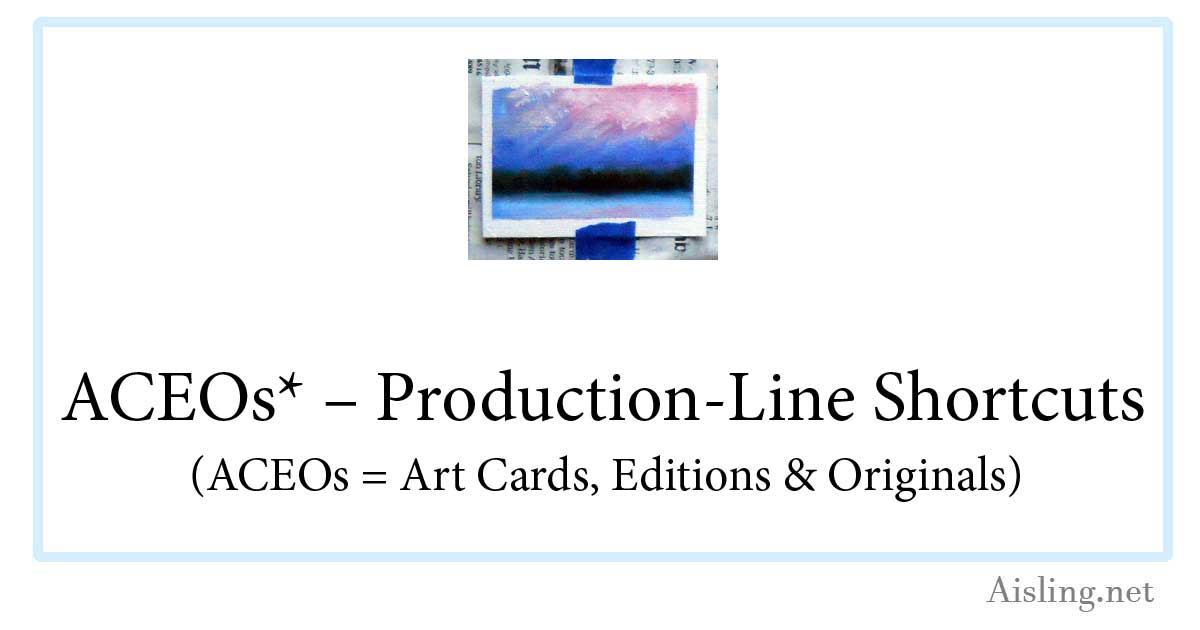
ACEOs – Production-line shortcuts

ACEO - in progressI’m trying some oil paintings as ACEOs.  (That stands for Art Card limited Editions and Originals, a kind of artists’ trading cards.)

Because traditional art cards (including ACEOs) are the same size as other trading cards (like baseball cards, etc.), the 2.5″ x 3.5″ ACEOs can be tricky to work with if you’re painting with oils or acrylics.

My first attempt revealed a few flaws that I’ll fix with the next batch.  However, here’s what I did:

First, I covered a masonite sketch board (shown below, at right) with newspaper, held in place by a Very Big Elastic. (The elastic comes with the sketch board when you buy it at any arts or crafts store, or you can simply use one from other packaging… but you may not need it at all.)

Then, I positioned a series of blank ATCs (artist trading cards) approximately where I figured they should be, to mask them. (Michael’s and other stores sell these canvas-textured blanks in the same aisle as their fine art drawing & painting supplies.)

Next, I used blue (easy to peel off) painter’s masking tape to tack blank ACEOs in place.

After that, I laid down strips of that same tape, masking the edges of the cards, usually about 1/4 inch.  (That’s not shown in the photo.)

And then, of course, I painted them… at least with an underpainting (my signature cadmium red) and then the first layer of oil paint.

Impatient to see how they’ll look, I peeled off the long strips of masking tape.  The result is in the photo on the right.

One card tore slightly as I was peeling off the tape.  (The tear was a small surface tear and it can be repaired with glue.) I’m not sure if that issue can be wholly avoided with this process, but I’ll keep experimenting.

I tweaked some of the cards while this first layer of paint is wet.  I wanted to cover the cadmium red that had seeped under the tape more than the oil paint did.  Alas, some of the tweaking ventured into the ACEOs’ white margins.

While these cards dry, I’m starting a new batch of ACEOs.  This time, I used a ruler to position the cards and the tape, so it’s more regular.  So far, so good.

The oil paint will take at least a week or two to dry enough for the next layer of paint, so these cards won’t be completed very quickly.   I’m aiming to have the first batch of ACEOs ready to ship in about a month.

However, I see several merits to using ACEOs for oil paint (or acrylics):

1. These allow me to experiment with designs on a small scale, to evaluate them for larger paintings.  These cards are sort of like thumbnail sketches, but more finished.

2. I can sell these ACEOs for far less than my paintings, making them easy for new art collectors to purchase.  (I’m very enthusiastic about the Cheap Art Manifesto as much as it’s practical… while still being a professional artist.)

3. Shipping the ACEOs will involve wax paper (to protect the surface of the card) and some cardboard rectangles as support in the mail.  Then, each card can go in an envelope… cheap and easy!

As soon as I’ve worked out more of the bugs, I’ll create a sheet that you can easily use to layout the blank cards yourself, if you’d like to try a painterly approach to ACEOs.

ATC – Spalding Inn, NH

Spalding Inn, Whitefield, NH - ATC by Aisling D'ArtThe subject of this pen & ink ATC is the Spalding Inn. I’m not entirely sure why that hotel fascinates me, but it does.

My husband and I have stayed there several times.

And it helps that my uncle and his wife used to vacation there. There’s a sense of heritage, I guess.

But… I don’t know.  It’s more than that.

The Spalding seemed a logical subject for an ATC.  It’s the final ATC in this series of six, and obviously the most detailed.  (The previous ATC, displaying a rose, led up to it.)

Though this country hotel has a charming history and – supposedly – a few great ghost stories, it’s not actually associated with UFOs.

The reason I put a flying saucer in this ATC is because the Spalding Inn is along the flight path described by America’s first known alien abductees, Betty & Barney Hill… and I wanted something interesting in the sky.  (The design of the card is based on my fine art painting of the Spalding Inn.)

The Spalding Inn is located in Whitefield, New Hampshire.  It’s near Mount Washington, and it’s generally in a perfect location for exploring the White Mountains.

As of 2019, and perhaps earlier, the hotel closed when its previous owners sold it. I think a local company bought it, but I’m not sure.

That also makes it a great location for any artist to set up an easel and paint, en plein air. From any spot on the hotel’s property, there are amazing views in any direction… all year ’round.

You can download a free, printable copy (at 150 dpi) of this Spalding Inn ATC by clicking on the image above, or by clicking here.

ATC – A Simple Rose

ATC - roseFor me, this ATC (artist’s trading card) was about design.  I wanted to see if I could use a simple subject and create enough visual interest so people don’t simply glance at it and say, “Ho-hum, it’s just a rose.”

I’m not 100% certain that I achieved that, but I think the various shading techniques work well enough.

This ATC actually repeats an exercise that I did in my junior year of high school.  I’m not kidding.  I’d learned a lot from it, and it’s stuck in my memory as something very positive.

Like my other ATCs in this series, this card was drawn with a Size 0 (zero) point rapidograph-style pen.  It’s a Koh-i-noor Rapido Drawing Pen, and I love it.  Unlike older rapidographs that I’ve used since college (when dorm friend/artist Darcy Grimm showed me her rapidograph), this one doesn’t seem to clog easily.  That’s a huge plus, and it’s one reason why I’m doing far more artwork with it.

Anyway, it’s all dots & lines in this ATC, and I’m pleased with it.  You can download a printable copy (at 150 dpi) by clicking on the card image, above, or by clicking here.

ATC – City/Stars in pen & ink

ATC - pen and ink - city stars This ATC is typical of the scribbles that decorated my class notes starting around age 12.

Bored out of my mind in junior and senior high school, I only half-listened to teachers. (Yes, I regretted that later.)

Instead, I drew a variety of designs, usually a series of connected images like the one at left.

For me, the squares and rectangles represent the architecture of the city.  The swirls represent the city’s energy, and the stars are the dreams and real-life stars, while the circles are clouds and bubbles of creativity.

Free download

You can download your own copy of this ATC by clicking on the image at left, or by right-clicking here and saving it to your hard drive. Print it at 150 dpi so it’s 2.5″ x 3.5″.

This is one of six ATCs that I created in October 2010, experimenting with a new pen.  (It’s a Size 0 point Koh-i-Noor Rapido Drawing Pen.)

Evolution of this style

When I was a teenager, I sometimes drew these designs in ink and just left them as-is.

Others were drawn in pencil during school.  Later, at home,  I drew over the pencil with India ink and my crow quill pen.

When the ink was fully dry, I’d add color.  My mother had paints left from her years as an air brush artist (Dr. Ph. Martin’s radiant, concentrated watercolors) and I used those because the colors were so vivid.  Generally, my color choices included magenta, turquoise, lime green, and yellow.  I used purple as well, but carefully; it’s a color that can dominate artwork very easily.

One of these drawings — painted with acrylic paints — decorated a residential elevator on Marlborough Street in Boston (MA) in 1970.  I remember showing it to musician Jaime Brockett when he visited me, and he could barely believe I’d created it.

Even then, I don’t think my appearance or demeanor matched who I really am.

Another  of these designs became a wall mural in an office just outside of Salt Lake City (UT) in 1973.  It’s no longer visible, of course, but I like to think that it still exists under layers of paint and tasteful wallpaper.

(Hmm… have I mentioned that I was a rather mobile hippie in that era?)

The art themes

These kinds of scribbles have a lot in common with work by Peter Max, but I don’t think he was popular when I began drawing these.

In fact, I think the art in my class notes (and this ATC) drew upon the same cultural icons that inspired Max and others. (The posters for the Grateful Dead and for concerts in general —  particularly around San Francisco — also featured similar imagery.)

When I adopted elements from any popular art, it was probably from a TV show that (I think) aired in the afternoons when I returned home from high school. It had a title like “The Amazing World of Dr. Silver”, but that’s not quite right. I’m pretty sure it was on PBS and produced in Boston, Massachusetts.  (Does anyone else remember this show?)

Mostly, there was a certain style to the art of the late 1960s and early 1970s.  It was happy but also complex, in its own way.

This ATC reflects that.

ATC – Desk chair

ATC of desk chair, printable copy linkedThe next ATC (artist’s trading card) in my pen-and-ink art experiments features my husband’s desk chair.

I drew it with a Size 0 (zero) point technical drawing pen.  I’ve been using this kind of pen for art since I was introduced to them by a college friend, Darcy Grimm.

The ink is called Ultradraw, and it’s Koh-i-Noor’s India ink for artists, illustrators and draftsmen.

Once that ink is dry, it’s usually waterproof and I can paint over the ink with watercolor paint or use watercolor pencils with water.

It’s ideal for sketchcrawls and other sketches that might become more formal artwork.

This ATC shows a comfy chair upholstered in a grey tweed, and our cat loves to sit in the chair when my husband isn’t in it.  (Otherwise, the cat likes to sit in HT’s lap.)

To protect the chair from our cat’s long hair, we have a (now somewhat ragged) piece of flannel that’s laundered regularly.  The fabric was on the chair when I drew this ATC.

To print this ATC, right-click on the picture and save the higher resolution copy on your computer.  Then, print the artwork at 150 dpi; it’ll be a 2.5″ x 3.5″ ATC after you trim it to size.

ATC – Pen and ink, fan

Printable ATC - click here to downloadMy second ATC in this series  of six shows our living room fan.  It’s one of those huge grey fans that, on the high setting, blasts you like you’re in a wind tunnel.

Drawing it was sort of a challenge.  I mean, there’s a lot of detail and shading in the actual fan.  Deciding what to include and what to leave out… that was the challenge.

Scaling it down to ATC size was even more interesting.

There are things I might do differently if I were to draw it all over again, but — of course — this was just an ATC… a one-time sketch.  I’m generally pleased with it.

This ATC was drawing with a Size 0 (zero) Koh-i-Noor rapido technical drawing pen on regular paper in my sketchbook.

I started by drawing (in pencil) the 2.5″ x 3.5″ dimensions of a standard ATC.  Then, I began drawing with my pen.  There was no rough sketch to start with, just the outline of the card so I’d get the size right.

About five minutes later (maybe less), it was an ATC.

Pretty simple, huh?

These are super easy.  A good pen makes all the difference.  Sure, you could use any drawing pen, including a felt-tip (like a Sharpie) or a rollerball pen.

However, I think there’s a different quality to more traditional pens, and I think it shows up in the finished artwork.

ATCs are like miniature works of art.  That makes the materials and workmanship more important, in a way.

(Don’t let that scare you off; if the ATC doesn’t look good, you can always put new/different art over it, or throw it out altogether.)

So, for this ATC and the others in this six-card series, I used a rapidograph with Koh-i-Noor’s Ultradraw black India ink. (The ink comes with the pen.)

Right-click on the image to download a printable copy (at 150 dpi)  of this ATC.

ATCs in Pen and Ink

ATCs - Umbrella ATC - October 2010ATCs have always been dear to my heart.  From the 1990s when many ATCs were created on 3″ x 5″ cards, to the 2.5″ x 3.5″ size that became more standard, to the smaller variations that have emerged: ATCs are fun, fast art.

Recently, I purchased a new rapidograph, also called a “rapido sketch pen.”  It’s an easier way to create the kind of drawings I did as a teenager, when I used a crow quill pen and an ink well.

My new pen has a Size 0 (zero) point, and it’s a vast improvement over rapidographs from even 10 years ago.

Anyway, to get used to my new pen, I decided to sketch a few ATCs.  My first is shown at right.  (Right-click on the image to download your own copy.) It’s a contour drawing of my silvery umbrella… the one I take with me when I go outside to paint landscapes in nature.

Like all of my recent ATCs, the original of this card is 2.5″ x 3.5″ and — by right-clicking on the image, above, and saving it to your hard drive — you can print a full-sized copy (at 150 dpi).

This is the first of six ATCs I’ll be posting over the next few days, showing my progress with my new drawing pen.

The signature (ais/em 2010) on these ATCs is sort of a segue between my online name of Aisling and Eibhlin (“Eileen”), the (real) name I paint under.

SketchCrawl as a Business?

The good news is, the next announced sketchcrawl is October 16th.  (See my notes from my July 2009 sketchcrawl.)

Right now, I’m on the fence. The email I rec’d from SketchCrawl.com was very different from the fun, wide-open, no-rules announcements of the past.

A man sketching, on site, as in a sketchcrawl.First, there was this message from that site:

– A key thing, help us spread the word!

If you are reading this, we are sure you have a number of friends that might be interested in this as much as you are. Tell them about SketchCrawl! Let’s share this idea with the rest of the globe. No borders.

“No borders.”  I like that reminder. The idea of a global, art-based event always delights me.

So, I was in a happy mood, already thinking about where I’d like to organize a sketchcrawl in October.

Then, I reached the list of rules that weren’t on previous SketchCrawl announcements.  Here they are, cut-and-pasted from the email.

When you participate, please remember to:

-Notify us of any sketchcrawl events (as applicable)
-Link back to sketchcrawl.com
-Give credit to Enrico Casarosa as the founder
-Must be a non-profit event
-Include sketches in sketchcrawl.com/forums and Flickr pool (as applicable)
-Try and time your sketchcrawls with the World Wide dates we promote at sketchcrawl.com

Those sound reasonable enough, individually, but — in combination — they seem like corporate rules. That seems a little hinky. (Hinky = strange or suspicious.)

I did a quick check.

So far in 2010, the U.S. Trademark Database doesn’t show anything when I search for “sketchcrawl. So, as of 2010, the term “sketchcrawl” is still free to use without trademark-related restrictions.

SketchCrawl trademarked now? Not per the U.S. government.

2023 UPDATE: As of January 2023, at the Sketchcrawl (dot com) site, the “TM” with the name suggests they did trademark it. (Adding a copyright symbol next to that? That’s odd, since the term has been in use for a very long time. He can copyright the site but not the word “sketchcrawl.”)


On one hand, I understand the importance of claiming a word or phrase that’s unique to your business. I’ve failed to do that (repeatedly) with my own projects. That’s been an expensive and disappointing series of blunders.

However, when I did a quick search to see if the Sketchcrawl (dot com) claim was legitimate, the results were interesting.

Here’s my search on 25 Jan 2023:

And here are the results of that search:

So, that suggests the “TM” indication is in error on the Sketchcrawl (dot com) site.

Hmm…

I remain wary.

I’m relieved and a bit baffled.

On one hand, I never want a popular word trademarked. That goes double for a word already in popular use in the arts community.

I don’t like seeing people staking claims, trying to make money off things that were initially created to be free, fun and cool.

But why would someone suggest that they’ve trademarked a term when they haven’t? That’s very weird.

Maybe he doesn’t understand how copyright and trademarks work?

I’d like some clarification. After all, for at least a dozen years, this has been a concern for some of us.

For now, I may organize my own sketchcrawls, as I did in the past. However, I’m uneasy posting them on the Sketchcrawl site.


FREE 24-Hour Zine – Download

Looking for a FREE art zine? Here’s one of mine. It’s from 2010’s “24-Hour Zine Thing” project. You can download this zine, page-by-page, and assemble it yourself. (It’s easy. Really.)

What’s a 24-hour zine?

During July 2010, participants had to go from concept to printed/bound zine in 24 hours or less, and the zine had to be 24 pages long.

We couldn’t prepare anything ahead of time.  We weren’t even supposed to think about what we might put into the zine.

It was exhausting, but I learned a lot!

(See my links at the foot of this article, for more information about the challenge, the diary I kept during the process, and what I learned.)

Remember: This is NOT an art zine.  It’s a rambling, personal zine reflecting my thoughts as I worked on this challenge.

To read (or print) your own copy of this zine

Download these PDF files and print them on letter-sized (8 1/2″ x 11″) paper:

Cover
Pages 1/24
Pages 2/23
Pages 3/22
Pages 4/21
Pages 5/20
Pages 6/19
Pages 7/18
Pages 8/17
Pages 9/16
Pages 10/15
Pages 11/14
Pages 12/13

If you’re not sure how to print &/or assemble the zine, check this article: 24-Page Zine Layout

If you can print back-to-back, do.  That’ll save paper and bulk in the finished zine.

See my hour-by-hour diary (not very cheerful, by the end of the 24 hours…) at Zines – The 24-Hour Zine Thing.

Read my happier summary (posted the following day) and see the contents of a 25th page (that didn’t fit in this zine) at 24-Hour Zine Thing – What I Learned.

And, if you’d like to try making zines, here’s a simple, single-sheet zine project anyone can make, easily: Single-Sheet Zine Layout. (It includes a link to yet another free zine you can download. Not as impressive as the 24-hour one, but it IS an art zine.)