
Sewing Onto Your Journal Pages

You can sew embellishments onto your paper journal pages.

You can use any page in a book like fabric (to sew on, for example) by using iron-on interfacing on the back side of the page.

Yes, just iron it on, the same as you would iron interfacing onto fabric. It won’t always stick 100%, but it will work well enough that you can sew through it.

(If you try to embroider or sew beads onto regular pages in a book, the thread tends to pull right through the paper, if the thread is tugged.)

You can do the same thing with your journal cover. A strong crewel embroidery needle will usually sew through cardboard… but you’ll probably need a thimble to push the needle through.

artists journals cover - treated as fabricYou can then embroider with embroidery floss, yarn, thin ribbon, etc. You can add buttons, beads, and so on, too.

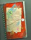
At left, you can see one of my journal covers that I’ve embellished with sewn-on buttons. (Click on the image to see it larger.) The biggest button is part of the journal closure. When it’s not in use, a string of hemp (secured to the back cover) is wrapped around the button on the front cover to hold the journal closed.

After you’ve finished your sewing (or other embellishment), you can glue a page or fabric over the ironed-on interfacing, so your stitches are concealed. If I’m doing a lot of this in a book, I’ll buy a second copy of the same book, so the “backing” page is what it would have been, if I hadn’t covered the original with interfacing.

You’ll find iron-on interfacing at any fabric shop. It’s usually kept in a bin or on shelving next to where they cut fabric yardage for you.

You can also iron on Stitch Witchery or another fusible adhesive, and that gives you the option of sticking something wonderful on the other side… interfacing isn’t all that interesting.

For example, you could fuse an actual piece of fabric to the paper page.

Then again, after I sew beads onto the page, I like to cover the interfacing side with more paper… maybe a collage.

You can sew onto your journal pages, or turn them into fabric. It’s easy!

Foam Brush Notes

PaintbrushesPaintbrushes are important for many artists.  I have lots of them for all purposes.

I use bristle-style brushes for my oil and acrylic painting. Also, I’ll use soft, hair-type brushes when I’m painting with watercolors.

However, for me, one-inch foam brushes are most useful for art journaling.

How I use foam brushes

When I’m creating collages, especially torn-paper collages when I’m art journaling, I apply Yes!Paste with a foam brush. That’s my favorite adhesive for magazine images, tissue paper, and so on.

If I’m using gel medium to seal my art journaling pages, I’ll apply that with a foam brush, too.

I’ll use a similar brush to add glittery paint and to apply gold leaf, too.

Also, I use foam brushes to apply cheap, vivid, cadmium red paint (acrylic) as an underpainting when I’m working on an art shrine (that I’ll also paint) or a fine art painting.

I generally get at least three to five uses from each foam brush.  I wash them thoroughly and promptly after using them.

Some foam brushes are better than others

I used to buy my foam brushes at Michael’s. Recently, to get the best price, I had to buy a package of assorted foam brushes.

That was a mistake. Some of the brush sizes were useless for my work. In addition, the quality wasn’t great.

Now I buy brands that I trust, like US Art Supply’s 1-inch brushes. And – for now – I order through Amazon. It’s convenient. If a product is disappointing, it’s easy to return it, but so far, these brushes have been fine and the price is very good.

Note: If you use the kind with wooden handles, the wood can be recycled in a variety of projects.  (For some of my cloth dolls, that handle is the perfect size to reinforce the doll’s neck, as the wooden dowel will extend from the head through the neck and then into the torso.)

Artists’ Journal RR #2b – Debbie O’s Pages

The following two journal pages are glorious examples of work by Debbie O. of our Yahoo Group, ArtistsJournals.

They’re wonderful mixed media journal pages with fabric elements, and they’re full of personal insights and juicy imagery.

These continue the journey of Round Robin #2b (a larger blank journal) as it traveled across the U.S. and then to foreign lands.

RR Journal #1 – Final American Scans

These are the final scans from the American participants in the round robin (RR) journal #1 that began at ArtistsJournals in April 2010.

The first are 10 pages by Linda Giese:

The next journal pages are by Iris Gonyea:

(The text on that collage says, “Imagination is more important than knowledge.” — Albert Einstein.)

Now, the journal will remain with me for about a week or ten days, and I may add something to it.  Then, it will be on its way to Stephen du Toit in England, to begin the international portion of its journey.

RR #1 – Pages 11 through 15

These are more scans from the round robin (RR) journal #1, launched in April 2010 for the ArtistsJournals group at Yahoo Groups.

The details in some of these images required very large file sizes.  However, the load time delay (if any) is worth the wait.

The first group of pages were by Dot McQuade:

Page 11 – Alphabet stamp from Turtle Press, pelican stamp carved by Dot McQuade.

Journal page, pelican stamp carved by Dot McQuade

Page 12

Page 13 – Dragonfly and butterfly stamps carved by Dot McQuade.  Bathtub stamp carved by Dot’s husband, Dan McQuade.  “Dots” stamp by Stampin’ Up.

The next two two-page spreads are by Lorna Sommer:

Page 14

Page 15

If you’re inspired by illustrated journals, many books feature related art.  Favorites include True Colors: A Palette of Collaborative Art Journals, and Artists’ Journals and Sketchbooks: Creating Personal Pages, and 1,000 Artist Journal Pages.  (My artwork is included in the latter.)

[table id=1 /]

Though those books aren’t “how-to” guides, and they can be overwhelming for beginners.  However, each book is amazingly visually inspiring.

Round Robin Journal #1 – ArtistsJournals Group

Last April (2010), I launched two round robin (RR) journals at ArtistsJournals2 (aka AJ2) at Yahoo Groups.  (Since then, AJ2 merged with my main ArtistsJournals group at Yahoo Groups.)

RR Journal #1 has returned to me.  I’m scanning it before sending it to Stephen in England, to begin the international segment of this journal’s adventures.

The first several pages are below, but the image files are large.  Please wait for them to fully load.

I’ve scanned the first ten pages of the journal, so I’m about 1/3 of the way through it.  Here are the pages, so far.

The first four pages are my own torn-paper collages.  (The glitter and gold leaf don’t really show up in the scans.)

The next three two-page spreads are by ffyrebird:

The next series of pages are by Lynn Trochelman:

ATC – Spalding Inn, NH

Spalding Inn, Whitefield, NH - ATC by Aisling D'ArtThe subject of this pen & ink ATC is the Spalding Inn. I’m not entirely sure why that hotel fascinates me, but it does.

My husband and I have stayed there several times.

And it helps that my uncle and his wife used to vacation there. There’s a sense of heritage, I guess.

But… I don’t know.  It’s more than that.

The Spalding seemed a logical subject for an ATC.  It’s the final ATC in this series of six, and obviously the most detailed.  (The previous ATC, displaying a rose, led up to it.)

Though this country hotel has a charming history and – supposedly – a few great ghost stories, it’s not actually associated with UFOs.

The reason I put a flying saucer in this ATC is because the Spalding Inn is along the flight path described by America’s first known alien abductees, Betty & Barney Hill… and I wanted something interesting in the sky.  (The design of the card is based on my fine art painting of the Spalding Inn.)

The Spalding Inn is located in Whitefield, New Hampshire.  It’s near Mount Washington, and it’s generally in a perfect location for exploring the White Mountains.

As of 2019, and perhaps earlier, the hotel closed when its previous owners sold it. I think a local company bought it, but I’m not sure.

That also makes it a great location for any artist to set up an easel and paint, en plein air. From any spot on the hotel’s property, there are amazing views in any direction… all year ’round.

You can download a free, printable copy (at 150 dpi) of this Spalding Inn ATC by clicking on the image above, or by clicking here.

ATC – A Simple Rose

ATC - roseFor me, this ATC (artist’s trading card) was about design.  I wanted to see if I could use a simple subject and create enough visual interest so people don’t simply glance at it and say, “Ho-hum, it’s just a rose.”

I’m not 100% certain that I achieved that, but I think the various shading techniques work well enough.

This ATC actually repeats an exercise that I did in my junior year of high school.  I’m not kidding.  I’d learned a lot from it, and it’s stuck in my memory as something very positive.

Like my other ATCs in this series, this card was drawn with a Size 0 (zero) point rapidograph-style pen.  It’s a Koh-i-noor Rapido Drawing Pen, and I love it.  Unlike older rapidographs that I’ve used since college (when dorm friend/artist Darcy Grimm showed me her rapidograph), this one doesn’t seem to clog easily.  That’s a huge plus, and it’s one reason why I’m doing far more artwork with it.

Anyway, it’s all dots & lines in this ATC, and I’m pleased with it.  You can download a printable copy (at 150 dpi) by clicking on the card image, above, or by clicking here.

ATC – City/Stars in pen & ink

ATC - pen and ink - city stars This ATC is typical of the scribbles that decorated my class notes starting around age 12.

Bored out of my mind in junior and senior high school, I only half-listened to teachers. (Yes, I regretted that later.)

Instead, I drew a variety of designs, usually a series of connected images like the one at left.

For me, the squares and rectangles represent the architecture of the city.  The swirls represent the city’s energy, and the stars are the dreams and real-life stars, while the circles are clouds and bubbles of creativity.

Free download

You can download your own copy of this ATC by clicking on the image at left, or by right-clicking here and saving it to your hard drive. Print it at 150 dpi so it’s 2.5″ x 3.5″.

This is one of six ATCs that I created in October 2010, experimenting with a new pen.  (It’s a Size 0 point Koh-i-Noor Rapido Drawing Pen.)

Evolution of this style

When I was a teenager, I sometimes drew these designs in ink and just left them as-is.

Others were drawn in pencil during school.  Later, at home,  I drew over the pencil with India ink and my crow quill pen.

When the ink was fully dry, I’d add color.  My mother had paints left from her years as an air brush artist (Dr. Ph. Martin’s radiant, concentrated watercolors) and I used those because the colors were so vivid.  Generally, my color choices included magenta, turquoise, lime green, and yellow.  I used purple as well, but carefully; it’s a color that can dominate artwork very easily.

One of these drawings — painted with acrylic paints — decorated a residential elevator on Marlborough Street in Boston (MA) in 1970.  I remember showing it to musician Jaime Brockett when he visited me, and he could barely believe I’d created it.

Even then, I don’t think my appearance or demeanor matched who I really am.

Another  of these designs became a wall mural in an office just outside of Salt Lake City (UT) in 1973.  It’s no longer visible, of course, but I like to think that it still exists under layers of paint and tasteful wallpaper.

(Hmm… have I mentioned that I was a rather mobile hippie in that era?)

The art themes

These kinds of scribbles have a lot in common with work by Peter Max, but I don’t think he was popular when I began drawing these.

In fact, I think the art in my class notes (and this ATC) drew upon the same cultural icons that inspired Max and others. (The posters for the Grateful Dead and for concerts in general —  particularly around San Francisco — also featured similar imagery.)

When I adopted elements from any popular art, it was probably from a TV show that (I think) aired in the afternoons when I returned home from high school. It had a title like “The Amazing World of Dr. Silver”, but that’s not quite right. I’m pretty sure it was on PBS and produced in Boston, Massachusetts.  (Does anyone else remember this show?)

Mostly, there was a certain style to the art of the late 1960s and early 1970s.  It was happy but also complex, in its own way.

This ATC reflects that.

ATC – Desk chair

ATC of desk chair, printable copy linkedThe next ATC (artist’s trading card) in my pen-and-ink art experiments features my husband’s desk chair.

I drew it with a Size 0 (zero) point technical drawing pen.  I’ve been using this kind of pen for art since I was introduced to them by a college friend, Darcy Grimm.

The ink is called Ultradraw, and it’s Koh-i-Noor’s India ink for artists, illustrators and draftsmen.

Once that ink is dry, it’s usually waterproof and I can paint over the ink with watercolor paint or use watercolor pencils with water.

It’s ideal for sketchcrawls and other sketches that might become more formal artwork.

This ATC shows a comfy chair upholstered in a grey tweed, and our cat loves to sit in the chair when my husband isn’t in it.  (Otherwise, the cat likes to sit in HT’s lap.)

To protect the chair from our cat’s long hair, we have a (now somewhat ragged) piece of flannel that’s laundered regularly.  The fabric was on the chair when I drew this ATC.

To print this ATC, right-click on the picture and save the higher resolution copy on your computer.  Then, print the artwork at 150 dpi; it’ll be a 2.5″ x 3.5″ ATC after you trim it to size.