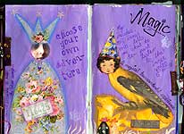
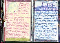
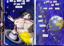
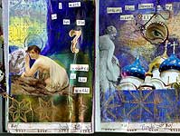
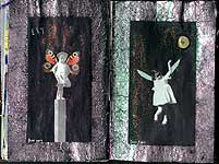
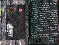
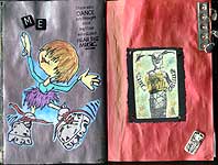
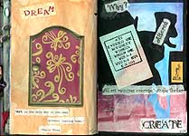
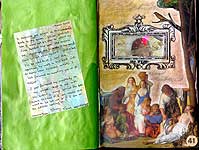
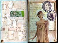
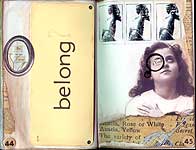
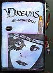
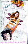
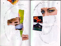
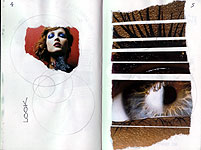
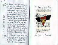
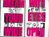
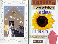
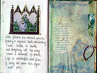
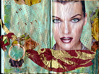
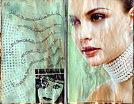
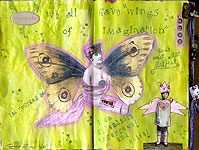
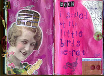
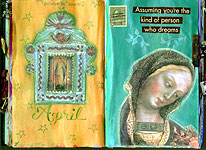
Artist’s journals are illustrated diaries and journals on any theme.
An artist’s journal – or art journal – can be a record of your daily thoughts, a travel journal, an exercise or diet diary, a dream journal, a place where you jot down your goals or to-do lists, or… well, almost any record that you’d like to keep in a book or notebook.
They become “artist’s journals” when you add any kind of art, illustration or embellishment to the pages.
On this page:
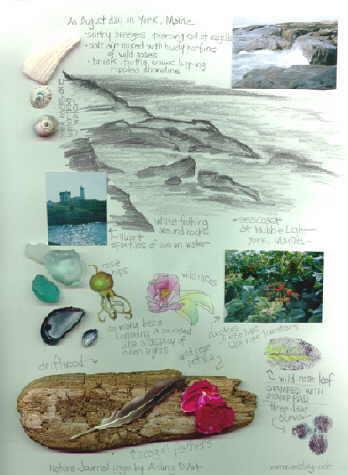
This is a travel journal page I created after visiting “The Nubble” lighthouse in York, Maine (USA). It’s a mixed media work, combining sketches, photos, beach glass, shells, and driftwood from that journey. The original is part of a 9″ x 12″ spiral-bound sketchbook.
This is a collage to honor the music of Dr. John (aka Mac Rebbenack). It’s art I created for the Homage to Music card deck exchange hosted by Red Dog Scott.
Dr. John is among my favorite musicians, since I first heard his music around 1970. On an early album, Gumbo, he described his sound as “a combination of Dixieland, Rock & Roll, and Funk.” Add a little Mardi Gras and gris-gris, and you’ll get the idea.
Not everyone understands his music; I do, and it inspires much of my art.
This collage was over a month in preparation. Here’s how I made it.
The first step: gesso and paint the canvas
I started with a stretched canvas that I’d primed with gesso, and then painted metallic gold (spray paint).
Then, I began layering Burnt Sienna, Cobalt Blue, French Ultramarine Blue, and finally a black that I mixed using French Ultramarine and Burnt Umber.
Because I use oil paints for their depth of color, each layer had to dry for at least ten days.
(In workshops, I use acrylics because the layers dry in minutes, not weeks.)
Then, I sanded it down for added texture
After the layers were dry, I began sanding them down for texture. Beneath the canvas, I place a wooden block just inside the stretcher bars, so the canvas was evenly supported.
I sanded down different amounts in different areas.
Next, I “painted on” a piece of antique lace. Over that, I glued three strips of teal chenille yarn.
For small pieces, I use the Golden Medium as glue; for larger pieces, I use hot glue.
Then, I added feathers. Some were gathered at the beach, others were purchased.
Sealing the canvas was next
Next, I coated the entire canvas with more Golden Medium, and waited for it to dry until tacky. At that point, I began applying Gildenglitz. For the larger areas, I increased the adhesion with pieces of double-sided tape.
Embellishments and ephemera took it to the next level
Almost finished, I glued on a dollhouse Parcheesi board, a plastic lizard, and a heart milagros that I had sprayed gold and highlighted with Dr. Martin’s calligraphy ink, in copper.
And finally, gold leaf highlights
The final step—when everything else had fully dried—was to add highlights with Rub N Buf gold leaf, in antique gold.
When I teach related workshops, I encourage students to work with rich & deep colors, gold leaf or glitter, and found objects.
Sometimes, found objects — natural ones like leaves and feathers, or bit of metal found by the roadside and in parking lots — can take this kind of collage to the magpie level, too. I love the whimsy of that.
This tribute to Dr. John remains one of my favorite collages.
Breakthrough art – as a process – is sometimes defined as art that challenges the artist.
It’s when an artist takes their work in a dramatically different direction, just to see what happens.
Maybe they like it. Maybe they hate it.
Either way, they learn something about themselves, their art, and their unique creative process.
First, the history of one disastrous “Breakthrough Shrines” workshop.
(It’s okay to skip this backstory.)
When I taught Breakthrough Shrines at Artfest 2004, it was unexpectedly controversial.
The theme was “Art Shrines from Dark to Light.”
In that half-day workshop, students would start with dark (or dark-ish) rubbings on paper as a background.
Then, inside a shallow box, they’d build upon that background, adding two- and three-dimensional items. They could lean into dark themes or—as intended—use elements to segue into lighter subjects.
Either way, it was up to them, and the result might be a collage or an assemblage, depending on the items they added. (Or, it might be a half-finished work casting light on their own artistic processes.)
What emerged—literally and figuratively—could give them fresh insights into dimensional art and their own artistic process.
These workshops had been inspired by one of 2004’s most popular books and movies, Harry Potter and the Prisoner of Azkaban.
Its ending had set the leading characters on a new path, albeit an uncertain one.
I wanted to emulate that, but in a workshop for artists eager to explore their creative boundaries… and push past them.
Leaning into that theme, I’d brought a wide range of materials for students to use. They included beach shells, coins, pressed pennies, vintage jewelry, handmade castings, and other textured items to use for rubbings.
I also encouraged them to take paper and charcoal or conte crayons, and go outside to make rubbings. (Artfest 2004 was held at Fort Worden Historical State Park. It offered an abundance of sites with surfaces and materials ideal for making rubbings.)
Also, for those who wanted to start with really “dark” themes, some of my castings were from 18th-century (and earlier) New England sites, including memorials.
Most of those castings featured angels and religious themes, but some were— admittedly — gothic. (Note: All were responsibly cast, legally, using techniques that risked no damage to the original art and carvings.)
Some of my Artfest students were delighted to have access to those casings; others were very creeped out by the 18th-century images. They complained loudly about my workshop.
By contrast, I taught this same workshop at other venues that year (and in 2005), with the same materials, and it was always well received.
Regardless, that was the last year I taught at Artfest.
(That was okay. For many years after that, I taught at other, larger events such as Dragon Con. Clearly, my workshop style was a better match for those audiences.)
And now, here’s what the workshop was actually like, at each venue where I conducted it…
The purpose of this workshop
This particular class was designed as a process-based experiment intended to push students toward artistic expression outside their comfort zones.
We weren’t trying to create art to impress friends, family, or even ourselves. It wasn’t a by-the-numbers class. The finished work (if it even was finished in the classroom) didn’t matter as much as understanding the art process, and how it helps us understand ourselves.
Some caught the spirit of the exercise and produced amazing work. Others used the workshop as an opportunity to test new materials and techniques, with no other goals in mind.
At its conclusion, most students left the workshop happy. A few practically had to be pried away from the desks, as they wanted more time to work with more experimental pieces.
The following notes summarize those workshops and the pre-class mini-class held the night before.
You can adapt this process to fit your goals, whether that’s pushing your creative boundaries or producing a fresh, fun art shrine that you’ll display with pride.
Step one: Prepared the shrine container
To get the most from this shrine-creation process, start with a medium-small box.
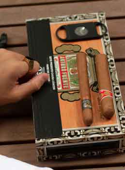
For my students’ use, I usually brought cigar boxes made from heavy cardboard with a paper surface. (You can buy them for less than $5 each at Amazon.com.)
A typical cigar box (underneath the cigars, etc.) – Photo courtesy of Gabriel Lima.
Of course, you can use wooden cigar boxes, or almost any box.
However, the surface should be something that plaster and gauze will stick to. (If the container is slick, painted, or metal, you may need to sand it and/or coat it with gesso.)
After waiting for the shrine’s exterior to dry—usually overnight—it’s time to create the interior.
I recommend using rubbings for your backgrounds. They’re a fast way to cover a lot of the surface, uniquely.
In addition, rubbings can reveal some interesting images you hadn’t expected.
You’ll create the rubbings using any kind of paper, from printer paper to tracing paper to… well, whatever comes to mind and is thin enough to pick up details on whatever’s below it.
The paper should be flexible but not too flexible. You’ll want to capture the textures beneath the paper, without tearing it.
In most cases, it’s smart to secure the paper with adhesive tape; I use blue “painter’s tape.” It’s unlikely to leave any marks or residue on the support surface.
To make the marks, rub a soft marker (but not a magic marker or felt writer) over the paper, picking up details from the support surface. Conte crayons, soft pencils, or even children’s everyday crayons can work well.
In real life, any kind or quality of rubbing will work. The rubbing can be flawed, missing areas, or even ugly. That’s okay! The point is to look at surfaces in a new way and then integrate the results into your finished shrine.
Try rubbings from:
a screen door
the sidewalk outside your home
metal plates and markers at historical locations*
the numbers from your front door
objects in your jewelry case or from your kitchen tools
keys and coins in your wallet, or
textured items like rubber stamps.
*Note: Check with authorities before making any rubbings at historical sites, monuments, churchyards, cemeteries, etc. In some communities, the art on stone – and some metal – surfaces can be fragile, and easily worn down if used for rubbings. (In some communities, it can be illegal to create rubbings at some locations.)
These rubbings are primarily backgrounds for mixed-media embellishments. You can use just one large rubbing, or piece several together, side-by-side or layered as a collage.
Once you have a background you like, start adding items – created, purchased, or found – in layers. I encourage students not to think about this too much, but instead add items and embellishments on impulse.
Those items can be anything from coins to buttons to snippets of fabric, or small toys, playing cards, junk jewelry, or… well, absolutely anything. The idea is to make this a three-dimensional piece, preferably with quirky bits placed impulsively.
You can glue or tape them in place as you work, or arrange the pieces as you think you’d like them, and then go back and use glue, etc. (I encourage you to glue or tape as you go along. Don’t get too finicky about this.)
Then pause. See what the shrine is telling you, either a story or something about where your art is going… or both. Or maybe neither!
Step Four: Stop when it feels right to stop.
Whether you’ve added one more element or 20 of them, pay close attention to your intuition. Stop when it feels right to stop. Or when you can’t seem to decide what to add (or remove) next.
Definitely stop if you feel bored, tired, angry, or even sad about the shrine.
It’s better to stop too soon than to continue and risk that more elements might conceal the essence of the finished piece.
Step Five: Revisit the shrine days (or even weeks) later
Put the shrine aside for at least a few days. When you revisit it, you should be ready to look at it as if someone else had made it.
See what catches your attention. Consider what the shrine might be telling you about yourself, and directions you may want to explore with your art.
If you don’t like the shrine, you can take it apart to use pieces in another project or even throw it out.
However, even if you truly hate it – and this sounds preposterously woo-woo – I still recommend putting it aside for a few months, or even a year.
Then, take a fresh look. See if you feel differently about it, and if it speaks to you about your past, your art, or… well, something else.
After completing the inside of the shrine, finish the outside by layering paint and polyurethane to add color and depth to the gauze. (Or, if you were aiming for a “mummy” effect, perhaps tea stain it?)
Optional extras: Easy antiquities and other finishing techniques
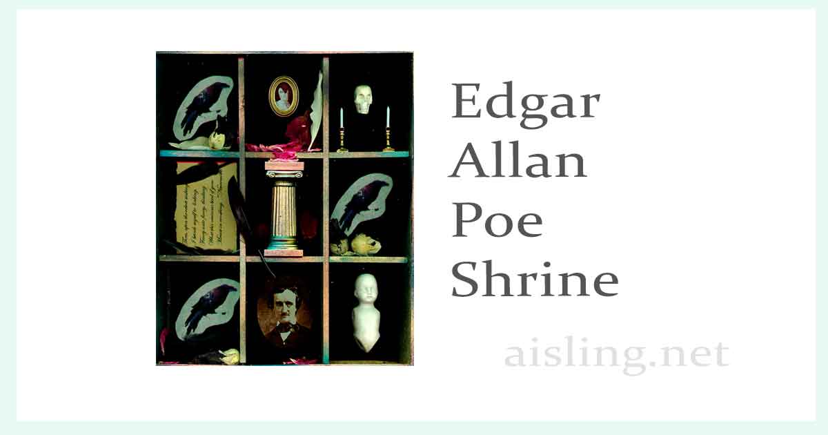
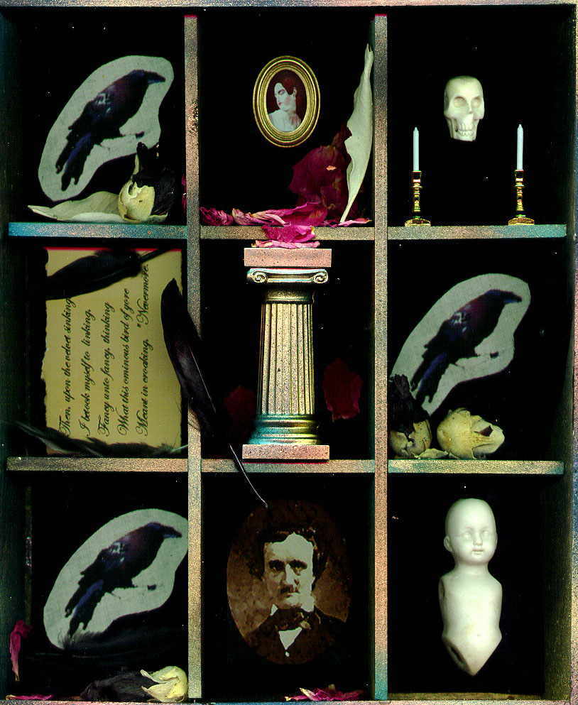
The Edgar Allan Poe Art Shrine is one of my favorite assemblages.
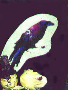
The elements include a raven printed on muslin, in three sections.
I found him in a Dover book, and added color in PhotoShop (Image-> Adjust-> Saturation).
Then, I printed him on iron-on tee shirt transfer paper that worked with inkjet printers. (This was back in 2009.)
I repeated the design several times on the paper, and then ironed the raven onto plain muslin, which I later cut to size. The edges were treated with Fray Check, a Dritz sewing product that prevents unravelling.
Black feathers and dried Black Malva flowers, plus dried wild rose petals, accent these compartments.
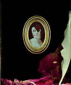
The portrait in the gold oval frame is Virginia, Poe’s great love.
I found her portrait in an old biography of Edgar Allan Poe, and copied it.
I printed it with sepia brown ink, on my inkjet printer.
The frame is a dollhouse decor frame.
In front of her rest dried wild rose petals, gathered at the seashore. I usually collect them at the park at Cape Neddick “Nubble” Lighthouse, in York, Maine, just over the border from New Hampshire.
A leaf of dried sage is to the right of the portrait. Traditionally, in addition to sage’s popularity in cooking – it’s used in turkey stuffing/dressing – it also signifies healing. It’s also supposed to be an aphrodisiac.
According to Poe’s biography, he never recovered from the death of his wife. So, the healing quality of sage is most appropriate.
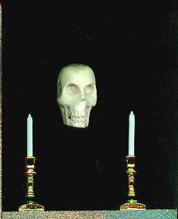
In the section to the right of her, there is a skull which was hand-carved from a deer’s antler. I found it at a flea market in Hollis, NH.
That dealer sells all kinds of weird and wonderful antique and reproduction beads and trinkets. He had only a few of these, and while it felt creepy buying one, it also seemed the right kind of creepy for this shrine.
In front of the skull are brass-colored metal candlesticks and dollhouse candles (probably plastic). I really like including dollhouse items in my shrines, especially if they look reasonably accurate. They can be pricey, but I find the best deals at crafts supply shops; these came from A.C. Moore in Nashua, NH.
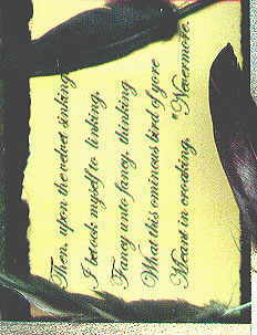
In the center section, the lines of poetry are from The Raven.
The scan quality isn’t very good in this copy, so here’s what the lines say:
Then, upon the velvet sinking I betook myself to linking, Fancy unto fancy, thinking What this ominous bird of yore Meant in croaking, “Nevermore.”
Next, a golden and teal-colored pillar represents Poe’s famous Fall of the House of Usher.
In the bottom row, the center image shows a photo of Poe, taken from his biography. I’ve modified this so it looks somewhat pointillist, and a little eerie.
At the far right is a limbless china doll’s body. I’m not certain why I included it, but it adds to the Gothic sensibility of the piece. It also came from the flea market in Hollis, NH.
The outside of the wooden shrine was painted black. On the back, I glued a title card and signed the piece.
The shrine is about 8 3/4 inches wide, and about 10 1/4 inches tall. It was completed in late September 2000, and immediately purchased by a happy collector.
Art should always be fun, and perhaps a little flippant. Here’s one way to make an art shrine using a small, empty matchbox… the kind you’ll find at a dollar (or £) store.
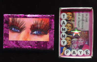
Shrine to the goddess of mascara,
Tammy Faye Bakker Messner
Tammy Faye Bakker Messner (March 7, 1942 – July 20, 2007) remains an icon today as she was during her brief time with us.
Her continuing optimism was a beacon for all of us. Her sincerity was almost as remarkable as her mascara — or were those false eyelashes…or both?
When I began working with art shrines, I had to make at least one shrine to her.
When I had reason to create sample “pocket shrines,” it was clear that one had to be to Tammy Faye. Few women have achieved such distinction in modern society. She was a legend in her own time, and success never spoiled her.
Inside the shrine, I’ve posted one of my favorite quotes from Tammy: “I’m just a small-town girl at heart.” (How could anyone not fall in love with someone that sweet and naive?)
The Supplies
The box is a plain matchbox, bought at a scrapbooking store in Massachusetts.
You can buy blank matchboxes at Amazon.com, usually in bulk. Also, discount stores and smoke shops often carry inexpensive (full) matchboxes. Empty them and cover them with art. (I suggest trying one or two of these art projects before buying 50-or-so blank matchboxes.)
I lined the matchbox with a glitzy, iridescent pink fabric that I bought at the local JoAnn Fabrics.
Thebeads that spell dear Tammy’s name can be found at Amazon.com, and the little star bead was from a bead shop in Harvard Square (Cambridge, MA).
The photos of Tammy are from several websites. Use any search engine to find “photos of Tammy Faye Bakker.” If any are too small, you can use a service like MidJourney’s Upscaler, to produce a crisp, clear, larger photo.
The outside of the matchbox is covered with a thin foil, which I got from Gayle Page-Robak.
My Art Shrine Process
To start, I cut out a photo of Tammy to feature her remarkable blue eyes.
The eyelashes are false, bought for $2.74 at WalMart. They’re the closest that I could find, to the “official” false eyelashes given to lucky members of the audience at the premiere of “The Eyes of Tammy Faye.”
(I have since acquired two sets of the official false eyelashes from the movie premiere. However, you can probably find similar eyelashes at any dollar store.)
I glued the eyelashes, beads and fabric in place with Perfect Paper Adhesive. Everything else was glued with Rollataq, but any paper adhesive could work fine.
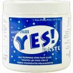
(Now, I use Yes! Paste, the far better adhesive I prefer for all of my collage art. It’s pricey, but lasts forever, is repositionable for a while, and nothing puckers or buckles. Big thanks to Nancy and Milan for recommending it!)
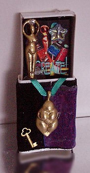
Here’s another matchbox shrine, simply called “Create!” It was inspired by a visit to an antiquities museum in London (England).
If you have any questions about making these kinds of art shrines, leave a comment. I’ll answer as helpfully as I can!
[P.S. I’ve been enormously flattered by the many requests for the Tammy shrine, but it’s not for sale.]
This is one of my workshop samples. It’s a pocket shrine in an embellished matchbox.
When I made this, I was inspired by a visit to the China pavilion at EPCOT’s World Showcase, in Orlando, Florida.
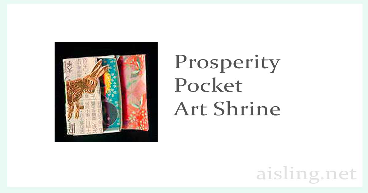
The left photo shows the outside of the shrine, and the right photo shows the matchbox, opened.
For this shrine, I used a plain matchbox that I’d covered with pieces of a Chinese newspaper.
I glued the hare (rabbit) sticker (from a swap) to the outside of the box, partly because I was born in the year of the hare. Then, I added the word “Prosperity,” since—in Chinese culture—the hare is a sign of longevity, peace, and prosperity. I like that idea.
Also, I cut the outside (the cardboard case) of the matchbox so that it would serve as a “door” to the shrine. It opens and closes, making the shrine interactive.
If you’re going to do something similar, I recommend gluing the case to the matchbox. For this shrine, I attached the case with a small amount of hot glue. So far, it’s held up well.
Inside the shrine—and for fun—I used decorated origami papers and other items that seemed to fit the theme.
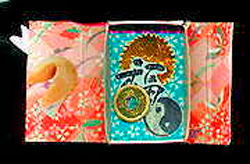
Inside the Prosperity pocket shrine, with the “doors” open on either side.
Elements in this shrine include:
a gold paper notary seal
the Chinese symbol/word “prosperity” from a rubber stamp
a yin/yang symbol on a Chinese newspaper
and a small replica of a Chinese coin, held in place with hot glue.
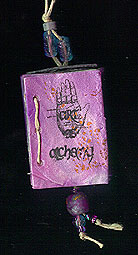
I created this pendant shrine for a friend. The symbols in it were specific to her interests.
When I started this project, I knew that I wanted to make a pendant/shrine using a matchbox, a Premo-covered book, and hemp and glass beads strung together.
The results were fabulous!
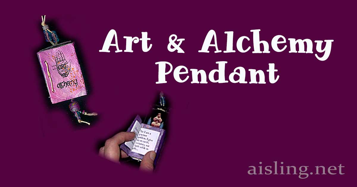
Here’s how it looks from the outside. First, I created the little book to match the size of the matchbox cover. It has just a few pages inside.
The book was printed on paper, folded and bound with muslin, glued inside the covers, and then bound with hemp twine, which is also used for beaded strands.
The pendant was made from a matchbox covered with metallic purple Premo (polymer clay) with added gold leaf accents. The images on clay were applied from laser prints, with gin.
It’s been years since I made this, but I think I printed it backward on paper, turned it print side down on the baked Premo cover, and then soaked the paper with gin so the ink transferred.
Images included a classic “palm reader” hand image and then the words “art” and “alchemy” scaled to the size of the mini-book cover.
I glued the mini-book to the matchbox cover, which I’d painted with a matching metallic purple paint.
When it was dry, I sealed the surface with a clear acrylic spray.
Above, the photo shows the outside of the art shrine/pendant. The book cover opens to a small book
Above, you can see that the inside of the matchbox slides out, revealing the tiny art shrine inside.
The shrine was lined with black velvet fabric, glued in place with Perfect Paper Adhesive.
Inside the shrine, there is a tiny, metallic-looking photo image of an ancient Ishtar figure. (I think it was reduced from a photo in National Geographic magazine.) On either side of the figure, I placed two tiny, actual candles. (I used the smallest birthday candles that I could find, lit them for just a second so the wicks would be black, and then placed them in miniature candleholders made of Premo, as well.)
The beads are glass, or made from Premo and gold leaf, strung on thin hemp cord.
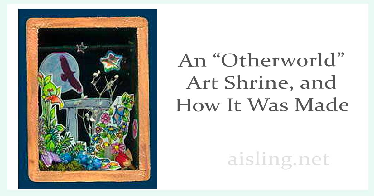
This is a pocket shrine that I created for an art shrine exchange – an art swap – hosted by Patty Harrison in the UK, September 2000.
Artist’s statement:
This box represents the “other” world. It’s the fantasy land of the faeries. In legends, it’s a world similar to ours but also different.
The black sky represents the darkness people travel through to reach this land. The flowers (painted, and dried, natural flowers) are part of the dazzling beauty of this fairy world.
The dangling opalescent star is what gives the shrine movement and life. The small bit of quartz crystal in each box represents “magic” in everyday life, which we add in our own, unique ways.
How each one was created
Preparing the container
I started with small wooden boxes, purchased at the local fabric store, JoAnn Fabrics. They’re each about four inches tall and have a removable lid with a star cut in it. (You could probably use one like this, at Amazon.com.)
I stained the outside of each box light oak and added color stains using a stencil that I’d cut into a classic star shape.
The inside of the lid is painted with gold. Inside the box, I used a moss green shade of Lumiere paint. The back of the box is lined with black plush velvet, which I glued to and wrapped around a cardboard base, before gluing it in place with Aleene’s Tacky Glue.
Then I drilled holes in the sides of the box, inserted part of a bamboo skewer (from barbecue supplies) and painted it black, so it’s sort of like a rod in a closet.
The shrine elements
In the very back, I used a moon-and-black-bird image that I’d created for one of my history websites. The bird represents the Morrighan, of Irish mythological history. She is one of the Tuatha De Danann, also called fairies.
Next, I drew a dolmen and painted it with watercolor. Both this and the moon/bird images were scanned a printed on shiny photographic paper, which I trimmed neatly before gluing the images in place on the velvet.
The flowers and elements of the green world were drawn with a zero-point Rapidograph (any fine-point, waterproof pen—like a Sharpie—will work fine). Then, I painted it with Dr. Ph. Martin’s concentrated watercolors. I scanned the art and printed it in full color on heavy matte paper.
These pieces (two per shrine) were glued, diorama-style, using tabs I’d left on the sides of the art when I trimmed it.
Next, I trimmed and glued bits of moss and dried natural flowers in the shrines. I used Aleene’s Tacky Glue for this.
Then, I added one small quartz crystal in each shrine, slightly hidden in the greenery.
Finally, I suspended an opalescent star bead from the “closet rod” in the box, using black thread. I glued one opalescent glitter star to the “closet rod”, and one directly to the black velvet background.
(In this photo, the black rod conceals the topmost edge of the moon. The rod is visible in the real shrines but does not generally obscure any of the images.)
Completing the shrines
The outside of the box was highlighted with gold and varnished using a glossy polyurethane finish.
Each of the four shrines sent to this exchange contained a small plastic bag. In it, there was a quartz stone with a hole in it, strung on a purple satin ribbon. (In fairy lore, if you look through a stone with a hole in it, you may be able to view the faerie world. Since childhood, I’ve loved that kind of fantasy.)
I made a total of eleven of these shrines.
Four went to the exchange, three were kept in our family, and three were sent to “four creative somethings*” subscribers who requested them.
The remaining one was sold to a collector at Artfest 2001.
*”Four creative somethings” was a four-part subscription to small pieces of art, sent at random to people who signed up. That art subscription is no longer available.
 Artist’s journals are illustrated diaries and journals on any theme.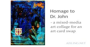
 The elements include a raven printed on muslin, in three sections.
 The portrait in the gold oval frame is Virginia, Poe’s great love.
 In the section to the right of her, there is a skull which was hand-carved from a deer’s antler. I found it at a flea market in Hollis, NH.
 In the center section, the lines of poetry are from The Raven.
 (Now, I use